 Art
Art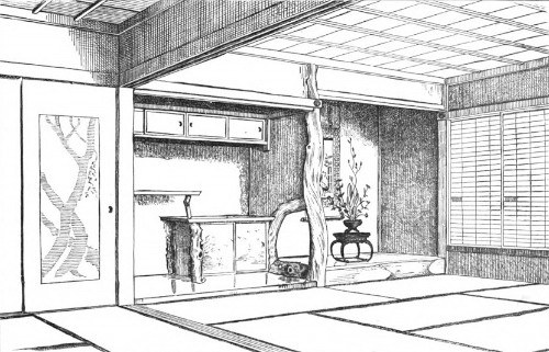
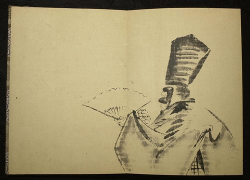
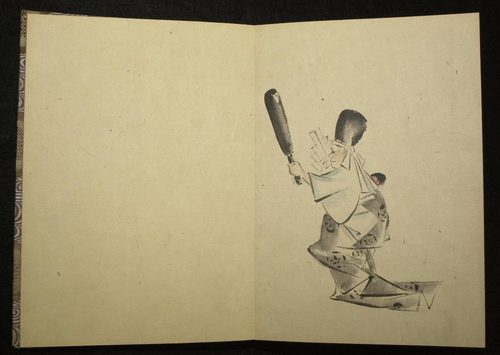
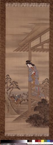
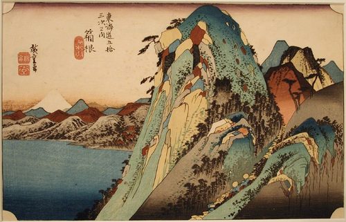

Asymmetry in art is a composition where the left and right (or top and bottom) sides differ in shape, size, or weight, yet still feel balanced overall. Instead of mirroring one side onto the other like a butterfly's wings, asymmetrical compositions balance visual weight — a large plain shape can offset a small busy one, a dark mass can counter a bright accent, a single figure at the edge can be balanced by empty space on the other side. This is the difference between formal balance (symmetry, which feels calm, stately, sometimes static) and informal balance (asymmetry, which feels alive, dynamic, natural). Painters have used asymmetry for centuries to guide the eye, create tension, and mimic how we actually see the world, since nothing in nature lines up perfectly down the middle. Japanese ink painting and woodblock prints pushed asymmetry further than almost any Western tradition, prizing off-center compositions and generous empty space as a virtue rather than a flaw. Today asymmetry is a basic tool in design, photography, and layout, proof that balance was never about being identical, just about feeling right.
How artists use it
Weight versus mirror
Hokusai's The Great Wave off Kanagawa puts a towering wave on the left and a tiny Mount Fuji on the right; the huge foam mass and the small, still peak trade size for stillness, so the two sides feel equally heavy even though they look nothing alike.
Off-center anchors
Manet's A Bar at the Folies-Bergère pushes the barmaid slightly left of center while her mirrored reflection swings improbably to the right, using the mismatch itself to unsettle the viewer and pull the eye back and forth across the canvas.
Diagonal counterweights
Géricault's The Raft of the Medusa builds a diagonal pyramid of bodies rising from the low left to the high right, so the empty gray sea filling the upper corner balances the crowded, contorted mass of survivors below it.
Empty space as ballast
Hiroshige's Sudden Shower over Shin-Ōhashi Bridge runs the crowded bridge and its hurrying figures diagonally across the upper half of the sheet while fine rain streaks the whole surface, leaving the wide, near-empty band of river below to counterweight the busy span above.
Color as counterweight
Mondrian's Composition with Red, Blue and Yellow sets one large red block in the upper right against small blocks of blue and yellow and a few white rectangles gridded by black lines, proving shapes that match in neither size nor color can still hold a canvas in balance.
Informal, cropped framing
Degas's The Dance Class crops dancers off to one side of the canvas as if caught mid-glance, borrowing snapshot photography's off-kilter framing so the scene feels observed in passing rather than arranged symmetrically for a viewer.
Instant examples
Asymmetry in famous works, fast
- The Great Wave off Kanagawa
- → a huge wave on the left is balanced by a tiny, distant Mount Fuji on the right through contrast in size, not mirroring.
- A Bar at the Folies-Bergère
- → the barmaid and her impossible reflection sit off-axis, with the tension built right into the mismatch.
- The Raft of the Medusa
- → a diagonal pyramid of bodies rises against a mostly empty sky, weight balanced against emptiness.
- Composition with Red, Blue and Yellow
- → a dominant red block is held in balance by small blue and yellow blocks set against it.
- Sudden Shower over Shin-Ōhashi Bridge
- → a crowded bridge cuts diagonally across the top while the wide, empty river below holds the other side.
- Nighthawks
- → a lit diner sits off to one side of the frame, its glow outweighing the dark, empty street around it.
- Christina's World
- → a girl sits low and off to one side, balanced by a small, distant farmhouse across the field.
The story
Formal, symmetrical composition dominated Western religious and court art for centuries: altarpieces, portraits, and architecture prized a strict central axis because symmetry read as order, authority, and the sacred. Renaissance painters occasionally broke the rule for drama, but balance still meant mirroring. That changed when Japanese woodblock prints reached Europe in the mid-1800s: artists like Hokusai and Hiroshige treated off-center compositions and empty space as deliberate, sophisticated choices, not accidents. Impressionists and Post-Impressionists, especially Degas and Manet, absorbed this influence alongside the new medium of photography, which naturally cropped scenes asymmetrically. By the twentieth century, modernists such as Mondrian formalized asymmetry into pure abstraction, balancing color and shape mathematically rather than mirroring form. Design education eventually codified it as informal balance, now taught alongside symmetry as an equally valid, often more dynamic way to organize a picture.
The canonical examples
| Work | Artist | Date | Why it matters |
|---|---|---|---|
| The Great Wave off Kanagawa | Katsushika Hokusai | c. 1831 | the towering wave and distant Fuji trade size for stillness |
| A Bar at the Folies-Bergère | Édouard Manet | 1882 | the mismatched reflection unbalances the whole canvas on purpose |
| The Raft of the Medusa | Théodore Géricault | 1818–19 | a diagonal pyramid of bodies rises against an empty gray sky |
| Composition with Red, Blue and Yellow | Piet Mondrian | 1930 | a large red block is balanced by small blue and yellow blocks |
| Christina's World | Andrew Wyeth | 1948 | a low, off-center figure is balanced by a distant farmhouse |
| Nighthawks | Edward Hopper | 1942 | the lit diner sits off to the right against a dark, empty street |
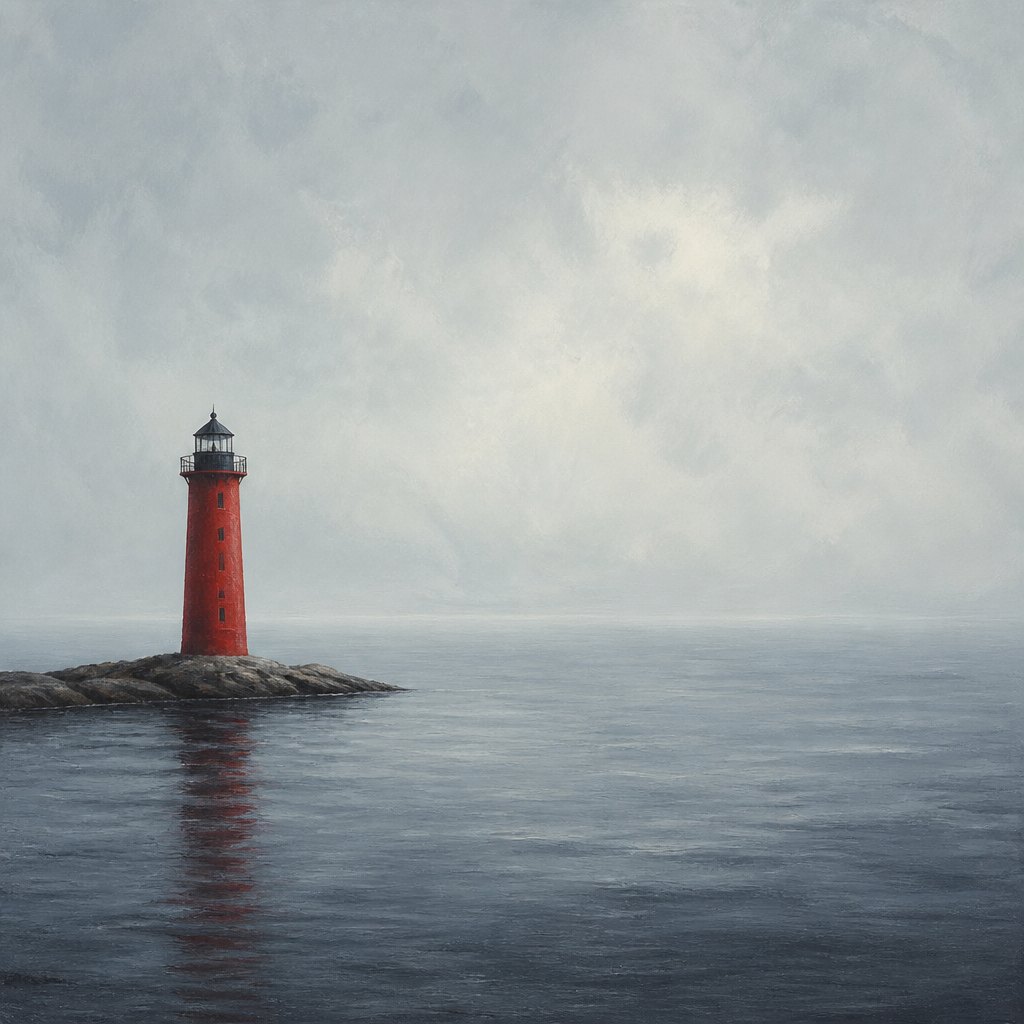 AI-generated
Try it yourself
Practice asymmetry with AI
This example was generated from a prompt like: “A single red lighthouse standing off to the left third of a wide, empty gray-blue seascape, with calm open water and pale sky filling the rest of the frame, balancing the small bright structure against vast negative space.”
Open the Elegant Asymmetry Art Style generator →The concept today
Photographers call it the rule of thirds: placing a subject off-center, roughly a third of the way into the frame, instead of dead center, because it almost always reads as more natural and dynamic. Film directors frame characters to one side of the shot to leave room for tension or an implied presence. Web and app designers use asymmetric grids so a hero image or headline pulls the eye without feeling stiff. AI image generators default toward centered subjects unless a prompt explicitly asks for off-center placement, negative space, or an unbalanced crop, since asymmetry usually has to be requested.
Compose your own
Start by placing your main subject off the center line, roughly a third of the way into the frame, rather than dead center. Then find something to balance it: a large plain area of color or sky can offset a small, detailed subject; a dark shape can counter a bright one; a distant, small element can balance a close, large one. Ask whether the two sides feel equally heavy, not whether they match. Leave real empty space instead of filling every corner, since that emptiness is doing balancing work, not going to waste. Try tilting the weight diagonally instead of side to side for more energy. Step back and squint: if your eye keeps sliding off one edge, add a small counterweight there rather than centering everything.
Frequently asked questions
What are examples of asymmetry in art?
Hokusai's The Great Wave off Kanagawa balances a huge wave against a tiny Mount Fuji, Manet's A Bar at the Folies-Bergère unbalances a reflection on purpose, and Mondrian's Composition with Red, Blue and Yellow balances one large red block against small blue and yellow blocks.
What's the difference between symmetry and asymmetry in art?
Symmetry mirrors one side onto the other for a calm, formal, often static feel. Asymmetry balances different shapes, colors, or sizes so the composition feels equally weighted without matching, usually reading as more natural and dynamic.
Why do artists use asymmetry instead of symmetry?
Asymmetry mimics how we actually see the world, since almost nothing lines up perfectly down the middle. It also creates movement and tension, guiding the eye across a composition instead of letting it settle in the center.
Is asymmetry the same as being unbalanced?
No, asymmetry is still balanced, just not identical on both sides. A small bright shape can offset a large dull one, so the visual weight matches even though the forms don't.