 Art
Art
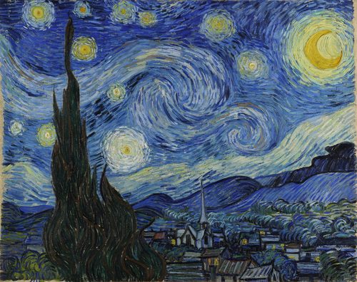
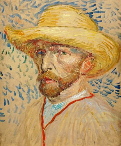
Color in art is the visual property created when light of different wavelengths reflects off a surface, and it is the element viewers register first, before line, shape, or subject even register consciously. Artists describe color through three properties: hue, which color it is on the wheel, like red or blue; value, how light or dark it is; and saturation, how pure or muted it is. Colors are further grouped into relationships, complementary pairs like red and green that vibrate against each other, analogous colors that sit next to each other on the wheel and feel harmonious, and warm colors, reds and yellows, versus cool colors, blues and greens, which affect how close or far apart an object feels. Colors can be used naturalistically, matching what a subject looks like in real light, or expressively, chosen for mood or symbolism instead of accuracy. Because color triggers such immediate emotional and physiological responses, faster and more automatically than shape or line, it is often the first design decision an artist makes, and frequently the one that defines a whole movement or era.
How artists use it
Color as pure emotion
Henri Matisse and the Fauves painted riverbanks and portraits in unnatural reds, greens, and oranges in works like Woman with a Hat, using color chosen entirely for emotional force rather than accuracy. Critics called them wild beasts; the name stuck, and expressive, non-naturalistic color became a legitimate tool.
Complementary contrast
Vincent van Gogh set blood-red walls against a green ceiling and green billiard table in The Night Café, exploiting how directly opposite colors on the wheel intensify each other when placed side by side. He wrote that he had tried to express the terrible passions of humanity by means of red and green.
Optical mixing
Georges Seurat built A Sunday Afternoon on the Island of La Grande Jatte from thousands of tiny dots of pure, unmixed color, letting the viewer's eye blend them into new hues from a distance. This pointillist technique produced colors that mixed paint on a palette never could.
Symbolic color
Pablo Picasso restricted his palette to melancholy blues for years during his Blue Period, painting works like The Old Guitarist almost entirely in a single cold hue to match the poverty and sorrow of his subjects. Color here carries narrative and mood rather than description.
Color field immersion
Mark Rothko filled huge canvases like Orange and Yellow with soft-edged rectangles of glowing color and almost nothing else, wanting viewers standing close to feel physically absorbed by color alone, with no subject, line, or narrative to distract from the sensation.
Local color abandoned
André Derain painted the Thames in Charing Cross Bridge, London in searing oranges and pinks that have nothing to do with London's actual gray light, treating color as an emotional decision rather than an observed fact. Abandoning true local color for felt color became a defining Fauvist move.
Instant examples
Color in famous works, fast
- The Night Café
- → complementary contrast — red and green, opposite on the color wheel, are pushed to their most intense pairing.
- A Sunday Afternoon on the Island of La Grande Jatte
- → optical mixing — tiny dots of pure color blend in the viewer's eye rather than on the palette.
- The Old Guitarist
- → symbolic monochrome — a single cold blue hue carries the entire mood of poverty and sorrow.
- Orange and Yellow
- → color field — soft glowing rectangles of color aim to physically absorb the viewer, with no other subject.
- Composition VII
- → color as sound — clashing, layered hues are arranged with a musician's sense of rhythm rather than description.
- Water Lilies (series)
- → shifting light — the same pond is painted in dramatically different color harmonies depending on the hour and season.
The story
For centuries, pigment availability limited color as much as theory did; ultramarine blue, ground from lapis lazuli, cost more than gold and was reserved for the most important subjects. The invention of synthetic pigments and portable paint tubes in the nineteenth century suddenly freed painters to work in bright, saturated color outdoors, fueling Impressionism's fascination with shifting natural light. Scientific color theory, including complementary contrast and the way the eye optically mixes nearby colors, directly shaped Neo-Impressionist pointillism. The Fauves and Expressionists then broke color free from description entirely, choosing hues for pure emotional effect rather than accuracy. Mid-century Color Field painters removed subject matter almost completely, treating large expanses of color as the entire content of a painting. Digital color, defined in RGB and hex values rather than pigment, has since removed the last physical limits on which colors an artist can access.
The canonical examples
| Work | Artist | Date | Why it matters |
|---|---|---|---|
| The Night Café | Vincent van Gogh | 1888 | red and green pushed to maximum complementary contrast |
| A Sunday Afternoon on the Island of La Grande Jatte | Georges Seurat | 1884–86 | thousands of small dots of pure color blend optically at a distance |
| The Old Guitarist | Pablo Picasso | 1903–04 | a restricted blue palette carries the painting's entire mood |
| Orange and Yellow | Mark Rothko | 1956 | soft-edged color fields with almost no other subject matter |
| Water Lilies (series) | Claude Monet | 1897–1926 | the same pond rendered in shifting color harmonies across light and season |
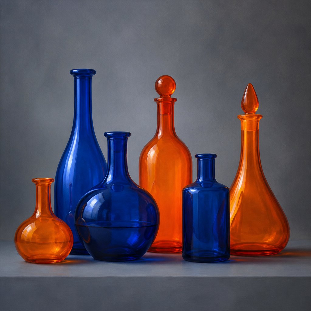 AI-generated
Try it yourself
Practice color with AI
This example was generated from a prompt like: “A still life of glass bottles in saturated orange and deep blue arranged side by side on a plain gray table, soft studio lighting, the complementary colors intensifying against each other, minimalist composition, no text, no logos.”
Open the Fauvism Art Style generator →The concept today
Color grading is now a dedicated post-production step in nearly every film and photo edit, pushing shadows toward teal and skin tones toward orange to trigger the same emotional effects painters have used for centuries. Brand identity teams choose a single signature color, a specific red or blue, knowing it will be recognized faster than any logo shape. AI image generators respond directly to color-mood prompts like warm golden hour or cold desaturated blues, since color remains the fastest lever for setting a scene's emotional temperature.
Compose your own
Pick a color relationship before you start, not after: complementary pairs, opposite each other on the color wheel, create energy and contrast, while analogous colors sitting next to each other create calm harmony. Limit your palette on purpose; three or four hues used consistently read as more intentional than ten used randomly. Use warm colors to bring elements forward and cool colors to push them back, a trick that fakes depth even in a flat digital image. Decide whether you are matching a subject's real color or choosing color for mood instead, and commit to one approach rather than drifting between them. When in doubt, test an image in grayscale first; if the composition still works without color, your color choices will only add to it, not have to rescue it.
Frequently asked questions
What are examples of color used for emotion in art?
Van Gogh's The Night Café uses clashing red and green for unease, Picasso's Blue Period paintings like The Old Guitarist use a single somber hue for sorrow, and Rothko's color field canvases, like Orange and Yellow, use glowing color alone to trigger feeling.
What is the difference between hue, value, and saturation?
Hue is which color it is, like red or blue. Value is how light or dark that color is. Saturation is how pure or muted it is. Any color can be described fully using just these three properties.
What are complementary colors in art?
Complementary colors sit directly opposite each other on the color wheel, like red and green or orange and blue. Placed side by side, they intensify each other, which is why artists like van Gogh used the pairing for dramatic contrast.
Why does color affect emotion faster than other elements of art?
Color triggers a physiological response in the eye and brain before conscious recognition of subject or shape kicks in, which is why a jarring red or a calm blue registers almost instantly, ahead of everything else in a composition.