 Art
Art
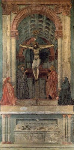
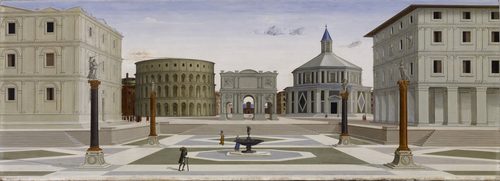
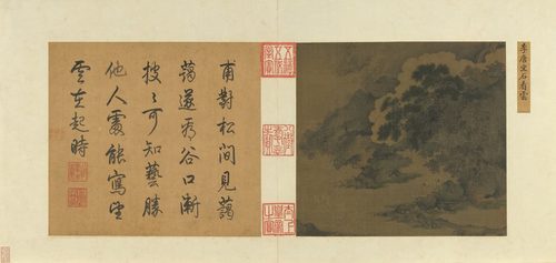
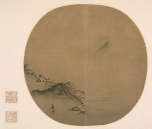
Space in art is the illusion of depth, distance, and the air between objects, built on a flat surface. Painters and photographers create it by overlapping forms, shrinking distant shapes, converging parallel lines toward a horizon, softening colors and edges the farther back they sit, and leaving empty negative space around a subject to let it breathe. Positive space is what fills the composition; negative space is what surrounds it, and the balance between the two shapes how open or crowded a scene feels. Space can be shallow, like a portrait pressed close to the picture plane, or deep, like a landscape that pulls the eye across miles of receding fields. Some traditions, particularly East Asian ink painting, treat empty space itself as an active subject rather than a gap to be filled. Understanding space means reading a flat rectangle as a believable world with a near and a far.
How artists use it
Lines that converge
Leonardo da Vinci's The Last Supper sends every architectural line in the room rushing back to a single vanishing point right behind Christ's head, so linear perspective does double duty, building believable depth while also anchoring the eye on the composition's emotional center.
Fading into haze
In Katsushika Hokusai's The Great Wave off Kanagawa, Mount Fuji sits pale and small in the distance while the foam-crowned wave dominates the foreground, its faded color and shrunken scale telling the eye it's miles away long before any line says so.
Space as the subject
In classical Chinese and Japanese ink painting, artists like Ma Yuan left most of the paper bare, letting empty space stand for mist, water, or sky so the few painted elements feel vast and isolated rather than crowded onto a page.
Overlap for order
In Pieter Bruegel the Elder's Hunters in the Snow, stacked overlapping shapes — hunters, dogs, a distant village — read instantly as near and far because closer forms simply cover the ones behind them, the cheapest and oldest trick for describing depth.
A figure swallowed whole
Andrew Wyeth's Christina's World places a single small figure in an enormous field of dry grass, and the sheer amount of empty ground between her and the farmhouse turns negative space into the picture's real subject, making distance feel physical and lonely.
Flattening depth on purpose
By stripping away shading, overlap, and perspective in Composition with Red, Blue and Yellow, Piet Mondrian collapses space into a flat grid of color, proving that refusing depth is itself a deliberate use of space, not an absence of skill.
Instant examples
Space in famous works, fast
- The Great Wave off Kanagawa
- → atmospheric depth — a pale, tiny Mount Fuji reads as far away purely through faded color and shrunken scale
- The Last Supper
- → linear perspective — every ceiling beam and wall line converges on Christ, pulling the eye deep into the room
- Christina's World
- → negative space — a vast, empty field between figure and farmhouse makes distance feel physical
- Wanderer above the Sea of Fog
- → aerial perspective — layered ridgelines fade paler and hazier the farther back they sit
- Hunters in the Snow
- → overlap — closer figures and trees simply cover what's behind them, stacking the scene into near and far
- Composition with Red, Blue and Yellow
- → flatness — no shading or overlap at all, so the grid reads as pure surface rather than depth
- View of Delft
- → scale and light — buildings shrink and soften across the water, describing distance without a single ruled line
The story
For most of human art, space was symbolic rather than measured — Egyptian and medieval painters sized figures by importance, not distance, so a pharaoh or a saint could tower over a whole crowd. Chinese and Japanese ink painters developed atmospheric and shifting perspective centuries before Europe, letting mist and blank paper stand in for measured depth. The breakthrough in the West came in early 1400s Florence, when architects and painters worked out linear perspective, a mathematical system for making parallel lines converge at a vanishing point so a flat wall could open into a believable room. Later painters layered in atmospheric perspective, muting color and detail with distance, to render whole landscapes convincingly. By the 20th century, artists like the Cubists and Mondrian began deliberately flattening space again, treating the picture plane as honestly flat rather than a window, which made depth itself a choice rather than a rule.
The canonical examples
| Work | Artist | Date | Why it matters |
|---|---|---|---|
| The Last Supper | Leonardo da Vinci | c. 1495-1498 | look at how every architectural line converges behind Christ's head |
| The Great Wave off Kanagawa | Katsushika Hokusai | c. 1831 | look at how pale, small Mount Fuji reads as distant against the huge, dark wave |
| Wanderer above the Sea of Fog | Caspar David Friedrich | 1818 | look at how each ridgeline fades lighter and hazier toward the horizon |
| Christina's World | Andrew Wyeth | 1948 | look at how much empty field separates the figure from the farmhouse |
| Hunters in the Snow | Pieter Bruegel the Elder | 1565 | look at how overlapping figures and trees stack the scene into clear layers |
| Composition with Red, Blue and Yellow | Piet Mondrian | 1930 | look at how the total absence of shading keeps the grid perfectly flat |
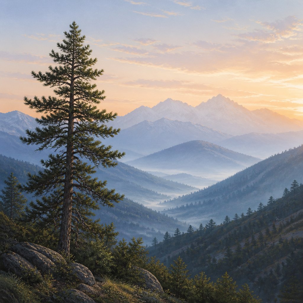 AI-generated
Try it yourself
Practice space with AI
This example was generated from a prompt like: “A quiet mountain valley at dawn: a sharp, detailed pine tree in the foreground, a soft row of hills fading to pale blue-gray in the middle distance, and faint mountain silhouettes dissolving into mist on the horizon.”
Open the Quattrocento Perspective Renaissance Art Style generator →The concept today
Photographers use shallow depth of field to push backgrounds out of focus, borrowing atmospheric perspective to separate a subject from its setting in an instant. Filmmakers stage actors at different depths within a frame — foreground, midground, background — to imply space without moving the camera. UI designers use drop shadows, blur, and layering to fake a sense of depth on a flat screen, stacking cards and panels like overlapping shapes. AI image generators lean on the same old cues: haze, scale, and overlap, which is why a prompt naming a clear foreground and distant background reads as convincingly deep.
Compose your own
Start by deciding what sits closest to the viewer and what sits farthest, then use overlap: let nearer shapes cover parts of shapes behind them, since covering is the fastest way to establish order. Shrink distant objects and soften their color and edges slightly, since haze and reduced contrast read as air and distance even at a small scale. If you want a deep scene, add converging lines — a road, a fence, a row of trees — that lead the eye toward a single point on the horizon. If you want the opposite, flatten deliberately: keep every shape the same size, sharpness, and value so nothing recedes. And don't fear empty space; a large plain area around a small subject can make distance feel enormous.
Frequently asked questions
What are examples of space in art?
Classic examples include Leonardo da Vinci's The Last Supper, where converging lines create deep perspective; Hokusai's The Great Wave off Kanagawa, where a pale, distant Mount Fuji shows atmospheric depth; and Andrew Wyeth's Christina's World, where a vast empty field turns negative space into the subject.
What's the difference between positive and negative space?
Positive space is the actual subject or filled area of a composition; negative space is everything around it. Both shape the reading of an image — a small figure surrounded by a large empty field feels isolated because of how much negative space frames it.
What is atmospheric perspective?
Atmospheric, or aerial, perspective is the technique of muting color, softening edges, and lightening value on distant objects, imitating how real haze scatters light. It's why far-off mountains look pale and blue-gray while nearby ones show sharp, saturated detail.
Can a flat, patterned image still use space effectively?
Yes — some artists flatten space on purpose, removing shading and overlap so the surface reads as honestly flat rather than a window. This isn't a failure to create depth; it's a deliberate choice that treats space as absence rather than illusion.