 Art
Art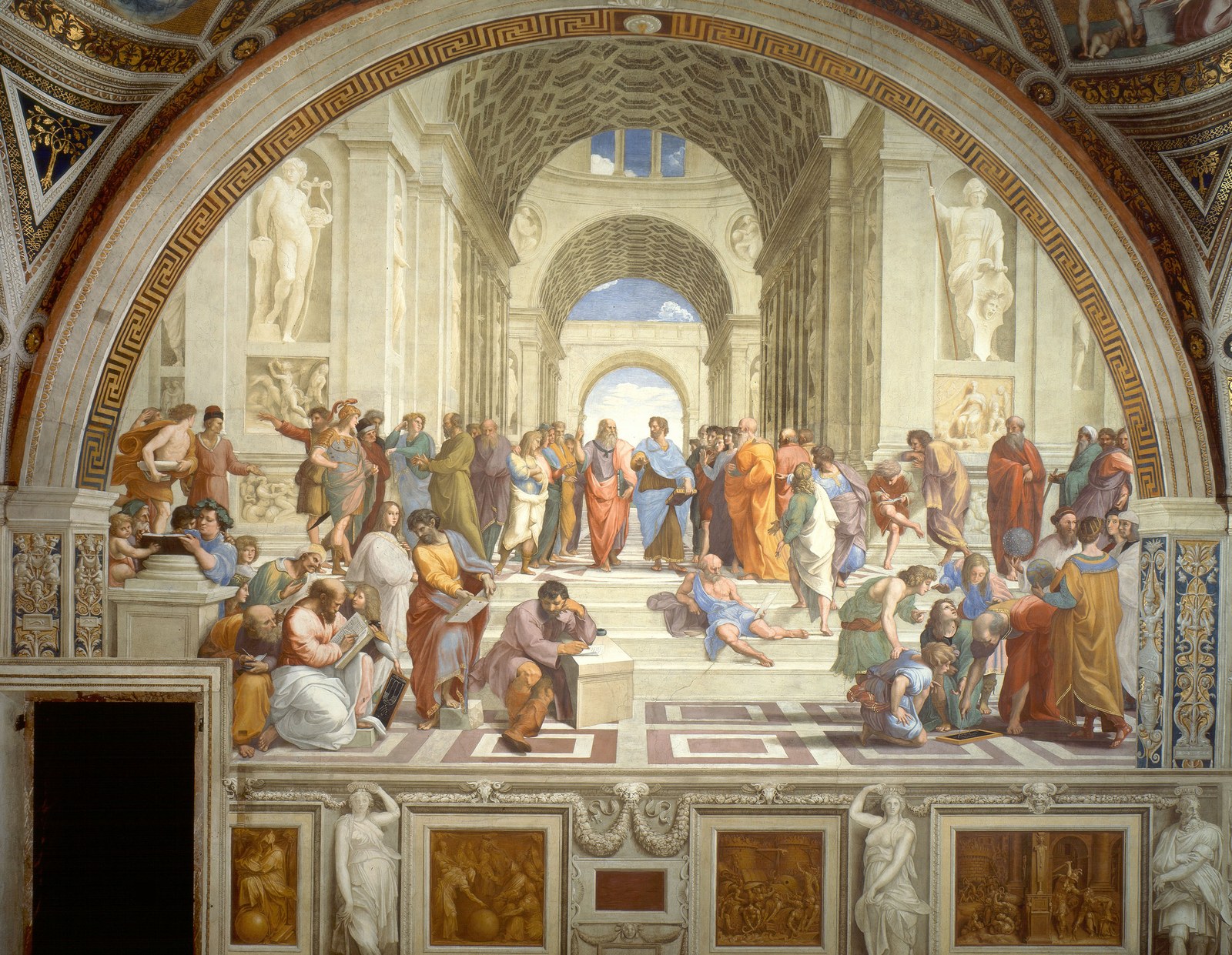
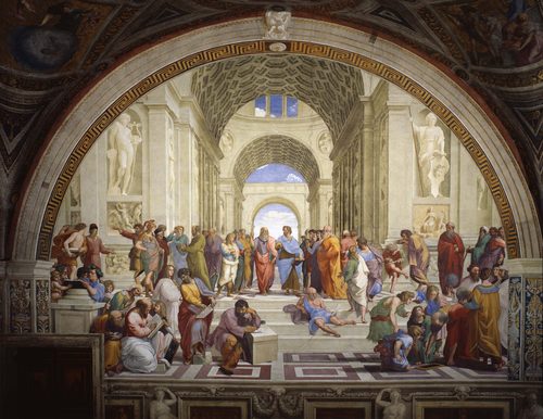
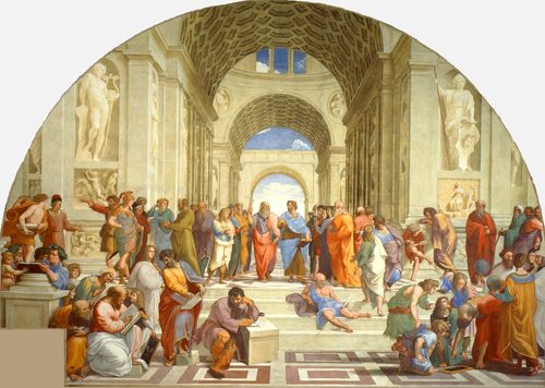
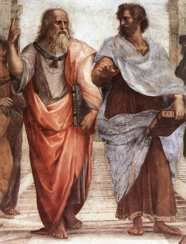
Balance in art is the sense that visual weight is distributed evenly across a composition, so no single part feels like it's about to tip the whole thing over. Weight isn't literal mass — it comes from size, color, contrast, texture, and position, so a small, bright shape can balance a large, pale one. Symmetrical balance mirrors elements around a central axis for a calm, formal feel, while asymmetrical balance uses different objects of equal visual pull on each side for a livelier, more natural one. Radial balance arranges elements around a central point, like petals around a flower's core. Artists lean on balance to make a composition feel settled and intentional, or they deliberately unbalance it to create tension and unease. Reading balance means asking where your eye rests and whether the composition feels like it could stand on its own without toppling.
How artists use it
Mirror symmetry
Leonardo da Vinci's Vitruvian Man plants a figure inside a circle and square with arms and legs mirrored on either side of a central spine, making perfect bilateral symmetry the literal subject of the drawing rather than just its structure.
Uneven weights, equal pull
Piet Mondrian's Composition with Red, Blue and Yellow balances one large, saturated red block in the upper right against small blocks of blue and yellow and a few white rectangles, proving that shapes of wildly unequal size and color can still trade off and hold each other in place.
Radial balance
Georgia O'Keeffe's Black Iris arranges the flower's petals so they radiate outward from a central core, giving the eye multiple equal paths to travel and creating balance around a middle point rather than across a mirrored line.
Color as ballast
In Henri Matisse's The Red Studio, a large expanse of red is balanced against small, scattered objects — furniture drawn as thin yellow outlines, framed canvases, ceramics, a clock — since their density and contrast let a handful of small shapes offset one huge field of color.
Balance through gaze and gesture
Diego Velázquez's Las Meninas clusters figures unevenly across the canvas, yet the composition holds together because gestures, gazes, and a mirror at the back distribute attention evenly rather than relying on mirrored shapes.
Deliberately off-balance
In Edvard Munch's The Scream, the central figure is pushed off-center against a wildly tilting bridge and sky, and the resulting imbalance is intentional, translating visual instability directly into the painting's feeling of panic.
Instant examples
Balance in famous works, fast
- Vitruvian Man
- → symmetry — a figure mirrored perfectly around a central spine inside a circle and square
- Composition with Red, Blue and Yellow
- → asymmetry — a dominant red block is offset by small blue and yellow blocks and white rectangles
- Black Iris
- → radial balance — petals fan out evenly from a central core
- The Red Studio
- → color weight — scattered small objects balance one dominant field of red
- Las Meninas
- → compositional balance — gazes and gestures distribute attention across an unevenly populated room
- The Scream
- → imbalance on purpose — an off-center figure against a tilting bridge creates visual panic
- American Gothic
- → near-mirror symmetry — two figures and a peaked window stack into a stable, formal triangle
The story
Early religious and ceremonial art favored strict symmetrical balance, mirroring figures around a central axis to project order, authority, and the sacred — think of a saint centered beneath a mirrored architectural frame. Renaissance painters kept symmetry for grand, formal scenes but began exploring subtler asymmetrical balance, weighing a large shape against several smaller ones to feel less rigid. Baroque artists pushed further, using diagonal composition and uneven groupings that still felt stable through color and gesture rather than mirrored shape. By the 20th century, abstract painters treated balance almost mathematically, weighing pure color and shape against each other with no figures at all. Modern and contemporary artists now often break balance on purpose, using instability to signal anxiety, motion, or tension, proving that even imbalance is a considered choice once the rules of balance are understood.
The canonical examples
| Work | Artist | Date | Why it matters |
|---|---|---|---|
| Vitruvian Man | Leonardo da Vinci | c. 1490 | look at how the figure mirrors perfectly around a central vertical line |
| Composition with Red, Blue and Yellow | Piet Mondrian | 1930 | look at how the large red block is offset by small blue and yellow blocks |
| Black Iris | Georgia O'Keeffe | 1926 | look at how the petals radiate evenly from a central point |
| Las Meninas | Diego Velázquez | 1656 | look at how gazes and gestures spread weight across an unevenly grouped room |
| The Scream | Edvard Munch | 1893 | look at how the off-center figure against a tilting bridge feels deliberately unstable |
| American Gothic | Grant Wood | 1930 | look at how two figures and a peaked window form a stable, near-symmetrical triangle |
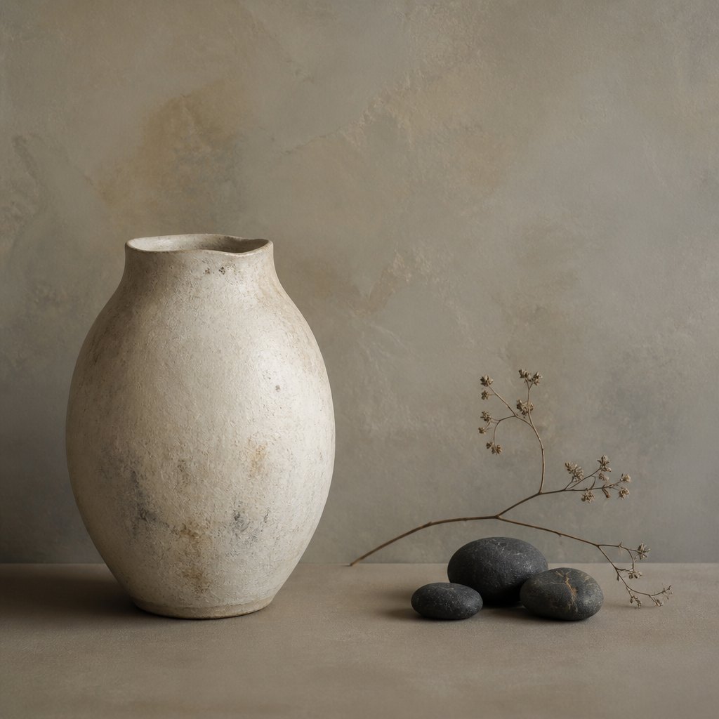 AI-generated
Try it yourself
Practice balance with AI
This example was generated from a prompt like: “An asymmetrical still-life composition: one large pale ceramic vase sits to the left, balanced on the right by three small dark stones and a slim dried branch, all resting on a plain warm-gray tabletop.”
Open the Perfect Balance Art Style generator →The concept today
Graphic and web designers balance a bold logo against generous white space the same way painters weigh a dark shape against a pale field. Photographers frame a subject off-center and let a smaller secondary element — a horizon, a shadow, a stray object — hold the other side of the picture steady. Film directors block actors asymmetrically within the frame to keep two-shots feeling alive rather than static. AI image tools respond well to prompts that name both a focal subject and something to counter it, since models trained on centuries of composed images already expect the frame to feel weighted, not lopsided.
Compose your own
Picture your composition on a scale: every shape, color, and area of contrast adds weight to one side or the other. A large pale shape can be balanced by a small, dark, saturated one, since color intensity and contrast carry as much visual weight as size. For a calm, formal feel, mirror elements around a central line or point. For a livelier feel, use asymmetrical balance — place a bold accent to one side and offset it with a cluster of smaller, quieter shapes on the other, checking that neither side feels like it's dragging the eye out of the frame. Step back and squint; if the image still holds together as a single, settled shape, it's balanced. If one corner feels empty or overloaded, adjust size or contrast there before adding anything new.
Frequently asked questions
What are examples of balance in art?
Leonardo da Vinci's Vitruvian Man shows perfect mirror symmetry; Piet Mondrian's Composition with Red, Blue and Yellow balances a large red block against small blue and yellow blocks; and Georgia O'Keeffe's Black Iris uses radial balance, with petals fanning evenly from a central point.
What's the difference between symmetrical and asymmetrical balance?
Symmetrical balance mirrors matching elements around a central line, producing a calm, formal effect. Asymmetrical balance uses different shapes, colors, or sizes on each side that carry equal visual weight without matching, producing a livelier, more natural feel.
What is radial balance?
Radial balance arranges elements so they radiate outward from a central point, like spokes on a wheel or petals on a flower, giving the eye several equal paths to travel rather than a single mirrored line.
Can an artwork be intentionally unbalanced?
Yes — artists sometimes push a composition off-balance on purpose, crowding weight to one side or tilting the scene, to create tension, unease, or a sense of motion that a calmly balanced image wouldn't produce.