 Art
Art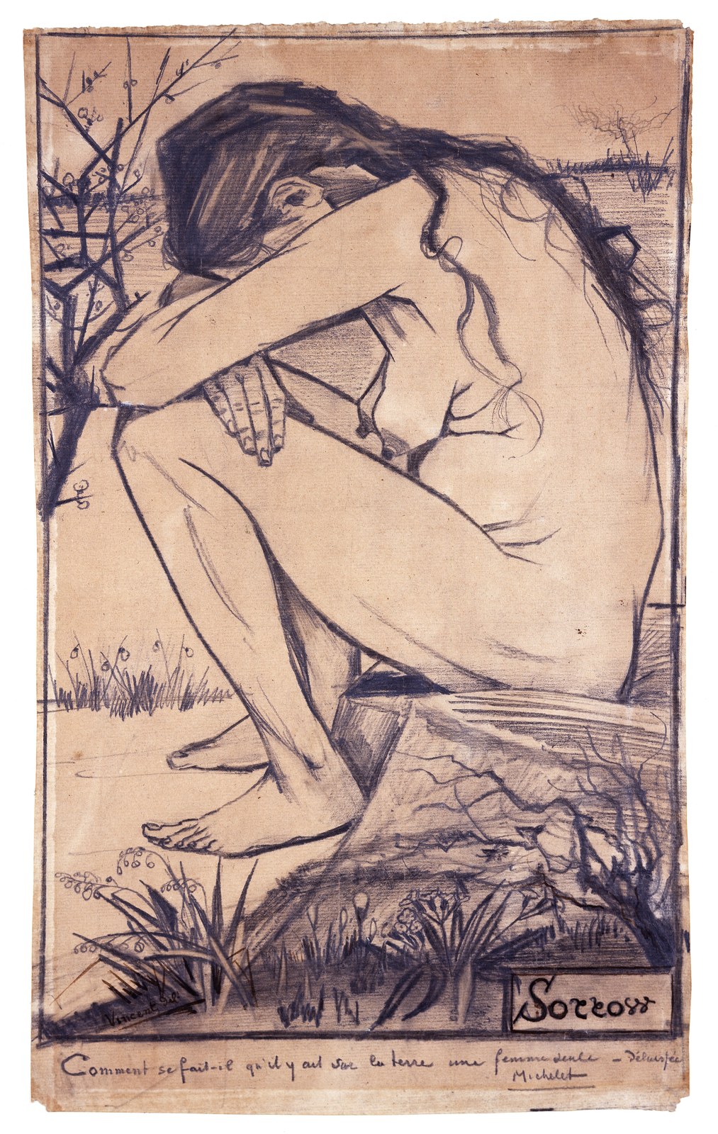
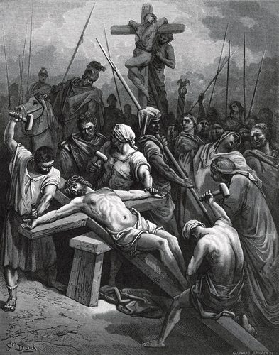
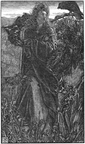
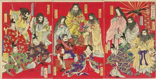
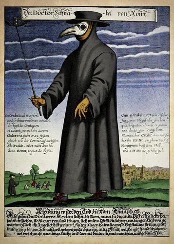
Contrast in art is the difference between two elements — light and dark, warm and cool, big and small, rough and smooth — placed close enough together that the difference itself becomes visible and interesting. The starkest and most common form is value contrast, pairing light and dark areas so a shape reads clearly against its background. Color contrast pairs complementary or opposing hues to make each look more intense than it would alone. Contrast can also come from scale, texture, shape, or even subject matter, like a single quiet object in an otherwise chaotic scene. Artists use contrast to create focus, since the eye is drawn instinctively to the point of greatest difference in a composition. Too little contrast and an image feels flat and hard to read; too much scattered everywhere and nothing stands out at all, so contrast usually works best when it's concentrated at the one spot an artist wants you to look.
How artists use it
Light against dark
In Caravaggio's The Calling of Saint Matthew, a blade of light cuts diagonally through near-total darkness, and the sharp value contrast between the lit hand of Christ and the shadowed tavern does the storytelling before any figure's expression does.
Warm against cool
Vincent van Gogh's The Starry Night sets golden-yellow stars and a hot crescent moon blazing against a deep blue-black sky, and that warm-cool color contrast is what makes the night feel electric rather than simply dark.
Scale against scale
In Caspar David Friedrich's Wanderer above the Sea of Fog, a single dark figure looks enormous in stature yet tiny in scale against the vast pale fog and rock below, and that size contrast is what makes the scene feel sublime rather than merely scenic.
Texture against texture
In Vincent van Gogh's Wheatfield with Cypresses, thick, ropy impasto strokes of wheat and sky sit against the darker, denser texture of the cypress tree, and that contrast in paint handling gives the whole canvas a restless energy.
One calm shape in chaos
In Katsushika Hokusai's The Great Wave off Kanagawa, the small, still, pale form of Mount Fuji sits calmly behind the wave's violent, clawing foam, and that contrast between chaos and calm lets the eye find rest inside an otherwise frantic composition.
Complementary color clash
Georges Seurat's A Sunday Afternoon on the Island of La Grande Jatte places tiny dots of orange next to blue that mix optically in the eye, and this complementary color contrast is what gives the flat scene its shimmering light.
Instant examples
Contrast in famous works, fast
- The Calling of Saint Matthew
- → value contrast — a blade of light cuts through near-total darkness to single out one hand
- The Starry Night
- → warm-cool contrast — hot yellow stars blaze against a deep, cold blue sky
- Wanderer above the Sea of Fog
- → scale contrast — a small dark figure looks monumental against a vast pale fog
- The Great Wave off Kanagawa
- → chaos vs. calm — a still, pale Mount Fuji sits behind the wave's violent foam
- A Sunday Afternoon on the Island of La Grande Jatte
- → complementary color contrast — dots of orange and blue vibrate against each other
- Wheatfield with Cypresses
- → texture contrast — thick, ropy strokes of wheat against the denser mass of a cypress tree
The story
Renaissance painters developed chiaroscuro, using strong light-and-dark contrast to model form and give flat panels a sense of three-dimensional weight. Baroque artists like Caravaggio pushed this further into tenebrism, plunging entire backgrounds into darkness so a single lit figure would seem to leap off the canvas. In the 19th century, color theory gave artists a new tool: complementary contrast, pairing opposite hues on the color wheel so each intensified the other, which the Impressionists and Pointillists used to make paintings vibrate with light rather than rely on outline. Photography inherited value contrast directly, using exposure to separate a subject from its background. By the 20th century, abstract and pop artists used stark, flat contrast — bold outline, saturated color blocks — to grab attention instantly, treating contrast less as a subtle modeling tool and more as a blunt, immediate signal.
The canonical examples
| Work | Artist | Date | Why it matters |
|---|---|---|---|
| The Calling of Saint Matthew | Caravaggio | 1599-1600 | look at how one shaft of light singles out a hand in an otherwise dark tavern |
| The Starry Night | Vincent van Gogh | 1889 | look at how hot yellow stars push forward against the cold, deep blue sky |
| Wanderer above the Sea of Fog | Caspar David Friedrich | 1818 | look at how the small dark figure gains monumental scale against the pale fog |
| A Sunday Afternoon on the Island of La Grande Jatte | Georges Seurat | 1884-1886 | look closely at how dots of orange and blue sit side by side and vibrate |
| The Great Wave off Kanagawa | Katsushika Hokusai | c. 1831 | look at how the calm, pale mountain contrasts with the wave's violent foam |
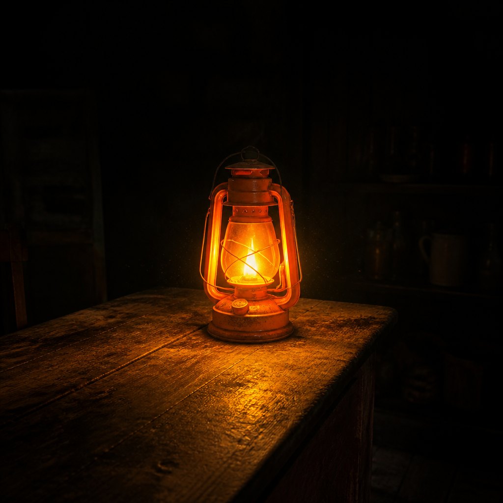 AI-generated
Try it yourself
Practice contrast with AI
This example was generated from a prompt like: “A single bright orange lantern glowing on a weathered wooden table, everything else in the room sunk into near-total darkness, sharp light against deep shadow, dust motes barely visible in the light's edge.”
Open the Tenebrism Drama Baroque Art Style generator →The concept today
Photographers boost contrast in editing to make a subject snap forward from its background, and cinematographers light night scenes with a single strong source to keep shadows deep and dramatic. UI designers rely on contrast for accessibility, making sure text is dark enough against its background to read clearly, and use a single bright button color against a muted interface to guide clicks. AI image generators respond strongly to prompts naming an explicit contrast, like a bright object in a dark room, since the resulting sharp value difference is exactly what makes a generated image feel focused rather than muddy.
Compose your own
Pick one kind of contrast to lead with — usually light against dark, since it's the strongest and most instantly readable. Push your darkest dark and lightest light as far apart as you can near the point you want the eye to land, and keep the rest of the image closer in value so that one area stands out. If you're working in color, try placing a small area of a warm hue against a much larger field of its cool opposite, or vice versa, since complementary colors intensify each other just by touching. Resist the urge to add contrast everywhere; if every part of an image screams for attention, none of it will. A single, well-placed area of strong contrast will do more work than contrast scattered across the whole frame.
Frequently asked questions
What are examples of contrast in art?
Caravaggio's The Calling of Saint Matthew uses a blade of light against deep shadow; Van Gogh's The Starry Night pairs hot yellow stars with cold blue sky; and Friedrich's Wanderer above the Sea of Fog contrasts a small dark figure with a vast pale fog.
What's the difference between value contrast and color contrast?
Value contrast is the difference between light and dark areas, regardless of hue, and is the strongest tool for making a shape read clearly. Color contrast is the difference between hues, like warm against cool or complementary opposites, which can intensify color without changing lightness.
What is chiaroscuro?
Chiaroscuro is the use of strong light-and-dark contrast to model three-dimensional form, developed by Renaissance and Baroque painters. Pushed to its extreme, with backgrounds sunk into near-total darkness, it's called tenebrism.
Why does too much contrast weaken an image?
When strong contrast is scattered evenly across an entire composition, nothing stands out more than anything else, so the eye has nowhere obvious to land. Concentrating contrast at one point is what creates focus.