 Art
Art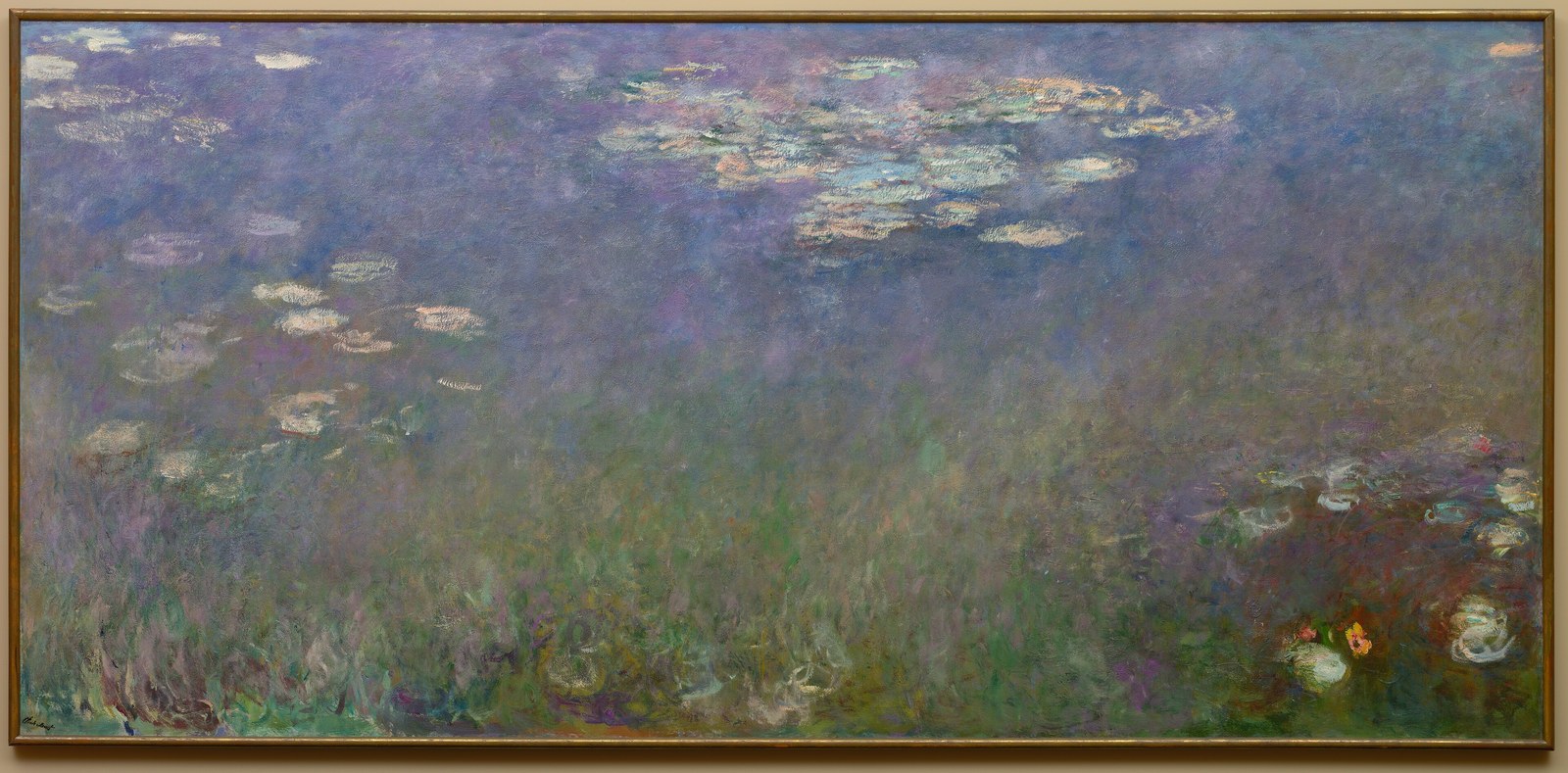
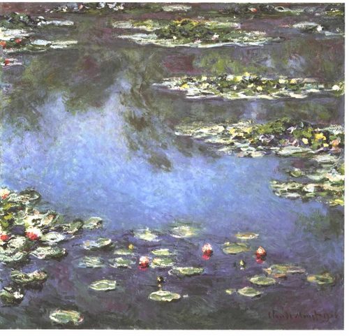
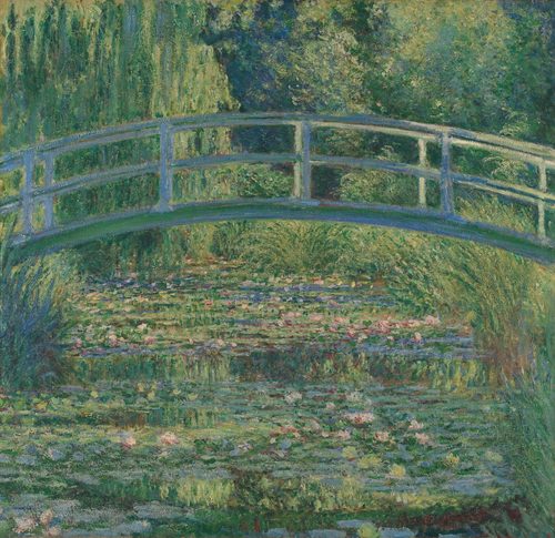
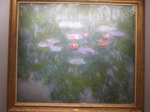
Unity in art is the sense that every part of a composition belongs together, working as one connected whole rather than a pile of unrelated pieces. Artists build unity through repetition, using a consistent palette, shape vocabulary, or brushstroke across an entire piece so the eye reads one voice rather than several. Proximity helps too — elements placed close together read as a group, while scattered elements read as separate. Continuation uses a line, edge, or gesture that carries from one part of a composition into the next, stitching sections together visually. A limited color palette is one of the fastest routes to unity, since even very different shapes feel related when they share the same handful of hues. Unity doesn't mean uniformity or monotony; a unified composition can still contain plenty of variety, as long as that variety is held together by some consistent thread. Without unity, a composition feels like fragments; with too much of it and no variety, it can feel static and dull, which is why unity and variety are usually discussed as a pair.
How artists use it
One palette, many parts
Pablo Picasso's Blue Period paintings, including The Old Guitarist, drench figures, shadows, and background alike in variations of a single blue, and that shared color across every element is what makes such different shapes read as one coherent, melancholic world.
A repeated motif throughout
In Gustav Klimt's The Kiss, gold leaf and small decorative patterns cover both figures and the ground beneath them, and repeating that same ornamental texture across the whole canvas welds two bodies and their setting into a single glowing surface.
Edges that connect
In Vincent van Gogh's Wheatfield with Cypresses, the curling brushwork in the wheat continues directly into the curling shapes of the clouds above, and that shared line quality carries the eye from ground to sky without a visible seam.
A frame that holds chaos
Jackson Pollock's Number 1, 1950 (Lavender Mist) scatters dripped paint edge to edge with no obvious focal point, yet the even density and consistent gesture across the whole canvas keeps the field from splintering into disconnected fragments.
Grouped by proximity
In Georges Seurat's A Sunday Afternoon on the Island of La Grande Jatte, clusters of figures stand close enough together to read as small unified groups, even though each individual figure is built from the same separated dots of paint.
One light source, one mood
Johannes Vermeer's Girl with a Pearl Earring bathes face, fabric, and background in one consistent, soft light source, and that single unifying light keeps very different textures — skin, cloth, pearl — feeling like part of the same quiet moment.
Instant examples
Unity in famous works, fast
- The Old Guitarist
- → unity — every element, from skin to shadow, shares the same blue palette
- The Kiss
- → unity — repeated gold ornament welds two figures and their ground into one surface
- Number 1, 1950 (Lavender Mist)
- → unity — even density of dripped paint keeps the whole canvas reading as one field
- Wheatfield with Cypresses
- → unity — the same curling brushstroke carries from ground to sky with no visible seam
- Girl with a Pearl Earring
- → unity — one consistent light source binds skin, cloth, and pearl into a single mood
- A Sunday Afternoon on the Island of La Grande Jatte
- → unity — proximity groups individual dotted figures into small, cohesive clusters
The story
Medieval altarpieces achieved unity mainly through shared gold backgrounds and a common religious subject, flattening many separate panels into one devotional object. Renaissance painters unified complex scenes with a single vanishing point and consistent light source, so dozens of figures felt like they occupied one believable room. Baroque artists added unity through dramatic, continuous light and shadow sweeping across a whole canvas. By the 19th century, movements like Impressionism unified a scene through a consistent brushstroke and limited palette rather than careful drawing, letting loose, repeated marks tie a landscape together at a glance. Abstract Expressionists took this further, using an all-over, evenly distributed gesture across the entire canvas so the whole surface, edge to edge, felt like a single continuous event rather than a composition with a center and edges.
The canonical examples
| Work | Artist | Date | Why it matters |
|---|---|---|---|
| The Old Guitarist | Pablo Picasso | 1903-1904 | look at how one shade of blue unifies figure, shadow, and background |
| The Kiss | Gustav Klimt | 1907-1908 | look at how the same gold pattern covers both figures and the ground |
| Number 1, 1950 (Lavender Mist) | Jackson Pollock | 1950 | look at how even density keeps the dripped field from splintering apart |
| Girl with a Pearl Earring | Johannes Vermeer | c. 1665 | look at how one soft light source binds every surface in the painting |
| Wheatfield with Cypresses | Vincent van Gogh | 1889 | look at how the same curling brushstroke carries from the wheat into the sky |
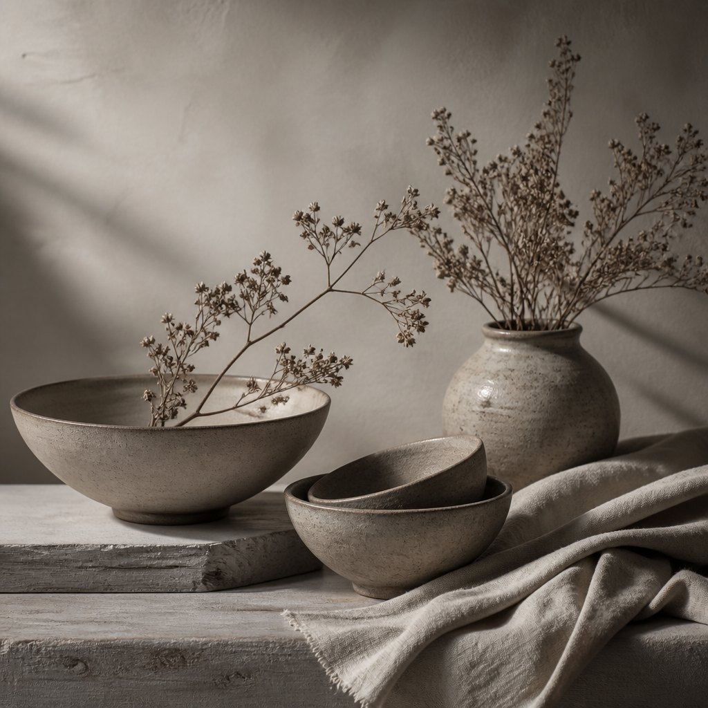 AI-generated
Try it yourself
Practice unity with AI
This example was generated from a prompt like: “A still life of ceramic bowls, dried branches, and folded linen, everything rendered in the same soft warm-gray palette and the same gentle side light, so despite different shapes and textures the whole arrangement reads as one calm, connected scene.”
Open the Tonal Unity Art Style generator →The concept today
Photographers unify a series by shooting through a consistent filter, crop, or color grade so separate images read as one body of work. Filmmakers use a controlled color palette across an entire film to hold wildly different scenes together tonally. UI designers lean on unity constantly, applying one type system, spacing scale, and color palette across every screen so an app feels like a single product rather than a patchwork. AI image generators achieve unity when a prompt specifies one consistent style, palette, or lighting condition, keeping every generated element visually related rather than stitched from mismatched parts.
Compose your own
Pick a limited color palette before you start and stick to it across the whole piece — even wildly different shapes will feel related if they share the same handful of hues. Repeat one element, whether it's a brushstroke, a texture, or a small motif, in several places across the composition so the eye recognizes a common thread. Keep your light source consistent, since mismatched shadows are one of the fastest ways to make a scene feel stitched together rather than whole. Group related elements close to one another rather than scattering them evenly, since proximity reads as belonging. Finally, let one edge or line continue from one section into the next, carrying the eye across the whole composition instead of stopping at internal boundaries.
Frequently asked questions
What are examples of unity in art?
Pablo Picasso's The Old Guitarist unifies every element through one blue palette; Gustav Klimt's The Kiss repeats gold ornament across both figures and ground; and Jackson Pollock's Number 1, 1950 keeps an even, all-over density so the whole canvas reads as one field.
What's the difference between unity and harmony?
Unity is the sense that all parts of a composition belong together as one whole, often built through repetition or a shared palette. Harmony is more specifically about elements agreeing pleasingly with each other, like related colors or consistent shapes. Harmony is one route to unity.
How is unity different from uniformity?
Uniformity means everything looks the same, which can feel monotonous. Unity means everything belongs together, but it can still contain plenty of variety — different shapes, colors, or textures — as long as some consistent thread, like a shared palette, ties them together.
Why is unity important in a composition?
Without unity, a composition reads as scattered fragments rather than one connected image, making it harder for a viewer to know where to look or how the parts relate. Unity gives a piece a coherent identity, letting variety happen within a whole that still holds together.