 Art
Art
Variety in art is the intentional use of different shapes, colors, sizes, textures, or values within a composition to keep it visually interesting rather than monotonous. Where unity ties a composition together with a consistent thread, variety introduces enough difference to stop that consistency from tipping into boredom. A single accent color in an otherwise muted painting, one larger shape among a field of small ones, or a rough texture breaking up a smooth surface are all forms of variety. Variety can appear in scale, contrasting a giant form against tiny ones; in color, breaking a limited palette with one unexpected hue; in shape, mixing organic curves with hard geometric edges; or in rhythm, interrupting a steady repeated beat with an irregular pause. The skill lies in balance — too little variety and a composition feels flat and predictable, too much and it feels chaotic and disconnected. The best use of variety happens inside a unified framework, so the eye is surprised without ever feeling lost, which is why artists and teachers usually treat unity and variety as two sides of the same coin.
How artists use it
One shape breaks the pattern
In Wassily Kandinsky's Composition VIII, dozens of circles, triangles, and lines repeat across the canvas in a related family of shapes, but a handful of oversized or unusually colored forms interrupt the pattern, giving the eye somewhere unexpected to land.
A single warm accent
Édouard Manet's A Bar at the Folies-Bergère keeps most of the composition in cool grays and blacks, then places small warm accents — oranges, a rose, flushed skin — that break the cool palette just enough to keep the scene from feeling flat.
Mixed textures in one scene
In Vincent van Gogh's Wheatfield with Cypresses, the loose, wavy texture of the wheat sits beside the tighter, more vertical texture of the cypress tree, and that contrast in brush handling gives an otherwise unified palette real visual variety.
Scale that surprises
Caspar David Friedrich's Wanderer above the Sea of Fog uses a small human figure against a vast rocky and cloud-filled landscape, and that dramatic difference in scale creates variety within an otherwise consistent, moody color scheme.
Organic shapes among straight lines
Antoni Gaudí's Casa Batlló facade mixes flowing, bone-like curves and rippled surfaces against the rigid grid of a typical city block, and that clash of organic and geometric shape is what makes the building read as alive against its stiff neighbors.
A pause in the pattern
In Georges Seurat's A Sunday Afternoon on the Island of La Grande Jatte, most figures stand upright and still, but a leaping monkey and a running dog break the composition's calm rhythm, adding a spark of variety to an otherwise formal, orderly scene.
Instant examples
Variety in famous works, fast
- Composition VIII
- → variety — oversized or unusually colored shapes interrupt an otherwise repeating family of forms
- A Bar at the Folies-Bergère
- → variety — small warm accents break up an otherwise cool gray palette
- Wanderer above the Sea of Fog
- → variety — a tiny figure against a vast landscape creates dramatic scale contrast
- Casa Batlló
- → variety — organic, bone-like curves break up the rigid grid of a city block
- Wheatfield with Cypresses
- → variety — the loose texture of wheat contrasts with the tighter texture of a cypress tree
- A Sunday Afternoon on the Island of La Grande Jatte
- → variety — a leaping monkey and running dog break an otherwise calm, upright crowd
The story
Classical and medieval ornament already understood variety, breaking repeating border patterns with occasional larger or differently colored motifs to keep long decorative bands from feeling monotonous. Renaissance painters varied pose, gesture, and drapery within otherwise symmetrical, formal compositions to keep large religious scenes from feeling stiff. Baroque artists pushed variety further, mixing wildly different textures, poses, and light within a single dramatic scene. In the 19th century, academic art theory formalized unity and variety as a paired principle, teaching that a successful composition needed both a consistent thread and enough deviation from it to stay interesting. Modern abstract painters treated variety almost as a formal experiment, repeating a family of shapes across a canvas while deliberately varying size, color, or orientation in a few places, testing exactly how much difference a unified composition could absorb before it fell apart.
The canonical examples
| Work | Artist | Date | Why it matters |
|---|---|---|---|
| Composition VIII | Wassily Kandinsky | 1923 | look at how a few oversized or unusually colored shapes break the repeating pattern |
| A Bar at the Folies-Bergère | Édouard Manet | 1882 | look at how small warm accents interrupt an otherwise cool, gray palette |
| Wanderer above the Sea of Fog | Caspar David Friedrich | 1818 | look at how the tiny figure creates variety of scale against the vast landscape |
| Wheatfield with Cypresses | Vincent van Gogh | 1889 | look at how the wheat's loose texture contrasts with the cypress tree's tighter strokes |
| A Sunday Afternoon on the Island of La Grande Jatte | Georges Seurat | 1884-1886 | look for the leaping monkey and running dog breaking the crowd's calm rhythm |
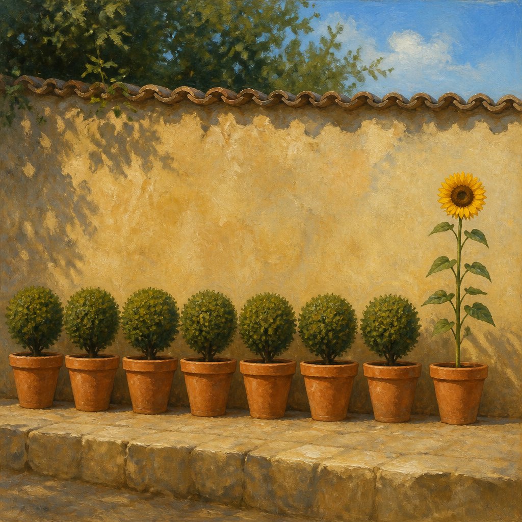 AI-generated
Try it yourself
Practice variety with AI
This example was generated from a prompt like: “A row of identical terracotta pots lined along a garden wall, each holding the same trimmed green shrub, except for one pot at the end that holds a single tall sunflower breaking the pattern's color and height.”
Open the Maximal Variety Art Style generator →The concept today
Photographers introduce variety by breaking a repeating pattern of windows or columns with a single open door or one element standing out of step. Film editors vary shot length and pacing within an otherwise consistent scene to keep a sequence from feeling monotonous. UI designers use one bold accent color or an oversized element within an otherwise consistent grid to draw attention to a single call to action. AI image generators respond to prompts that name both a repeating element and one deliberate exception, producing images that feel composed rather than uniformly tiled.
Compose your own
Start from a unified base — a consistent palette, repeated shape, or steady rhythm — since variety only reads as interesting against something predictable. Then break that consistency in one or two deliberate places: change the scale of a single shape, swap in one unexpected color, or let one edge go rough where everything else is smooth. Keep the amount of variety proportional to the size of the composition; a large, busy piece can absorb several points of difference, while a small, simple one usually only needs one. Avoid scattering variety evenly across the whole piece, since that tends to cancel out the very consistency it's supposed to interrupt. The goal is a single surprise the eye can rest on, not constant unpredictability that leaves nowhere calm to look.
Frequently asked questions
What are examples of variety in art?
Wassily Kandinsky's Composition VIII breaks a repeating pattern of shapes with a few oversized forms; Édouard Manet's A Bar at the Folies-Bergère uses small warm accents against a cool palette; and Georges Seurat's La Grande Jatte adds a leaping monkey to an otherwise calm, upright crowd.
What's the difference between variety and contrast?
Contrast is a difference between two specific elements placed close together, like light against dark. Variety is broader — it describes the overall range of difference across a whole composition, in shape, size, color, or texture, that keeps a unified piece from feeling repetitive.
How much variety should a composition have?
Enough to keep the eye interested, but not so much that it overwhelms the composition's underlying unity. A common approach is to establish one consistent element — palette, shape, or rhythm — and vary it in just one or two deliberate places.
Why do artists balance variety with unity?
Too much unity without variety feels flat and predictable; too much variety without unity feels chaotic and disconnected. Balancing the two lets a composition stay coherent while still giving the eye something unexpected to discover, which keeps a viewer looking longer.