 Art
Art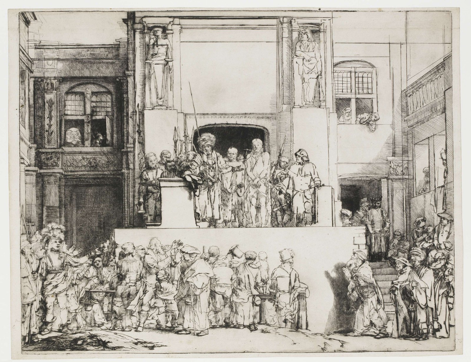
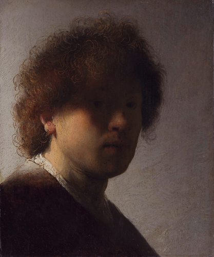
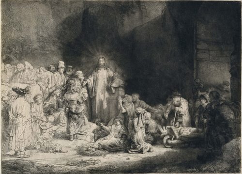
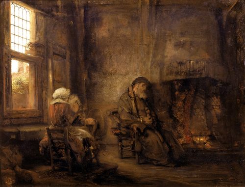
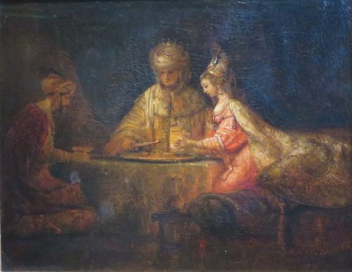
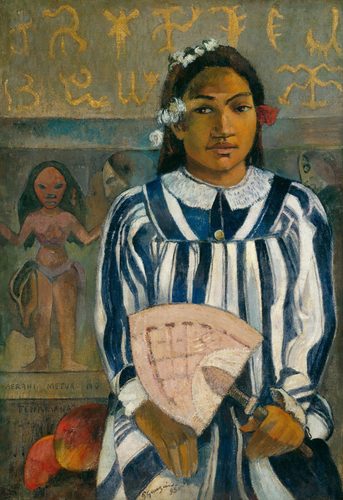
Value in art is the relative lightness or darkness of a color, measured on a scale from pure white to pure black regardless of hue. Two colors, say a red and a blue, can share the exact same value if they are equally light or dark, which is why a black-and-white photograph of a painting can still look coherent even after every hue is stripped away. Value is the primary tool artists use to create the illusion of form, since shading from light to dark is what makes a flat circle read as a solid sphere. It is also the main driver of visual drama and focus: a small area of high contrast, where the lightest light sits right next to the darkest dark, will pull the eye faster than any other element in a composition, which is why that technique, chiaroscuro, has been used for centuries to spotlight a painting's most important figure. Artists plan value before color, often working out an entire composition in grayscale first, because a painting with confused, muddled value relationships will read as flat and unclear no matter how well its colors are chosen.
How artists use it
Value carves the figure
Caravaggio's The Calling of Saint Matthew uses a single sharp diagonal of light against near-total darkness to pull the viewer's eye directly to Christ's outstretched hand. Chiaroscuro, extreme value contrast, was Caravaggio's signature, and it remains the fastest way to stage a dramatic focal point.
Soft value transitions
Leonardo da Vinci blurred every value transition in the Mona Lisa's face using sfumato, a smoky blending technique with no hard edges anywhere, especially around the famously ambiguous mouth and eyes. Soft value gradients, rather than sharp contrast, can create mystery instead of drama.
High-key brightness
Claude Monet kept nearly the entire value range of Impression, Sunrise compressed into the light end of the scale, using color shifts more than dark shadow to describe the misty harbor. High-key value, avoiding deep darks almost entirely, produces a soft, luminous mood.
Low-key darkness
Rembrandt van Rijn submerged most of The Night Watch in deep shadow, letting only a handful of faces and a single glowing figure emerge from near-black surroundings. Low-key value, dominated by dark tones, creates weight, mystery, and theatrical focus on whatever the artist chooses to light.
Value as pure structure
Ansel Adams developed the Zone System to plan black-and-white photographs like Moonrise, Hernandez, New Mexico across eleven precise steps from pure black to pure white before ever pressing the shutter. His method treats value as a controllable, technical scale rather than an intuitive guess.
Value over color
Francisco Goya rendered The Third of May 1808 with a stark white-shirted figure blazing against a near-black firing squad, using value contrast rather than color to make an unmistakable moral and visual focal point. The scene would still read with total clarity even with the color removed.
Instant examples
Value in famous works, fast
- The Calling of Saint Matthew
- → chiaroscuro — a sharp diagonal of light against darkness pulls the eye straight to the focal point.
- The Night Watch
- → low-key drama — most of the canvas sits in deep shadow, with only a few figures lit.
- Moonrise, Hernandez, New Mexico
- → tonal range — a full scale from pure black to pure white is planned with technical precision.
- The Third of May 1808
- → value over color — a glowing white shirt against black shadow creates the focal point without relying on hue.
- Nighthawks
- → value isolation — bright fluorescent interior light against a dark, empty street sets an entire mood.
- Whistler's Mother
- → restrained tonal range — a narrow band of grays and blacks creates quiet, somber harmony.
The story
Value took center stage during the Baroque era, when Caravaggio and his followers, known as the Caravaggisti, pushed chiaroscuro to theatrical extremes, using violent contrast between light and dark to stage religious and everyday scenes alike with maximum drama. Rembrandt refined the technique into something quieter and more psychological, letting value describe interior emotion rather than pure spectacle. Academic art training later formalized value study through the grisaille, an entire underpainting rendered only in grays before color was added on top, ensuring the light and dark structure of a composition was resolved first. The invention of photography in the nineteenth century turned value into a measurable, technical concern, culminating in systems like Ansel Adams's Zone System for precisely planning tonal range. Digital tools have since made value even easier to isolate, since any color image can be converted to grayscale instantly to check whether its value structure still holds up.
The canonical examples
| Work | Artist | Date | Why it matters |
|---|---|---|---|
| The Calling of Saint Matthew | Caravaggio | 1599–1600 | extreme chiaroscuro pulls the eye to a single lit hand |
| The Night Watch | Rembrandt van Rijn | 1642 | most of the canvas recedes into deep, low-key shadow |
| The Third of May 1808 | Francisco Goya | 1814 | a glowing white shirt reads instantly against near-black surroundings |
| Moonrise, Hernandez, New Mexico | Ansel Adams | 1941 | a full, precisely planned range from pure black to pure white |
| Nighthawks | Edward Hopper | 1942 | bright interior light isolates figures against a dark, empty street |
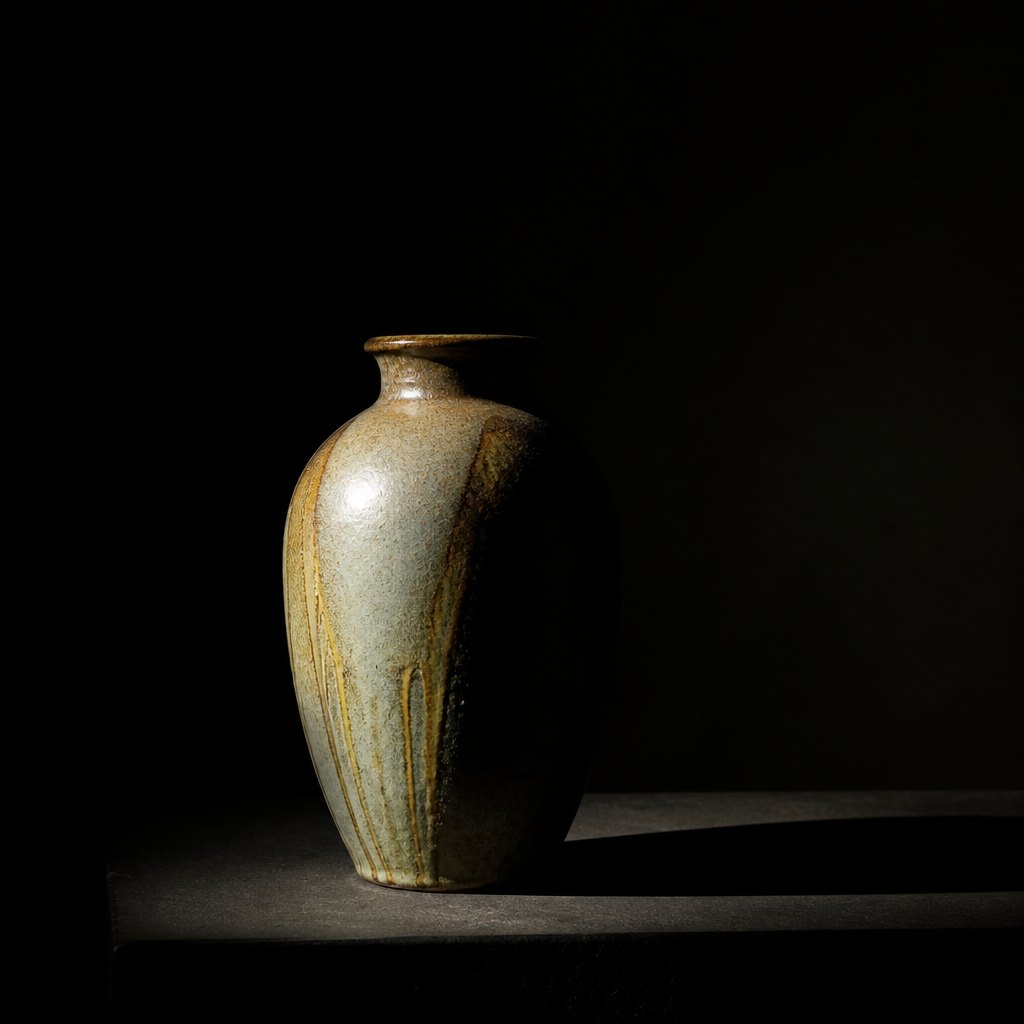 AI-generated
Try it yourself
Practice value with AI
This example was generated from a prompt like: “A single ceramic vase lit dramatically from one side, sitting on a plain dark table against a near-black background, with a sharp shaft of light creating a bright highlight and deep cast shadow, extreme contrast, high-key focal point.”
Open the Value Study Art Style generator →The concept today
Cinematographers plan value, called exposure and lighting ratio on set, before color grading ever enters the conversation, since a scene with muddled value reads as flat no matter how the color is graded afterward. Photographers still check a shot's histogram, essentially a value map, to confirm a clear tonal structure exists. Product and portrait photographers use lighting ratios borrowed directly from centuries-old painting technique to sculpt a face or object with light against dark. AI image generators frequently need explicit prompting toward high contrast or low-key lighting to avoid the flat, evenly lit default many models default to.
Compose your own
Plan value before color: convert a reference photo to grayscale, or squint at your subject until detail blurs away, and identify just three or four value groups, lightest lights, darks, and one or two mid-tones in between. Put your strongest value contrast, the lightest light next to the darkest dark, exactly where you want the eye to land first, and keep contrast lower everywhere else so that focal point stays dominant. Avoid scattering many small areas of high contrast across a composition, since the eye cannot tell which one to prioritize. Test any finished piece by converting it to grayscale; if the composition and focal point still read clearly with color removed, the underlying value structure is solid, and color will only improve it from there.
Frequently asked questions
What are examples of value used for drama in art?
Caravaggio's The Calling of Saint Matthew uses harsh chiaroscuro to spotlight a single hand, Rembrandt's The Night Watch submerges most of the canvas in shadow, and Goya's The Third of May 1808 uses a glowing white shirt against black to fix the eye instantly.
What is chiaroscuro?
Chiaroscuro is the Italian term for extreme contrast between light and dark values within a single artwork, used to create drama, volume, and a clear focal point. Caravaggio is the artist most associated with pushing the technique to its limits.
What is the difference between value and color?
Value describes how light or dark something is, independent of hue. Color, or hue, describes which color it is, like red or blue. Two very different colors can share the same value, which is why grayscale photos of colorful scenes still read clearly.
Why do artists plan value before color?
Because value carries the composition's structure and focal point on its own. A piece with confused, muddled value relationships reads as flat and unclear no matter how well its colors are chosen, so most artists work out a grayscale value plan first.