 Art
Art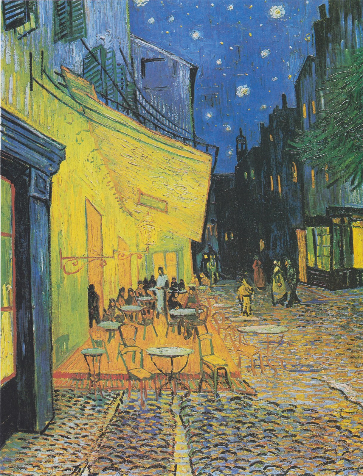


Complementary colors are pairs that sit directly opposite each other on the color wheel — red and green, blue and orange, yellow and violet — and when placed side by side, each pair intensifies the other far beyond what either color achieves alone. The effect is optical, not just decorative: the eye's cone cells fatigue when staring at one hue and generate an afterimage in its complement, which is part of why complementary pairs seem to vibrate or glow where they touch. Painters have used this to make a single color pop without raising its saturation — a small patch of orange surrounded by blue looks far brighter than the same orange on a neutral gray ground. Complementary pairs also create instant visual tension, useful for drawing the eye to a focal point or signaling drama, conflict, or excitement. Because true complements can be jarring at full strength, many artists use one color as a small, controlled accent against a much larger field of its opposite, rather than splitting the canvas evenly. The pairing is one of the oldest tools in color theory, taught right alongside the color wheel itself.
How artists use it
Orange stars, blue sky
Vincent van Gogh's The Starry Night sets glowing orange-yellow stars and moon against a swirling blue-violet sky, a textbook complementary pairing. The contrast is what makes the sky feel electric and alive rather than simply dark.
Red walls, green table
Vincent van Gogh's The Night Café pits red walls against a green billiard table and ceiling, a pairing he chose specifically to feel discordant. The complementary clash was intentional: he wanted the room to feel like a place where people could ruin themselves.
Blue turban, gold jacket
Johannes Vermeer's Girl with a Pearl Earring wraps the sitter's head in a saturated blue turban beside a warm golden-ochre jacket, an approximate complementary pairing. The blue makes the gold look richer, and the gold makes the blue look deeper.
Yellow blooms, violet water
Claude Monet's Water Lilies scatters small yellow blooms across a pond painted in violet and blue-violet reflections, a gentle complementary pairing. The yellow accents glow because the surrounding water pulls toward violet rather than a neutral green.
Red roofs, green hills
Paul Cézanne's paintings of the hills around Aix-en-Provence repeatedly set red-orange rooftops against green hillsides, a complementary pairing he returned to for decades. The red roofs read as sharp, structured accents precisely because the surrounding green is so dominant.
Gold sparks, blue-black night
James McNeill Whistler's Nocturne in Black and Gold scatters small warm gold fireworks against a deep blue-black night sky, a near-complementary pairing reduced to its simplest form. The tiny gold sparks read as brilliant precisely because almost nothing else in the canvas is warm.
Instant examples
Complementary Colors in famous works, fast
- The Starry Night
- → orange-yellow stars against a blue-violet sky is the classic complementary pairing
- The Night Café
- → red and green were chosen deliberately to make the room feel unsettling
- Girl with a Pearl Earring
- → a blue turban and gold jacket intensify each other by sitting near-opposite on the wheel
- Water Lilies
- → small yellow blooms glow because the pond around them leans violet
- Nocturne in Black and Gold
- → a few warm gold sparks read as brilliant against an almost entirely cool night
- Sunflowers
- → a turquoise-blue ground in several versions keeps an almost all-yellow painting from flattening
The story
Complementary color pairs were formalized with the modern color wheel, developed in stages by thinkers including Isaac Newton and later refined by Michel-Eugène Chevreul, whose 19th-century work on simultaneous contrast explained why opposite hues intensify each other optically. Chevreul's research, done while running the dye works at a French tapestry manufacturer, directly influenced Impressionist and Post-Impressionist painters, who began placing complementary strokes side by side rather than blending them on the palette. Vincent van Gogh used the pairing most explicitly, writing about red and green as tools for conveying specific emotional states rather than just decoration. Pointillist painters pushed the idea further, applying small dots of complementary color that the eye blends at a distance. By the 20th century, complementary contrast was standard vocabulary in art and design education, taught as one of the core relationships on the color wheel.
The canonical examples
| Work | Artist | Date | Why it matters |
|---|---|---|---|
| The Starry Night | Vincent van Gogh | 1889 | orange stars glowing against a blue-violet sky |
| The Night Café | Vincent van Gogh | 1888 | red and green chosen deliberately to feel unsettling |
| Girl with a Pearl Earring | Johannes Vermeer | c. 1665 | a blue turban intensifying a warm gold jacket |
| Water Lilies | Claude Monet | 1906 | yellow blooms glowing against violet water reflections |
| Nocturne in Black and Gold | James McNeill Whistler | 1875 | gold fireworks sparking against a blue-black sky |
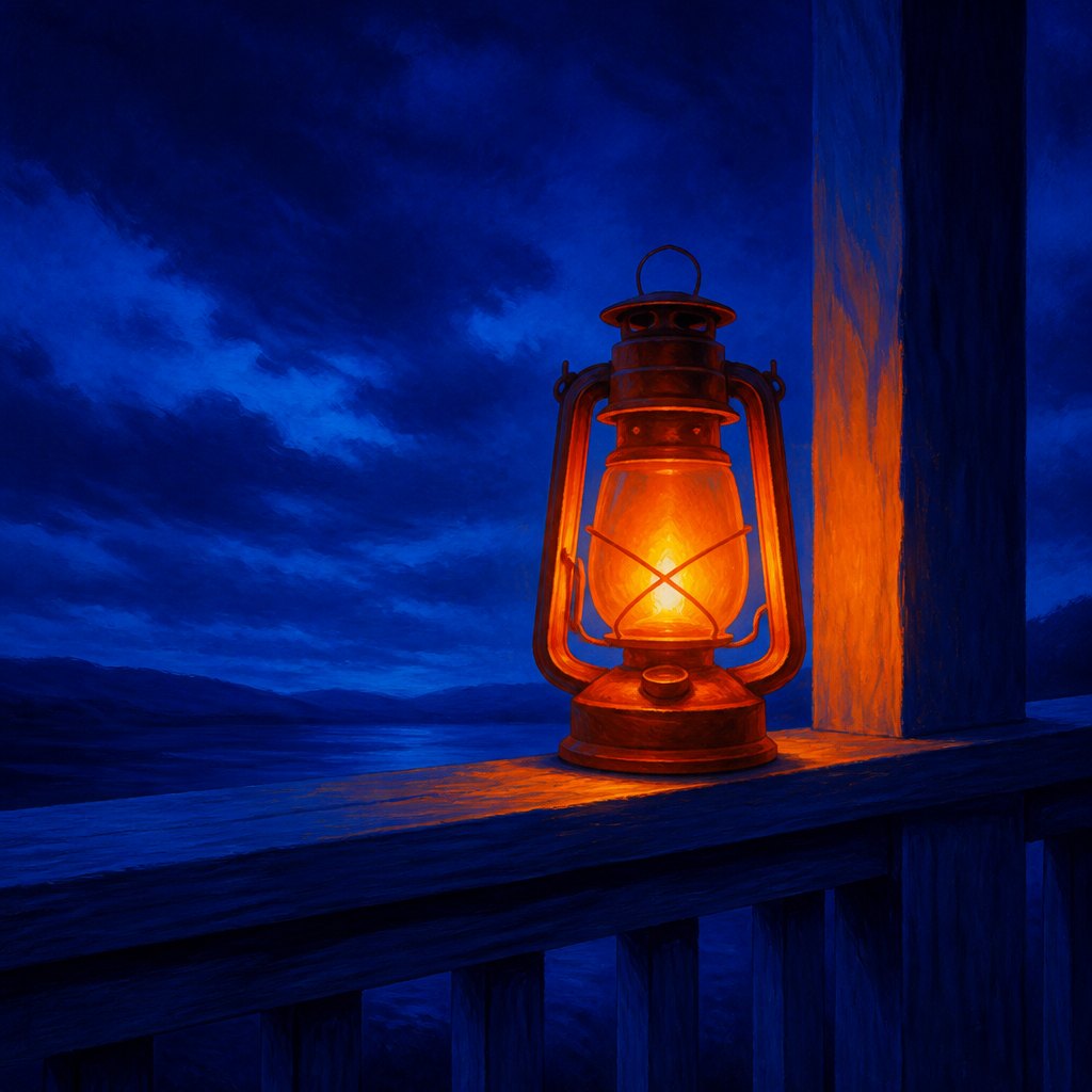 AI-generated
Try it yourself
Practice complementary colors with AI
This example was generated from a prompt like: “A single orange lantern glowing on a deep blue porch railing at dusk, the warm light and cool surrounding shadow pushed to their most saturated complementary extremes, with no other colors competing in the frame.”
Open the Complementary Color Art Style generator →The concept today
Sports and brand logos lean on complementary pairs — blue and orange especially — because the contrast reads clearly at a glance, even small or far away. Film posters and movie color grading favor teal shadows against orange skin tones for the same reason: it separates actors from backgrounds instantly. UI designers use a complementary accent color sparingly, a single orange button on a blue interface, to guarantee it gets noticed. AI image generators asked for 'complementary color scheme' will reliably push a scene toward one of these opposite pairs, most often blue-orange.
Compose your own
Pick one pair from the color wheel — red-green, blue-orange, or yellow-violet — and let one color dominate the composition while the other appears only as an accent; two complements used in equal amounts tend to fight rather than pop. Put your focal point in the accent color, since a complementary surround will make even a small, muted patch of it read as bright. If a pairing feels too aggressive at full saturation, desaturate one side rather than abandoning the pairing entirely — a soft gray-green next to a rich red still reads as complementary contrast without the visual buzz. In AI prompts, naming the specific pair, like 'blue and orange color scheme,' gives more control than the general term 'complementary colors.'
Frequently asked questions
What are examples of complementary colors in art?
Vincent van Gogh's The Starry Night pairs orange stars with a blue-violet sky, his The Night Café pits red against green, and Vermeer's Girl with a Pearl Earring sets a blue turban beside a gold jacket — all classic complementary pairs.
Which colors are complementary to each other?
Pairs sitting opposite on the color wheel: red and green, blue and orange, yellow and violet. Each pair intensifies the other when placed side by side, a stronger effect than either color produces alone.
Why do complementary colors look brighter together?
The eye's color receptors fatigue when viewing one hue and generate an afterimage in its opposite, so placing true complements side by side produces a real optical vibration. Painters use this to boost intensity without adding saturation.
Did Van Gogh use complementary colors on purpose?
Yes. He wrote specifically about pairing red and green in The Night Café to make the room feel unsettling, and used orange against blue-violet throughout The Starry Night. The choices were deliberate, not accidental.