 Art
Art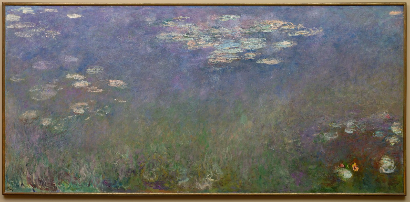
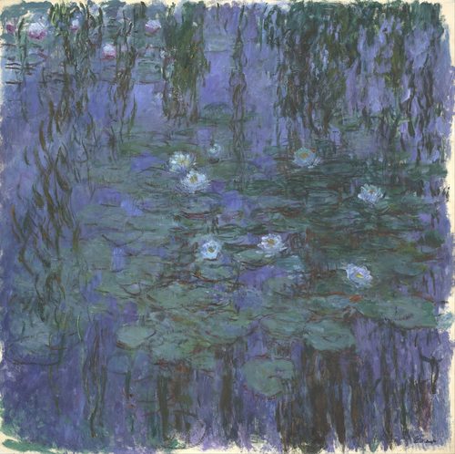
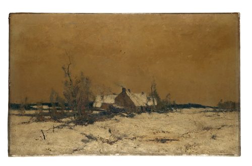
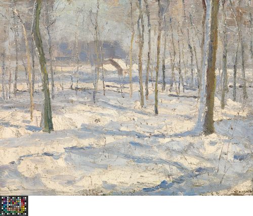
Cool colors are blue, green, and violet — the hues of water, shade, night, and distance — and the eye reads them as receding away from the viewer rather than advancing. That perceptual quirk makes cool colors a workhorse for depth: painters push distant mountains, misty backgrounds, and shadowed corners toward blue and violet, letting them visually retreat behind warmer foreground elements. Cool palettes carry their own emotional register too — calm, melancholy, isolation, cold — associations built from lived experience of blue evenings, green shade, and gray winter light. A painting built almost entirely from cool color can feel meditative or lonely long before a viewer identifies a single object in the scene, which is why cool blues dominate paintings about grief, solitude, or quiet interiors. Cool colors also do useful optical work at smaller scales: a cool gray shadow reads as more convincingly three-dimensional than a plain gray one, because it mimics how ambient sky light actually tints shade. Used as a full palette or as the quiet half of a warm-cool pairing, cool color is less about volume and more about atmosphere.
How artists use it
An entire mood in blue
Pablo Picasso's The Old Guitarist renders a hunched, poverty-stricken figure almost entirely in cold blues, a palette he leaned on for years. The cool color alone carries the painting's grief and isolation, doing more emotional work than the pose or subject.
Mountains fading to violet
Leonardo da Vinci pushed the winding rivers and peaks behind the Mona Lisa into hazy blue-violet, an early use of aerial perspective. The cooling, softening background convinces the eye of enormous distance without a single perspective line.
A townscape in blue-gray
Johannes Vermeer's View of Delft blankets an entire townscape in cool blue-gray, with only a few sunlit rooftops breaking the palette. The overwhelming cool light gives the painting its hushed, still-morning calm.
Cold as isolation
Edward Hopper's Automat surrounds a lone woman with a cold, near-black blue window reflecting empty light fixtures. The cool color does the storytelling, turning a simple café table into a study of solitude.
Overwhelming cool water
Winslow Homer's The Gulf Stream drenches a storm-tossed sea in deep blue-green, dwarfing the single warm-toned sailor adrift on his boat. The overwhelming cool water communicates danger and scale that the small warm figure alone couldn't.
One warm sun in cool
Claude Monet's Impression, Sunrise sets a small warm orange sun against a vast cool blue-gray harbor, the cool water and mist making up nearly the whole canvas. The dominant cool palette gives the single warm accent all its power.
Instant examples
Cool Colors in famous works, fast
- The Old Guitarist
- → cold blues carry grief and poverty without a single explicit symbol
- Mona Lisa
- → the background peaks fade to blue-violet, an early trick for painted distance
- View of Delft
- → a whole townscape in blue-gray reads as a hushed, still morning
- The Gulf Stream
- → deep blue-green water dwarfs the lone sailor and signals danger
- Impression, Sunrise
- → a cool blue-gray harbor makes the single warm sun the loudest thing in the frame
- Automat
- → a cold blue-black window turns a café table into a study of isolation
The story
Blue pigment was historically expensive and rare — genuine ultramarine came from lapis lazuli shipped from Afghanistan — so cool color once signaled luxury and reverence, reserved for the robes of religious and royal figures. Once synthetic blues and greens became affordable in the 19th century, cool palettes spread into everyday subject matter. Impressionist painters used cool color scientifically, observing that outdoor shadows are tinted blue or violet by ambient sky light rather than simply darker versions of a warm local color. Picasso's Blue Period pushed cool color into pure psychology, using it to signal poverty and grief independent of any pigment scarcity. By the 20th century, color theory formalized cool hues as the receding half of the warm-cool pair, a principle now taught alongside the color wheel in every foundational art class.
The canonical examples
| Work | Artist | Date | Why it matters |
|---|---|---|---|
| The Old Guitarist | Pablo Picasso | 1903-04 | grief and poverty rendered almost entirely in blue |
| View of Delft | Johannes Vermeer | c. 1660-61 | a whole townscape hushed under blue-gray sky |
| Impression, Sunrise | Claude Monet | 1872 | one warm sun against an overwhelmingly cool harbor |
| The Gulf Stream | Winslow Homer | 1899 | deep blue-green sea signaling danger and scale |
| Automat | Edward Hopper | 1927 | a cold blue window framing a solitary figure |
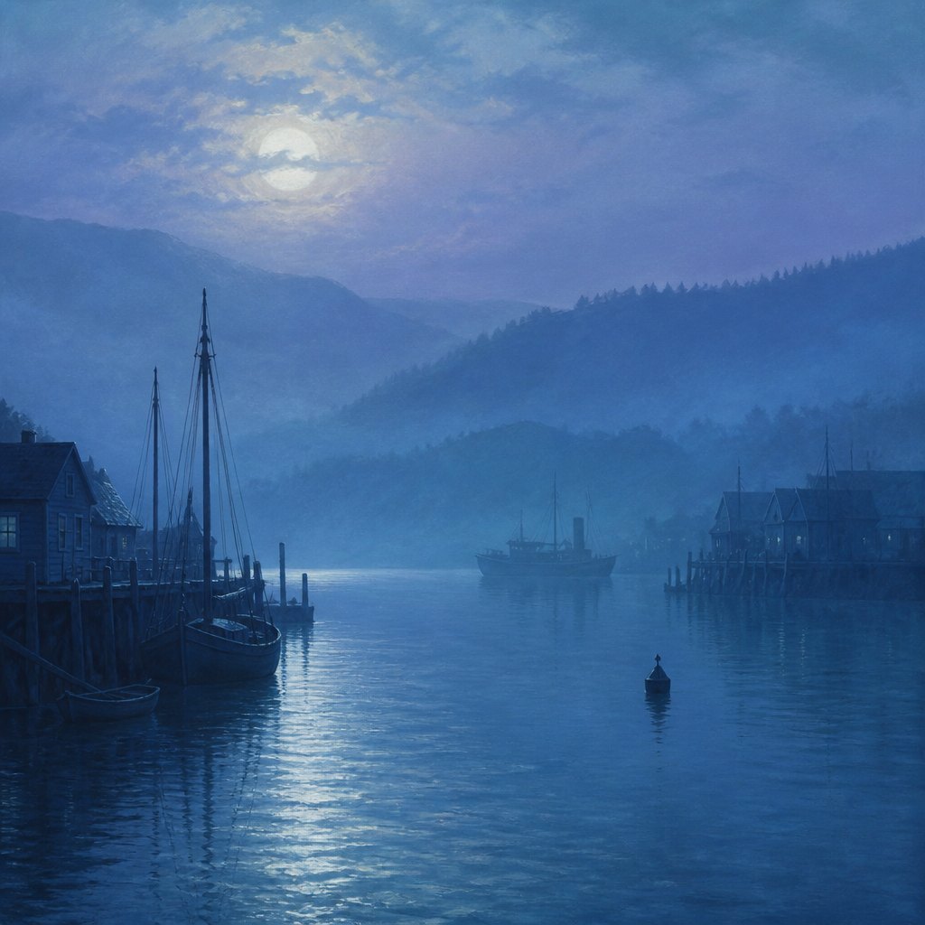 AI-generated
Try it yourself
Practice cool colors with AI
This example was generated from a prompt like: “A foggy blue-green harbor at dawn, distant hills fading into violet haze, water and sky rendered almost entirely in cool tones with no warm accent anywhere in the frame — a quiet study in atmosphere and recession.”
Open the Cool Palette Art Style generator →The concept today
Photographers push shadows and highlights toward teal and blue in modern color grading, a look so common it has its own name: teal-and-orange. Film uses cool lighting to signal night, cold, sterility, or danger — a hospital, a crime scene, a winter exterior. Interfaces lean on cool blues for calm, trustworthy tones in banking and health apps, reserving warm colors for alerts. AI image generators respond to prompts like 'moody blue tones' or 'cool color grade' by shifting an entire scene's palette toward blue, green, and violet, the same instinct painters have used for centuries.
Compose your own
Use cool color to push something back in space — a distant building, a hazy hill, a background figure — and warm color to bring something forward; the two working together builds depth faster than either alone. If you want a mood of calm or melancholy rather than energy, build your whole palette from blue, green, and violet and resist adding a warm accent, since even a small warm note will dominate a mostly cool scene. Tint shadows cool rather than simply darkening them, which reads as more convincing light. In AI prompts, be specific about which cool hue you want — teal, indigo, sage — since 'cool colors' alone can produce a muddy, indecisive result rather than a controlled palette.
Frequently asked questions
What are examples of cool colors in art?
Pablo Picasso's The Old Guitarist, Johannes Vermeer's View of Delft, Claude Monet's Impression, Sunrise, and Winslow Homer's The Gulf Stream all build their mood from dominant blues, greens, and violets rather than warm color.
Why do cool colors seem to recede in a painting?
The eye perceives shorter wavelengths like blue and violet as spatially farther away, an effect used since the Renaissance to fade distant mountains and backgrounds into hazy blue. Painters exploit this to build depth without extra perspective lines.
What mood do cool colors usually create?
Calm, melancholy, isolation, or cold. Picasso's Blue Period paintings, built almost entirely from blue, are the clearest example — grief and poverty communicated through color alone, independent of the figures' poses or expressions.
Are shadows always painted with cool colors?
Not always, but outdoor shadows are often tinted blue or violet because ambient sky light colors them, an effect Impressionist painters observed and exaggerated. Indoor shadows can lean warm instead, depending on the light source.