 Art
Art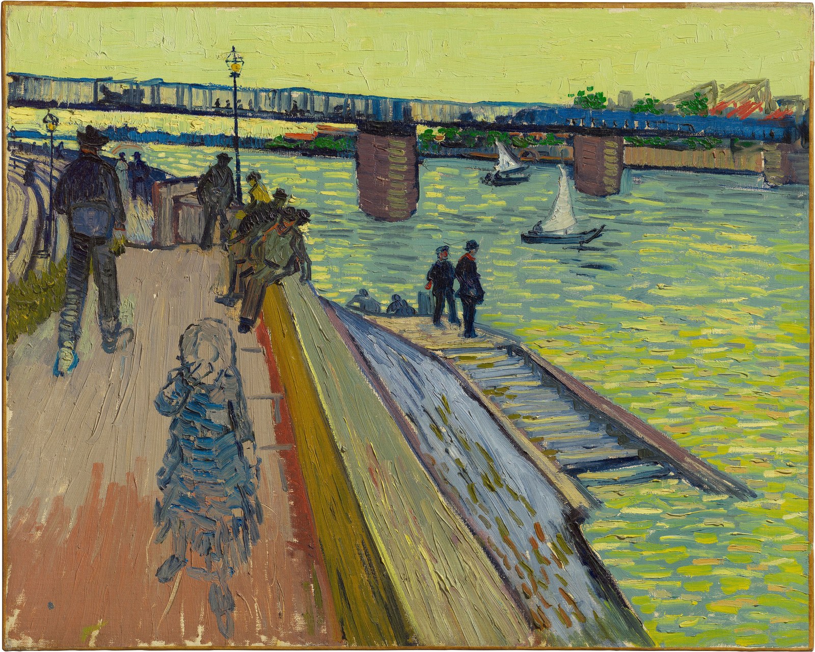
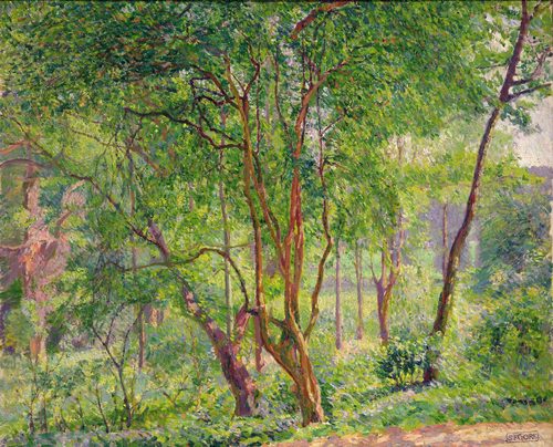
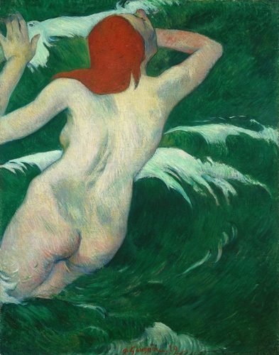
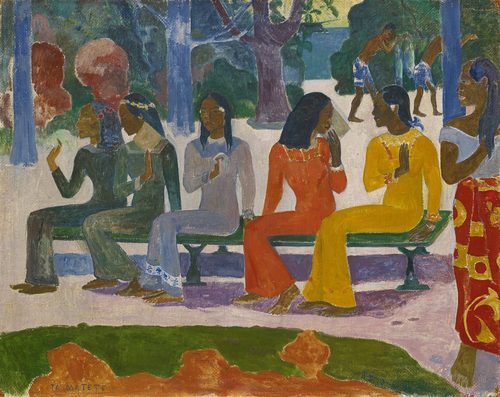
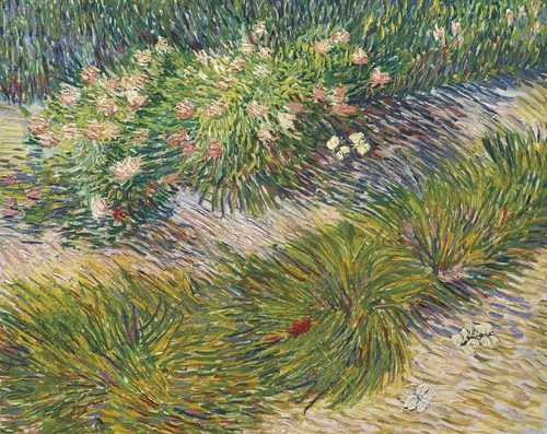
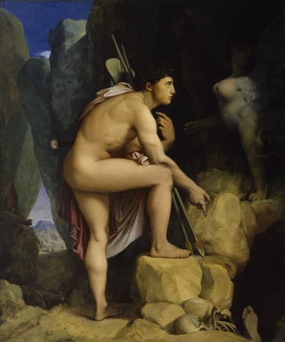
A split-complementary color scheme takes one base hue and pairs it not with its direct opposite on the color wheel, but with the two colors sitting on either side of that opposite. Blue, for instance, would normally pair with orange in a straight complementary scheme; split-complementary instead pairs blue with red-orange and yellow-orange. The result keeps most of the punch of true complementary contrast — cool against warm — while softening the single, sometimes harsh, head-on clash of two exact opposites. Because there are three colors instead of two, artists also get more flexibility: one hue can dominate a canvas while the other two appear in smaller, supporting doses, giving a composition depth without turning muddy. This scheme shows up constantly in landscape painting, where a dominant sky or shadow color needs to be balanced against warmer light without the scene feeling like it is fighting itself.
How artists use it
Blue nights, warm light
Vincent van Gogh built Café Terrace at Night around a deep blue sky and blue-toned cobblestones set against the warm yellow-orange glow of the café awning and lamps, pairing blue with hues that flank its orange complement rather than the complement itself.
Shadow and sunlight
Impressionist and Post-Impressionist landscape painters routinely rendered shaded areas in blue-violet and lit ground in orange-yellow, a combination that reads as natural daylight because it echoes how cool shadow and warm sun actually look side by side.
One dominant field
Henri Matisse flooded The Red Studio with a single overwhelming red, then let a green houseplant and yellow-outlined furniture supply the contrast. The two supporting colors flank red's green complement instead of opposing it head-on, keeping the room from feeling aggressive.
Pointillist mixing
Georges Seurat built A Sunday on La Grande Jatte from tiny dots of orange-yellow sunlight and blue-violet shadow. Seen from a distance, the closely related cool tones blend into shaded ground while orange keeps every sunlit patch glowing.
Poster palettes
Art Nouveau and early travel posters often set a warm figure or type against a muted teal or blue-green background instead of straight orange-blue, softening the contrast so lettering stays legible without vibrating against the backdrop.
Layered landscape color
Paul Cézanne's Mont Sainte-Victoire paintings set a blue mountain and sky against orange-red rooftops and yellow-green fields below, using colors that flank blue's orange complement to hold the whole valley together in one temperature range.
Instant examples
Split-Complementary Colors in famous works, fast
- Café Terrace at Night
- → a blue night sky paired with warm yellow-orange lamplight instead of pure orange.
- Impressionist shadows
- → blue-violet shade set against orange-yellow sunlight, the classic cool-shadow, warm-light landscape pairing.
- Travel posters
- → a warm central figure or sun set against a muted teal or blue-green sky rather than straight complementary orange-blue.
- Pointillist dots
- → tiny strokes of orange-yellow and blue-violet placed side by side to build shaded, sunlit ground.
- Mont Sainte-Victoire
- → a blue mountain balanced against orange rooftops and yellow-green fields in the valley below.
- Autumn landscape paintings
- → a blue sky framed by golden and rust-orange foliage instead of a single flat complementary orange.
The story
Split-complementary contrast was recognized before it had a name. Michel-Eugène Chevreul's 1839 treatise on simultaneous color contrast, written while he ran the dye works at the Gobelins tapestry manufactory, gave painters a scientific vocabulary for why certain near-complementary pairings felt lively but not harsh. The Impressionists absorbed this directly, rendering outdoor shadows in blue and violet against warm sunlit passages of orange and yellow rather than reaching for a flat complementary pair. Vincent van Gogh, writing letters to his brother Theo in the late 1880s about color relationships, repeatedly set warm lamplight or wheat fields against cooler blues rather than pure orange. Twentieth-century color theorists, including Johannes Itten at the Bauhaus in the 1920s, later codified the split-complementary scheme formally on the twelve-part color wheel, naming it alongside complementary and triadic schemes as a standard harmony template.
The canonical examples
| Work | Artist | Date | Why it matters |
|---|---|---|---|
| Café Terrace at Night | Vincent van Gogh | 1888 | a deep blue night sky and blue-toned street surround the café's warm yellow-orange lamplight, pairing blue with hues flanking its orange complement |
| Vision after the Sermon (Jacob Wrestling with the Angel) | Paul Gauguin | 1888 | a flat vermilion-red ground sits behind black-and-white clad figures and a diagonal green tree bough, setting red near green rather than opposite it directly |
| The Red Studio | Henri Matisse | 1911 | an overwhelming red field surrounds furniture outlined in yellow and a green houseplant, both flanking red's green complement |
| A Sunday Afternoon on the Island of La Grande Jatte | Georges Seurat | 1884–86 | pointillist dots mix orange-yellow sunlit grass with blue-violet shaded ground throughout the park |
| Mont Sainte-Victoire | Paul Cézanne | 1904–06 | a blue mountain and sky are balanced against orange-red rooftops and yellow-green fields in the valley below |
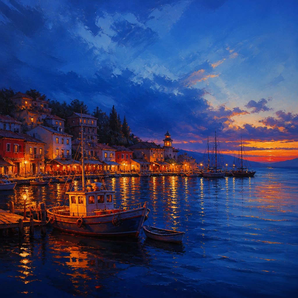 AI-generated
Try it yourself
Practice split-complementary colors with AI
This example was generated from a prompt like: “A quiet harbor landscape at dusk, a deep blue sea and sky dominating the canvas, warm orange-red and golden-yellow light glowing along the docks and boats, painterly brushwork, soft atmospheric contrast.”
Open the Split-Complementary Colors Art Style generator →The concept today
Split-complementary remains a default option in Adobe Color, Coolors, and other palette-generator tools, sitting alongside complementary and triadic as a one-click harmony scheme. Film colorists use a version of it constantly, pushing shadows toward teal while keeping skin tones warm orange, a look softened the same way nineteenth-century landscape painters softened straight complementary contrast. Product and web designers reach for it when a brand needs a warm accent against a cooler background without vibration.
Compose your own
Pick a base hue, then find its direct complement on the color wheel and move one step to either side of that complement instead of landing on it exactly — those two neighboring hues are your split-complementary pair. Let the base color cover the largest area of your composition, and use the two supporting hues in smaller, uneven amounts rather than equal thirds. Painting a landscape is the easiest way to feel the scheme: render shadows in a cool violet-blue and sunlit areas in warm orange-yellow, keeping both slightly off from a pure complementary pair. Compare the result to a straight complementary version of the same sketch — the split-complementary version should feel calmer, even though the contrast is nearly as strong.
Frequently asked questions
What is a split-complementary color scheme?
It pairs one base color with the two hues sitting next to its direct complement on the color wheel, rather than the complement itself. Blue, for example, pairs with red-orange and yellow-orange instead of straight orange.
How is split-complementary different from complementary color?
Complementary uses two colors directly opposite each other on the wheel, creating maximum contrast. Split-complementary uses three colors — the base plus the two neighbors of its opposite — keeping strong contrast but feeling softer and less confrontational.
What are examples of split-complementary color in real paintings?
Van Gogh's Café Terrace at Night sets a blue night sky against warm yellow-orange lamplight, and Cézanne's Mont Sainte-Victoire paintings balance a blue mountain against orange-red rooftops and yellow-green fields.
Why do artists choose split-complementary over straight complementary?
It offers nearly the same warm-cool contrast but with more flexibility — three colors instead of two let one hue dominate while the others support it, avoiding the visual vibration a single complementary pair can cause at full saturation.