 Art
Art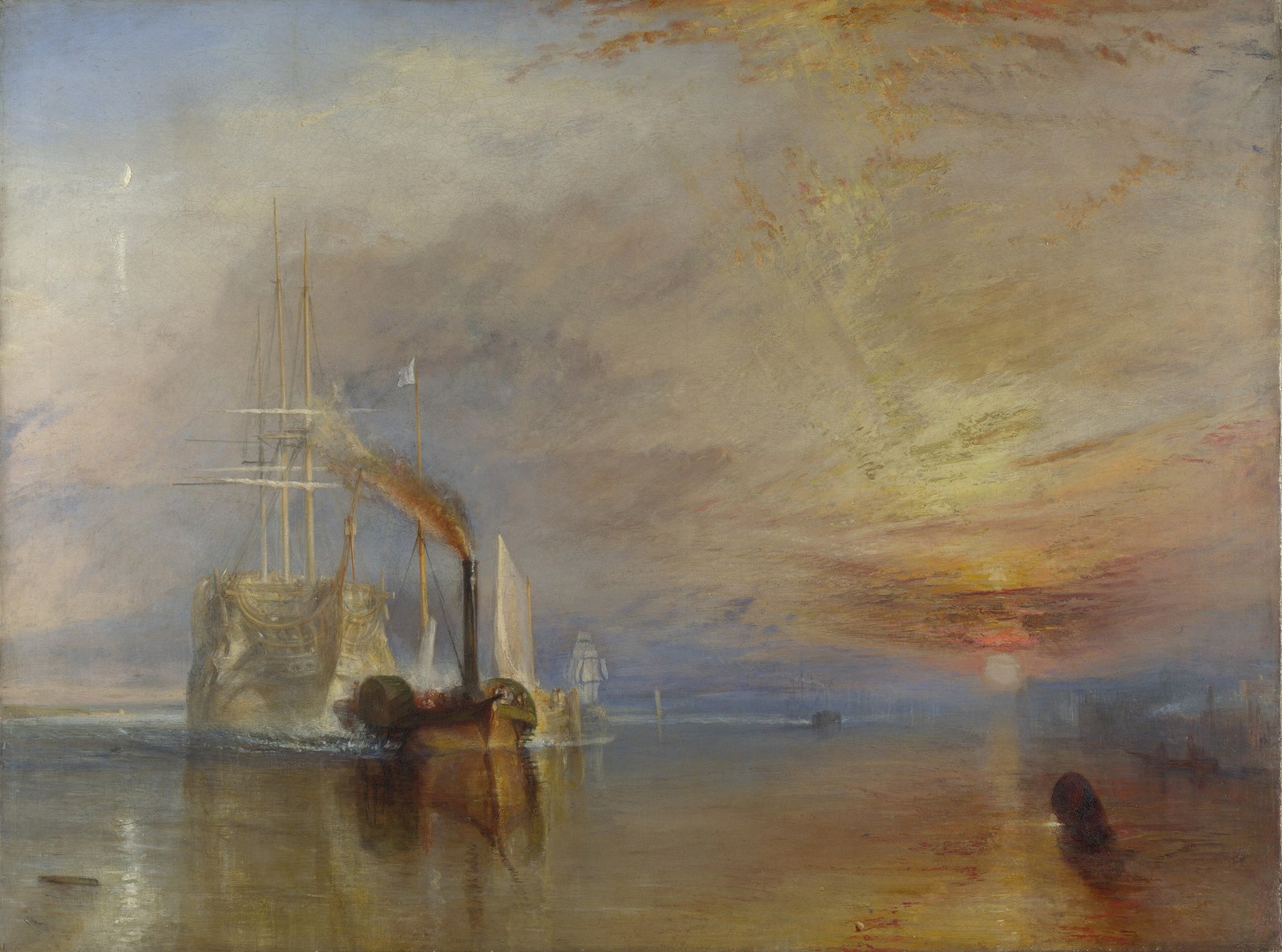
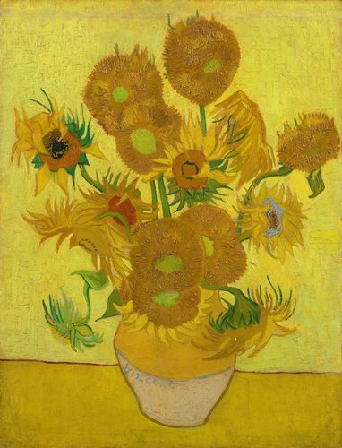
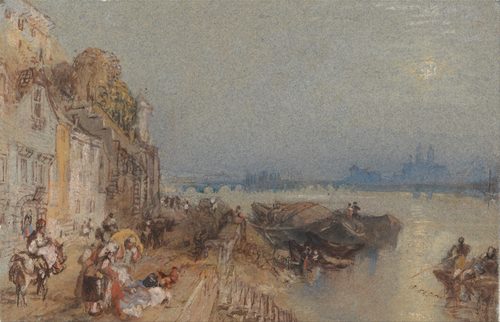
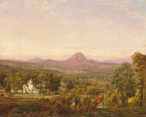
Warm colors are red, orange, and yellow — the hues of fire, sunlight, and skin, and the ones the eye reads as advancing toward the viewer. Because they sit on the same side of everyday experience as heat and energy, warm colors carry built-in associations: passion, danger, comfort, appetite. Painters lean on that instinct. A patch of warm color in an otherwise cool composition pulls focus almost automatically, which is why warm hues so often mark the subject a painter wants noticed first — a face, a flame, a wound, a piece of fruit. Warmth also does spatial work: in traditional perspective, warm objects appear to sit closer to the viewer than cool ones at the same distance, so artists push warm tones forward and cool tones back to build depth without relying on line alone. Warm palettes can suggest an entire mood — a golden afternoon, a battlefield, a domestic hearth — before a viewer registers a single object in the scene. Used sparingly, a single warm accent becomes the loudest thing in the room.
How artists use it
Red as the subject
In The Red Studio, Henri Matisse floods an entire room in flat vermilion, dissolving furniture and walls into one saturated field. The warm red isn't decoration — it is the subject, proving a single hue can hold a whole composition together without shading or perspective.
Fire against night
Vincent van Gogh's Café Terrace at Night sets a warm yellow awning glowing under a cool indigo sky. The warmth marks the café as the human, inhabited space, pulling the eye to the terrace before it wanders up into the star-flecked dark above.
A blazing sunset elegy
J.M.W. Turner's The Fighting Temeraire dissolves an old warship into a blaze of orange and gold sunset. The warm sky does the emotional work, turning a scene about mechanical progress into an elegy lit like a farewell.
Warmth as danger
Edvard Munch's The Scream paints the sky in streaks of violent orange and red, a warmth that reads as alarm rather than comfort. The color proves warm hues don't always soothe — pushed to an acid intensity, they can signal dread.
Flesh and firelight
Caravaggio's The Calling of Saint Matthew picks faces and hands out of near-total darkness with warm, candle-colored light. The narrow band of warmth does all the storytelling, directing attention exactly where the gesture and the gaze need to land.
A warm field of fruit
Paul Cézanne's Still Life with Apples groups warm reds, oranges, and yellows against cool tablecloth folds, letting the fruit visually advance off the canvas. The warm-cool split builds volume and depth without a trace of soft shading.
Instant examples
Warm Colors in famous works, fast
- Café Terrace at Night
- → warm lantern-yellow marks the café as the one inhabited, human patch in a cool blue night
- The Scream
- → a violent orange sky turns warmth into alarm instead of comfort
- The Red Studio
- → an entire room in flat vermilion collapses walls and furniture into one warm field
- Nighthawks
- → the diner's warm interior glow isolates the figures from the cool, empty street outside
- The Fighting Temeraire
- → a blazing warm sunset carries the elegy, not the ship itself
- Girl with a Pearl Earring
- → her warm ochre jacket is the only heat in an otherwise near-black background
The story
Painters have used red, orange, and yellow to command attention since antiquity — Roman frescoes used costly warm pigments like cinnabar to mark status and importance. But 'warm' as a formal color category only crystallized with color theory. Michel-Eugène Chevreul's 19th-century studies on simultaneous contrast gave warm and cool a scientific footing, describing how they visually push toward or recede from a viewer. Impressionists and Post-Impressionists — Van Gogh especially — pushed warm color past description into pure emotional charge, letting a yellow or orange stand for feeling rather than local light. By the 20th century, Fauvist and Expressionist painters detached warm colors from realistic description entirely, using them as raw structural and psychological tools. Today the warm-cool distinction is basic vocabulary taught in every foundational art and design course.
The canonical examples
| Work | Artist | Date | Why it matters |
|---|---|---|---|
| The Red Studio | Henri Matisse | 1911 | an entire interior rendered in one saturated warm red |
| Café Terrace at Night | Vincent van Gogh | 1888 | warm lamplight glowing against a deep cool sky |
| The Fighting Temeraire | J.M.W. Turner | 1839 | a warm sunset that carries the painting's emotion |
| The Scream | Edvard Munch | 1893 | warm orange sky used to signal dread, not comfort |
| The Calling of Saint Matthew | Caravaggio | c. 1600 | a narrow beam of warm light picking faces from darkness |
| Nighthawks | Edward Hopper | 1942 | warm diner light isolating figures from a cool street |
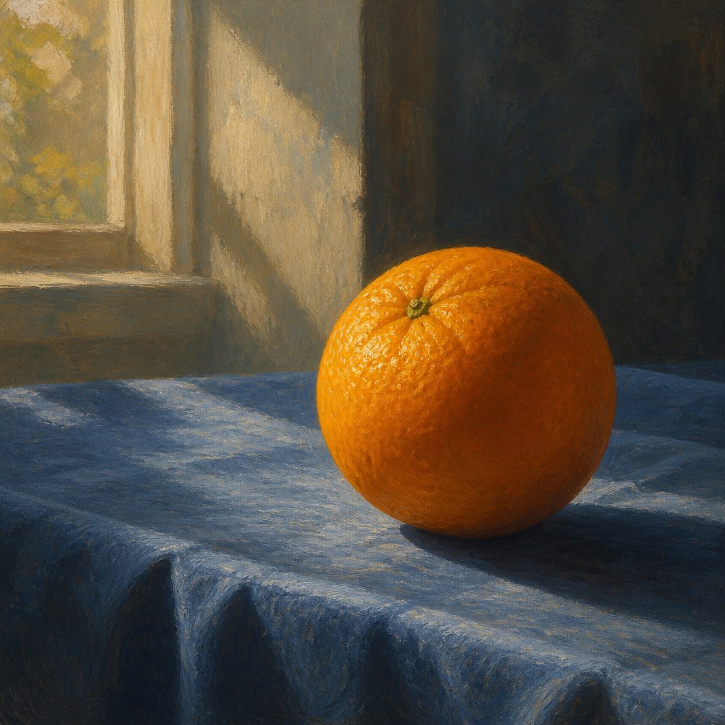 AI-generated
Try it yourself
Practice warm colors with AI
This example was generated from a prompt like: “A single ripe orange resting on a cool slate-blue tablecloth, lit by warm late-afternoon window light, its saturated color pulling forward against the muted, shadowed background — a simple study in warm-versus-cool contrast.”
Open the Warm Palette Art Style generator →The concept today
Photographers dial white balance toward amber to make a scene feel inviting, nostalgic, or golden-hour warm — even under flat midday light. Film colorists push skin tones warm and shadows cool to separate actors from backgrounds at a glance, a look now built into most grading presets. Interfaces use warm accent colors — a red badge, an orange call-to-action button — because warmth reliably pulls the eye first. AI image generators respond just as strongly to prompt words like 'golden hour' or 'warm tones,' skewing an entire palette toward amber and red the same way a painter would.
Compose your own
Pick one warm color to be the loudest thing in your image and keep everything else cooler or more muted around it — warmth reads strongest by contrast, not in isolation. If you want a subject to feel close to the viewer, paint or light it warm and push the background cooler; that advance-and-recede relationship builds depth on a flat surface. Reserve pure, saturated warm color for the one element you want noticed first, because too many warm accents cancel each other out. Decide first whether you want comfort — soft amber, low saturation — or alarm — acid orange, high saturation. In AI prompts, name a specific warm light source, like candlelight, sunset, or embers, rather than just 'warm colors,' for a more controlled result.
Frequently asked questions
What are examples of warm colors in art?
Vincent van Gogh's Café Terrace at Night, Henri Matisse's The Red Studio, J.M.W. Turner's The Fighting Temeraire, and Edvard Munch's The Scream all build a scene around dominant reds, oranges, and yellows — from a glowing café awning to a room of vermilion.
Why do warm colors seem to come forward in a painting?
The eye and brain process longer wavelengths like red and orange as spatially closer, an effect called color advancing. Painters exploit this by placing warm objects in the foreground and cool ones behind, building depth without relying only on linear perspective.
Do warm colors always mean something positive?
No. Edvard Munch's The Scream uses a violent warm orange sky to signal dread, not comfort. Intensity and saturation matter as much as hue — soft amber can feel cozy while acid orange can feel alarming or dangerous.
What colors count as warm?
Red, orange, and yellow, plus hues leaning toward them, like red-violet or yellow-green. Warmth is relative too — a cooler red can still read as warm next to a blue or green.