 Art
Art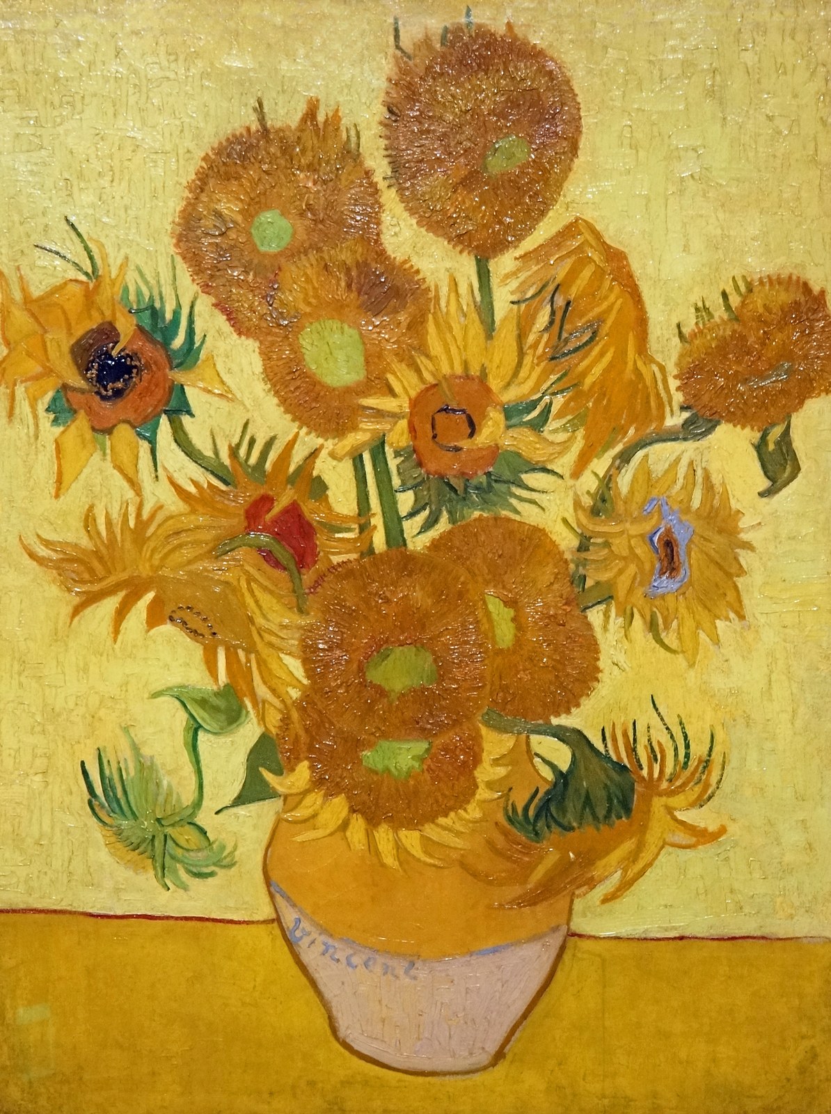
Analogous colors are hues that sit next to each other on the color wheel — blue, blue-green, and green, for instance, or red, red-orange, and orange. Because neighboring hues share an underlying wavelength, they naturally look related rather than competing, which makes an analogous scheme one of the most reliable ways to build harmony into a painting. Artists typically choose three to five adjacent hues, let one dominate, and vary value and saturation so the limited range doesn't feel flat. Analogous schemes are especially common in landscape and seascape painting, where sky, water, and foliage genuinely do sit close together on the wheel, so the harmony feels natural rather than imposed. The trade-off for that harmony is contrast: because none of the hues fight each other, analogous paintings can read as calm, atmospheric, or unified, but they rarely produce the jolt of a complementary pairing. Painters often add one small complementary accent to keep an otherwise analogous canvas from feeling monotonous.
How artists use it
Water and sky harmony
Claude Monet's Water Lilies paintings blend blues, greens, and violets across pond and sky until the reflection and the reflected surface become almost indistinguishable, unified entirely by adjacent hues.
Warm analogous glow
J. M. W. Turner's Rain, Steam and Speed (1844) fuses a steam engine into its atmosphere using oranges, yellows, and browns that all sit close together on the wheel, dissolving hard edges into a warm blur.
Named analogous scheme
James McNeill Whistler titled works like Nocturne: Blue and Green – Chelsea (1871) after their color scheme directly, using two adjacent hues to structure an entire nighttime harbor scene.
Blue-only atmosphere
Katsushika Hokusai's The Great Wave off Kanagawa (c. 1831) builds its entire sky and sea from layered shades of Prussian and indigo blue, proving a scene can hold together on one hue family alone.
Analogous under one light
Vincent van Gogh's The Olive Trees (1889) unifies foliage, hills, and sky under closely related blues and greens, letting a single light condition tie the whole canvas together.
Analogous underpainting
Old-master painters often blocked in a canvas with close warm earth tones, such as yellow ochre and burnt sienna, before adding local color, letting that analogous underlayer harmonize the finished painting from beneath.
Instant examples
Analogous Colors in famous works, fast
- Ocean horizon in a seascape
- → harmony — blues and blue-greens blend water into sky with no hard color shift.
- Autumn forest painting
- → warmth — yellows, oranges, and reds sit side by side on the wheel, reading as one seasonal mood.
- Sunset sky
- → unity — reds, oranges, and yellows fade into each other with no jarring transition.
- Forest canopy
- → cohesion — greens and yellow-greens layer together to describe depth without changing hue family.
- Twilight cityscape
- → atmosphere — blues merging into violets suggest fading light using one narrow color range.
- Blue-only woodblock print
- → restraint — an entire scene rendered in shades of a single blue proves harmony needs no variety of hue.
The story
Formal color-wheel thinking begins with Isaac Newton's 1666 arrangement of spectral hues into a circle, later refined by theorists like Michel-Eugène Chevreul, whose 1839 book on simultaneous contrast shaped how 19th-century painters thought about neighboring versus opposing hues. Japanese ukiyo-e printmakers embraced imported Prussian blue after the 1820s, producing aizuri-e, prints built almost entirely from shades of one blue, including Hokusai's Great Wave (c. 1831). Whistler explicitly named paintings after their analogous schemes, calling works Nocturnes in blue and green starting in the 1870s. The Impressionists, including Monet, leaned on analogous blues, greens, and violets to render atmosphere rather than local color. Color theory remains standard art-school curriculum today, with the analogous scheme taught alongside complementary and triadic schemes as one of the basic ways to organize a palette.
The canonical examples
| Work | Artist | Date | Why it matters |
|---|---|---|---|
| Water Lilies | Claude Monet | 1906 | blues, greens, and violets blend pond and sky into one unified surface with no sharp color breaks |
| Nocturne: Blue and Green – Chelsea | James McNeill Whistler | 1871 | the title names its own analogous scheme, using only closely related blues and greens across the entire canvas |
| The Olive Trees | Vincent van Gogh | 1889 | foliage, hills, and sky are unified through closely related blues and greens under one consistent light |
| Rain, Steam and Speed – The Great Western Railway | J. M. W. Turner | 1844 | warm oranges, yellows, and browns dissolve the train and its surroundings into one unified atmospheric blur |
| The Great Wave off Kanagawa | Katsushika Hokusai | c. 1831 | sea and sky are built almost entirely from layered shades of Prussian and indigo blue |
 AI-generated
Try it yourself
Practice analogous colors with AI
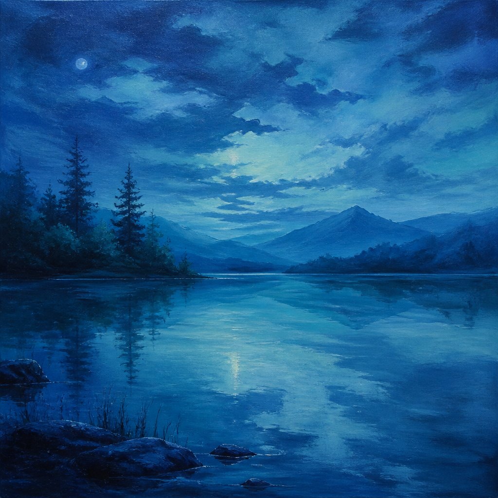
This example was generated from a prompt like: “A calm painted lake at dusk rendered entirely in blues, teals, and blue-greens, with soft reflections blending water into sky, no warm colors present anywhere, gentle brushwork, atmospheric, unified color harmony.”
Open the Analogous Colors Art Style generator →The concept today
Analogous schemes remain a default choice in interior design, where paint brands sell pre-matched blue-green or red-orange palettes for instant harmony. Film colorists lean on analogous teal-and-green grading to unify a scene's mood. Brand and app designers build palettes from three or four adjacent hues to feel cohesive without needing a full color wheel. Digital painting software now includes built-in analogous-harmony pickers, automating the same relationship Chevreul described by hand in the 19th century.
Compose your own
Pick any hue on a 12-part color wheel, then choose the two hues directly beside it — that trio is your analogous set. Paint a simple landscape using only those three hues plus black and white for value, and notice how naturally sky, water, and land start to unify. Try the warm end of the wheel next, using only reds, red-oranges, and oranges for a sunset study, to feel how an analogous scheme shifts mood by temperature alone. As a final exercise, take a finished analogous painting and add one small dab of its complementary color; notice how much visual energy that single accent adds against the otherwise harmonious range.
Frequently asked questions
What are examples of analogous colors in famous paintings?
Monet's Water Lilies use blues, greens, and violets together, Whistler's Nocturne: Blue and Green names its own scheme directly, Van Gogh's The Olive Trees unify blues and greens under one light, and Hokusai's Great Wave is built almost entirely from shades of blue.
What colors count as analogous?
Any three to five hues that sit next to each other on a color wheel, such as blue, blue-green, and green, or yellow, yellow-orange, and orange. They share an underlying hue family, which is why they naturally look harmonious together.
How is an analogous color scheme different from complementary?
Analogous colors sit beside each other on the wheel and create calm, unified harmony. Complementary colors sit directly opposite each other and create strong contrast and visual tension. Many paintings combine a mostly analogous palette with one complementary accent.
Why do landscape painters use analogous colors so often?
Sky, water, and foliage genuinely sit close together on the color wheel in real light conditions, so an analogous palette reads as natural and atmospheric rather than artificially harmonized, which is why it's a landscape-painting default.