 Art
Art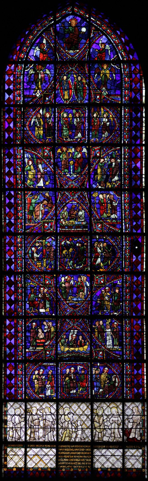
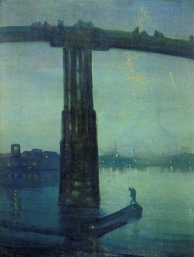
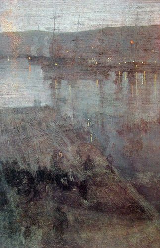
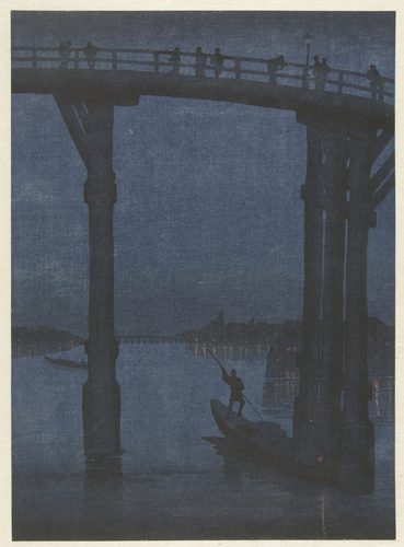
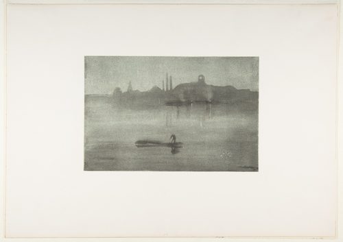
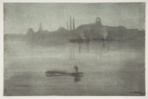
Monochromatic art uses a single hue — one color family, like blue or red — carried through a full range of values, from its lightest tint to its darkest shade, without introducing a second hue. The restriction sounds limiting, but it forces attention onto qualities easy to overlook when many colors compete: value, texture, and form. Without hue variety to lean on, a monochromatic image has to build all of its depth, mood, and structure from light and dark alone, which is why monochromatic works often read as more graphic, more unified, or more emotionally singular than multicolor ones. The approach has a long history in painting, going back to grisaille underpaintings used to establish form before color was added, and it shows up constantly in photography, where black-and-white is monochromatic by definition. A monochromatic palette also guarantees harmony automatically — there's no risk of clashing hues, because there's only one — which makes it a reliable choice whenever a painter or designer wants an image to feel calm, cohesive, or deliberately restrained rather than loud.
How artists use it
Blue as an entire mood
Pablo Picasso's La Vie, painted almost entirely in blue during his Blue Period, uses value shifts within that single hue to model figures, shadow, and mood. The restriction to one color makes the painting's melancholy feel total rather than partial.
Gray on gray on gray
Pablo Picasso's Guernica abandons color almost entirely, working in black, white, and gray like a photograph or a newspaper page. The monochrome palette strips away any decorative reading and pushes the eye straight to the chaos of shape and value.
A single sepia wash
J.M.W. Turner's Liber Studiorum prints work almost entirely in warm sepia-brown ink washes, using only value shifts within that one hue to describe atmosphere and light. The limited palette lets Turner focus entirely on how light behaves rather than what color it is.
Grisaille beneath the paint
Jan van Eyck's grisaille panels on the exterior of the Ghent Altarpiece imitate stone sculpture using only gray values, no color at all. The trick relies entirely on light and dark to fake three-dimensional form on a flat surface.
Black-and-white as default
Ansel Adams' Moonrise, Hernandez, New Mexico builds an entire dramatic landscape from black-and-white values alone, using his famous Zone System to control contrast precisely. The monochrome format proves that value contrast, not color, can carry an image's full emotional weight.
One red, endless range
Mark Rothko's Red on Maroon panels layer multiple close values of red and maroon to create a glowing, meditative field with almost no other hue present. The narrow range forces total attention onto subtle shifts in tone rather than any depicted subject.
Instant examples
Monochromatic in famous works, fast
- La Vie
- → a single blue hue's full light-to-dark range carries the painting's mood alone
- Guernica
- → black, white, and gray strip the scene down to pure shape and value
- Ghent Altarpiece (exterior panels)
- → gray-only grisaille fakes carved stone using nothing but value
- Moonrise, Hernandez, New Mexico
- → a black-and-white photograph proves value alone can carry drama
- Red on Maroon
- → close shades of one red family glow through subtle value shifts alone
- Liber Studiorum
- → sepia ink washes describe light and atmosphere using a single warm hue
The story
Monochrome painting predates color theory itself — grisaille, painting entirely in grays, was standard practice in medieval and Renaissance workshops for underpaintings and for imitating carved stone on altarpiece exteriors, where Jan van Eyck's panels remain a benchmark. Ink-wash traditions in East Asian painting built centuries of technique around a single hue's tonal range rather than multiple colors. Photography made monochrome a default rather than a choice for most of its first century, since black-and-white was simply what the medium produced, and photographers like Ansel Adams turned that limitation into a precise system for controlling value. In the 20th century, painters including Pablo Picasso and Mark Rothko used monochromatic and near-monochromatic palettes deliberately, treating a single hue's full range as enough to carry an entire emotional register without any color variety at all.
The canonical examples
| Work | Artist | Date | Why it matters |
|---|---|---|---|
| La Vie | Pablo Picasso | 1903 | melancholy built from one blue hue's full value range |
| Guernica | Pablo Picasso | 1937 | black, white, and gray stripping the scene to shape alone |
| Ghent Altarpiece (exterior panels) | Jan van Eyck | 1432 | gray-only grisaille imitating carved stone figures |
| Moonrise, Hernandez, New Mexico | Ansel Adams | 1941 | a landscape's drama carried entirely by black-and-white value |
| Red on Maroon | Mark Rothko | 1959 | layered close reds glowing through subtle tonal shifts |
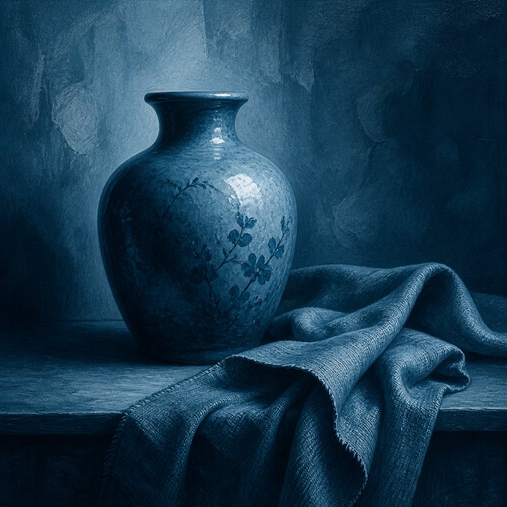 AI-generated
Try it yourself
Practice monochromatic with AI
This example was generated from a prompt like: “A ceramic vase and folded cloth on a table, rendered entirely in shades of deep teal blue, from near-white highlight to near-black shadow, with no other hue anywhere in the frame — a still life in pure monochrome.”
Open the Grisaille Painting Style generator →The concept today
Black-and-white photography and film remain the clearest everyday example of monochromatic work, prized for how much it forces attention onto composition and light. Interfaces use monochromatic color schemes — one hue in many tints and shades — to look calm and professional without the risk of clashing accents. Branding often restricts a logo to one color family for the same reason: guaranteed harmony. AI image generators handle prompts like 'monochromatic blue' or 'sepia tone' reliably, since removing hue variety is one of the simplest, most consistent constraints to apply to a generated image.
Compose your own
Choose one hue and commit to it fully — build your lightest highlight and your darkest shadow from tints and shades of that same color rather than reaching for a second hue when you need contrast. Since you can't lean on hue to separate elements, do that work with value instead: keep a clear range from near-white to near-black so shapes stay readable. Texture and pattern also carry more weight in a monochromatic image, since they're some of the only remaining ways to create visual variety. If the result feels flat, check that you have enough value range, not more color — that's almost always the real fix. In AI prompts, specify both the hue and the format, like 'monochromatic in sepia tones' or 'black-and-white monochrome,' for a more reliable result.
Frequently asked questions
What are examples of monochromatic art?
Pablo Picasso's La Vie and The Old Guitarist, painted almost entirely in blue, Jan van Eyck's gray grisaille panels on the Ghent Altarpiece, and Ansel Adams' black-and-white photograph Moonrise, Hernandez, New Mexico all build their image from one hue's value range.
What does monochromatic mean in art?
Built from a single hue carried through a range of light and dark values — tints, tones, and shades of one color — rather than multiple hues. Black-and-white photography counts as monochromatic by definition.
Is black and white considered monochromatic?
Yes. Black-and-white images use only value, no hue at all, which is the most extreme version of a monochromatic approach. Ansel Adams' photographs are a classic example of value alone carrying a full composition.
Why do artists limit a painting to one color?
It guarantees harmony, since a single hue can't clash with itself, and it forces more attention onto value, texture, and composition. Picasso's Blue Period paintings show how one restricted hue can carry an entire emotional mood.