 Art
Art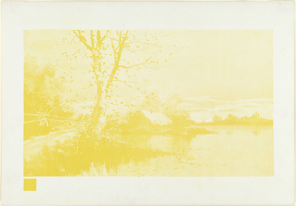
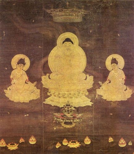
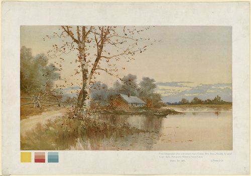
A triadic color scheme uses three hues spaced evenly around the color wheel, roughly 120 degrees apart, so no single color dominates the way it would in a complementary pairing. The most familiar triad is the primary set — red, yellow, and blue — used by Mondrian and countless children's toys alike. A second, softer triad comes from the secondary colors — orange, green, and violet — which appears constantly in Fauvist landscapes and Art Nouveau posters. Because the three hues sit at equal distances, a triadic palette offers built-in contrast without the harsh push-pull of two direct opposites; one color usually leads while the other two support it in smaller amounts. Artists lean on this scheme when they want a picture to feel lively and varied but still unified, anywhere a designer needs maximum color energy that still reads as one coherent whole.
How artists use it
Primary triad grids
Piet Mondrian built compositions like Composition II in Red, Blue, and Yellow from flat blocks of the three primary hues, separated by thick black lines. The even spacing of red, yellow, and blue keeps every block distinct without any one color overwhelming the others.
Secondary triad in Fauvism
Henri Matisse and fellow Fauves reached for orange, green, and violet side by side, pushing every hue toward full saturation. In The Dance, blue sky, green ground, and orange-red bodies form a near-triadic set that reads as electric rather than jarring.
Named by the wheel
Vasily Kandinsky titled one canvas Yellow-Red-Blue, using the three primary hues as both subject and structure. Shapes and lines in each color occupy their own zone of the canvas, letting the triad organize the composition as much as the forms do.
Stained glass triads
Medieval cathedral windows used red, blue, and yellow glass together because the triad stays legible from across a nave, even backlit and seen from a distance. Lead lines separate the hues the way Mondrian's black grid would centuries later.
Posters that shout
Circus, carnival, and travel posters lean on triadic color because it reads instantly across a crowded street. Bold red lettering, yellow highlights, and blue backgrounds compete for attention without any single color losing legibility.
Orphist color wheels
Robert Delaunay broke color into rotating disks in works like Homage to Blériot, cycling through triads and near-triads of orange, green, and violet. The spinning arrangement makes the evenly spaced hues feel like they generate their own motion.
Instant examples
Triadic Colors in famous works, fast
- Composition II in Red, Blue, and Yellow
- → the primary triad — flat blocks of red, yellow, and blue divided by a black grid, no color allowed to dominate.
- Yellow-Red-Blue
- → a triad named in the title itself — abstract shapes sorted into zones of the three primary hues.
- Circus and carnival posters
- → red, yellow, and blue lettering fighting for attention across a crowded street, all legible at once.
- Medieval stained glass
- → red, blue, and yellow panes glow together in cathedral windows, staying readable even backlit from far away.
- Fauvist landscapes
- → orange, green, and violet pushed to full saturation side by side for maximum color energy.
- Homage to Blériot
- → spinning color disks cycle through orange, green, and violet, making a static triad feel like motion.
The story
Color wheel theory made triadic harmony possible to name. Isaac Newton's 1666 spectrum and later wheels by Michel-Eugène Chevreul in the 1830s laid out hues in a circle, making it visible that three evenly spaced colors would balance each other. Nineteenth-century painters absorbed this science directly: Chevreul's law of simultaneous contrast influenced the Impressionists and, later, the deliberately vivid palettes of the Fauves around 1905, who pushed orange, green, and violet to full strength side by side. Vasily Kandinsky and the Bauhaus, where color theorist Johannes Itten taught structured wheel-based exercises in the 1920s, treated primary triads as a foundation for abstract composition. Piet Mondrian reduced painting to exactly this idea in the 1920s and 1930s, restricting his canvases to red, yellow, and blue alone. Long before any of this theory existed, medieval glaziers had already discovered by eye that red, blue, and yellow together stayed vivid and legible.
The canonical examples
| Work | Artist | Date | Why it matters |
|---|---|---|---|
| Composition II in Red, Blue, and Yellow | Piet Mondrian | 1930 | flat blocks of the three primary hues sit within a thick black grid, with no color allowed to dominate |
| Yellow-Red-Blue | Vasily Kandinsky | 1925 | abstract shapes are sorted into zones of the three primary hues named directly in the title |
| The Dance | Henri Matisse | 1909–10 | blue sky, green ground, and orange-red dancing figures form a near-secondary triad in full saturation |
| Homage to Blériot | Robert Delaunay | 1914 | rotating disks of color cycle through orange, green, and violet, spinning a triad into implied motion |
| Rose window (Chartres Cathedral) | Unknown | 13th century | red, blue, and yellow glass panels combine so the triad stays legible even backlit from across the nave |
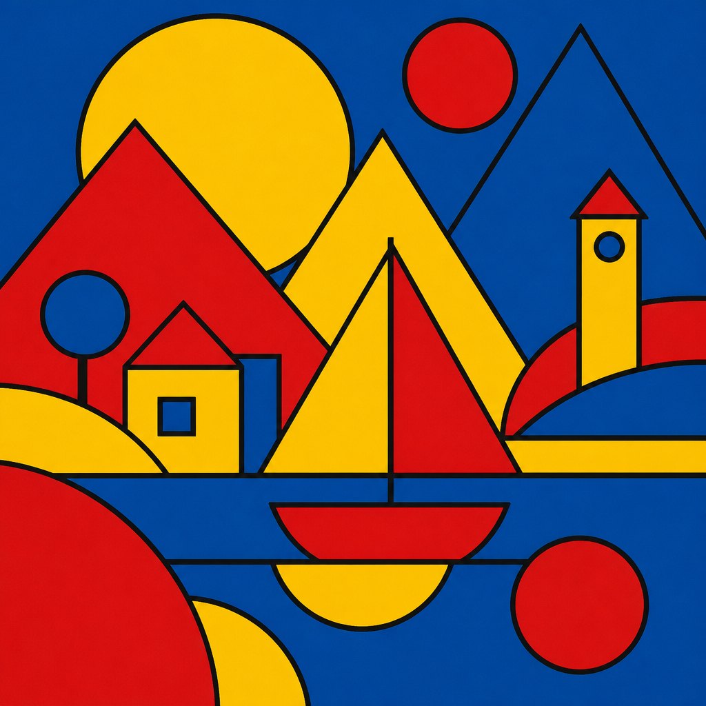 AI-generated
Try it yourself
Practice triadic colors with AI
This example was generated from a prompt like: “A flat geometric poster of overlapping circles and triangles in pure red, yellow, and blue, thick black outlines separating each shape, flat matte color, no gradients, evenly balanced composition, graphic design style.”
Open the Triadic Colors Art Style generator →The concept today
Graphic designers still reach for triadic schemes whenever a brand or poster needs to feel energetic but organized — sports logos, children's brands, and streaming app icons frequently rely on a red-yellow-blue or orange-green-purple set. Color-picker tools in Adobe and Canva include a one-click 'triadic' harmony option built directly on the same 120-degree spacing Chevreul described. Packaging design uses it constantly, since three balanced hues photograph and print consistently across different materials.
Compose your own
Start by picking one anchor hue, then find its two triadic partners by measuring 120 degrees in each direction around a color wheel — most design software will do this automatically with a triadic harmony tool. Let one color dominate roughly 60 percent of the composition, use a second for supporting shapes, and reserve the third for small accents; equal thirds of all three usually looks chaotic rather than balanced. Try both the primary triad and the secondary triad on the same sketch to feel how much softer the secondary version reads. Test your triad in black and white too — if the hues go muddy in grayscale, adjust their values before committing to color.
Frequently asked questions
What is a triadic color scheme in art?
A triadic color scheme uses three hues spaced evenly around the color wheel, about 120 degrees apart, such as red, yellow, and blue or orange, green, and violet. It gives strong contrast that still feels balanced because no two colors sit directly opposite each other.
What are examples of triadic colors in famous paintings?
Mondrian's Composition II in Red, Blue, and Yellow uses the primary triad in flat blocks, Kandinsky's Yellow-Red-Blue names the scheme outright, and Matisse's The Dance pairs blue sky, green ground, and orange-red figures in a secondary triad.
Is triadic the same as complementary color?
No. Complementary colors sit directly opposite each other on the wheel, just two hues total. Triadic schemes use three hues spaced evenly apart, so the contrast is spread across three colors instead of concentrated between two.
Why do designers like triadic color schemes?
Because the even spacing guarantees contrast without the harsh clash of a straight complementary pair. One color can dominate while the other two support it, giving a poster or painting energy that still reads as unified.