 Art
Art
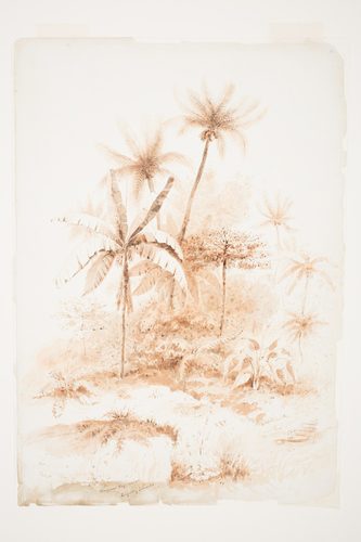
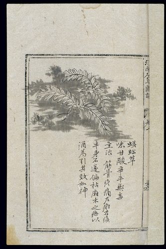
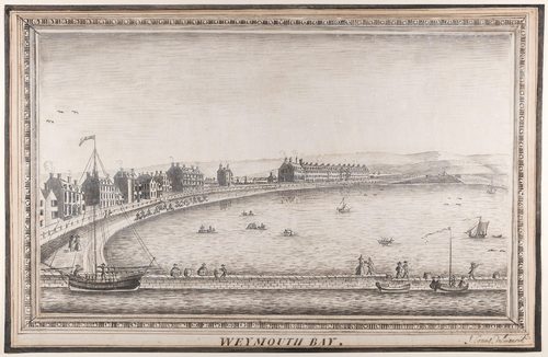
Neutral colors are the hues with little or no visible saturation: black, white, gray, and the muted browns, tans, and ochres that result from mixing complementary colors together rather than keeping them pure. Unlike a vivid red or blue, a neutral doesn't announce itself; it recedes, which is exactly why artists rely on it so heavily. A gray or brown background lets a single saturated color placed against it read as far more intense than it would surrounded by other bright hues. Neutrals also carry their own quiet mood — somber, aged, restrained, or elegant depending on how they're used — and an entire picture can be built from neutrals alone, as in grisaille painting or black-and-white photography, where all of the information comes from value and texture rather than color. Because they don't compete for attention, neutrals do enormous structural work: shadows, underpainting, backgrounds, and transitional areas are almost always neutral.
How artists use it
Grisaille imitation
Jan van Eyck painted the exterior wings of the Ghent Altarpiece almost entirely in gray tones, imitating carved stone sculpture so convincingly that the figures appear three-dimensional until the panels are opened to reveal full color inside.
Dark earth grounds
Rembrandt built The Night Watch on a foundation of deep umbers and blacks, letting only a few passages of gold, red, and cream light emerge from the shadow. The neutral base makes those few saturated notes feel far brighter by contrast.
Near-monochrome portraiture
James McNeill Whistler restricted Arrangement in Grey and Black No. 1 to a tightly controlled range of grays, black, and white, using value shifts rather than color to model the seated figure and the room around her.
Analytic cubism's palette
Pablo Picasso and Georges Braque stripped color almost entirely from their analytic cubist canvases around 1910–12, working in fractured browns, grays, and ochres so the fragmented forms, not competing hues, carried the composition.
Photography's built-in neutrality
Early photography had no choice but neutrals: Alfred Stieglitz's The Steerage exists entirely in a scale of grays, blacks, and whites, proving how much structure, mood, and detail can be conveyed through value alone.
Earth tones in still life
Dutch still life painters frequently set gleaming objects against dark, near-black backgrounds and muted brown tablecloths, a neutral stage that makes a single lemon peel or glass of wine read as startlingly vivid.
Instant examples
Neutral Colors in famous works, fast
- Whistler's Mother (Arrangement in Grey and Black No. 1)
- → a nearly monochrome scale of gray, black, and white carrying the entire portrait.
- Grisaille altarpiece panels
- → figures painted in gray tones alone to imitate carved stone sculpture.
- Rembrandt's dark backgrounds
- → deep brown and black grounds that make small passages of gold or red light glow by contrast.
- Black-and-white photographs
- → an entire image built from a scale of grays with no color information at all.
- Analytic Cubist canvases
- → fractured forms rendered in muted browns, grays, and ochres instead of bright color.
- Charcoal figure drawings
- → a value study built entirely from black, gray, and the white of the paper.
The story
Neutral tones have a long technical history separate from color itself. Medieval and Renaissance painters used grisaille — from the French gris, meaning gray — to imitate carved stone in stained glass borders and altarpiece exteriors, most famously on the closed wings of Jan van Eyck's Ghent Altarpiece, completed in 1432. Academic workshops later formalized underpainting, blocking in a canvas in neutral grays or browns before adding color on top. The Dutch Golden Age of the 1600s built its dramatic lighting on dark neutral backgrounds, letting Rembrandt and his contemporaries push a few warm highlights out of near-total shadow. The invention of photography in the 1830s made neutral tone the default medium for capturing the world for nearly a century, since color photography wasn't commercially practical until the 1930s and 40s. Analytic Cubism around 1910 and Kazimir Malevich's stark Black Square of 1915 pushed neutrality further still, treating the absence of hue as a statement in itself.
The canonical examples
| Work | Artist | Date | Why it matters |
|---|---|---|---|
| Ghent Altarpiece (exterior wings) | Jan van Eyck | 1432 | the closed altarpiece is painted almost entirely in gray grisaille, making the donor and saint figures resemble carved stone statues in niches |
| The Night Watch | Rembrandt van Rijn | 1642 | a dark ground of umber and black dominates the canvas, with only a few figures picked out in gold, red, and cream light |
| Arrangement in Grey and Black No. 1 | James McNeill Whistler | 1871 | the seated figure, wall, and curtain are all rendered in a tightly limited scale of gray, black, and white |
| Ma Jolie | Pablo Picasso | 1911–12 | the fractured cubist forms are painted almost entirely in muted grays, browns, and ochres with color nearly absent |
| The Steerage | Alfred Stieglitz | 1907 | a black-and-white photograph in which every shape, from the gangplank to the crowd below, is defined purely by tonal value |
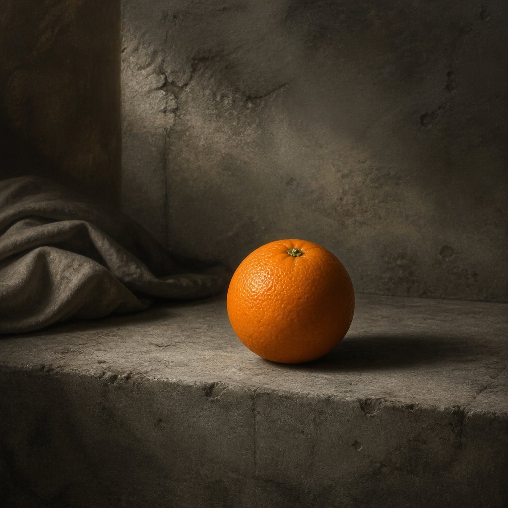 AI-generated
Try it yourself
Practice neutral colors with AI
This example was generated from a prompt like: “A still life of a single ripe orange sitting on a plain gray stone surface, everything else in the scene rendered in muted grays, browns, and soft charcoal shadow, dramatic side lighting, restrained neutral palette.”
Open the Neutral Colors Art Style generator →The concept today
Neutral palettes dominate contemporary interior design, minimalist branding, and product photography, where grays, whites, and warm taupes create a calm backdrop for a single accent color or object to stand out. Fashion and architecture return to neutrals whenever a look needs to read as timeless rather than trend-driven. In digital design, 'grayscale mode' remains a standard test: designers check an interface in neutral tones first to make sure layout and contrast work before color is added.
Compose your own
Try painting or drawing an entire scene using only black, white, and the grays or browns you can mix between them — this is essentially grisaille, and it forces you to solve a composition through value alone before color complicates things. Once comfortable, add one small area of saturated color to an otherwise neutral painting and notice how much more intense it looks than the same color would surrounded by other bright hues. Practice mixing your own neutrals by combining two complementary colors, like red and green or blue and orange, instead of buying gray from a tube — the resulting neutral will carry a subtle warm or cool undertone that flat gray never has. Use neutral backgrounds deliberately in still life setups to make one object the clear focal point.
Frequently asked questions
What are neutral colors in art?
Neutral colors are grays, blacks, whites, and muted earth tones like brown and tan that carry little or no pure hue. They're often made by mixing complementary colors together rather than by using a color straight from the tube.
What is grisaille painting?
Grisaille is a technique of painting entirely in shades of gray, used since the Middle Ages to imitate carved stone sculpture, as on the closed exterior wings of Jan van Eyck's Ghent Altarpiece, and later as an underpainting stage beneath full color.
Why do artists use neutral colors instead of bright ones?
Neutrals recede rather than compete for attention, which makes them ideal for backgrounds, shadows, and transitions. A small area of saturated color placed against a neutral field reads as far more vivid than it would surrounded by other bright hues.
Is black and white photography an example of neutral color in art?
Yes. Early photographs like Alfred Stieglitz's The Steerage from 1907 exist entirely in a scale of grays, blacks, and whites, showing how composition, mood, and detail can be built from value alone with no hue at all.