 Art
Art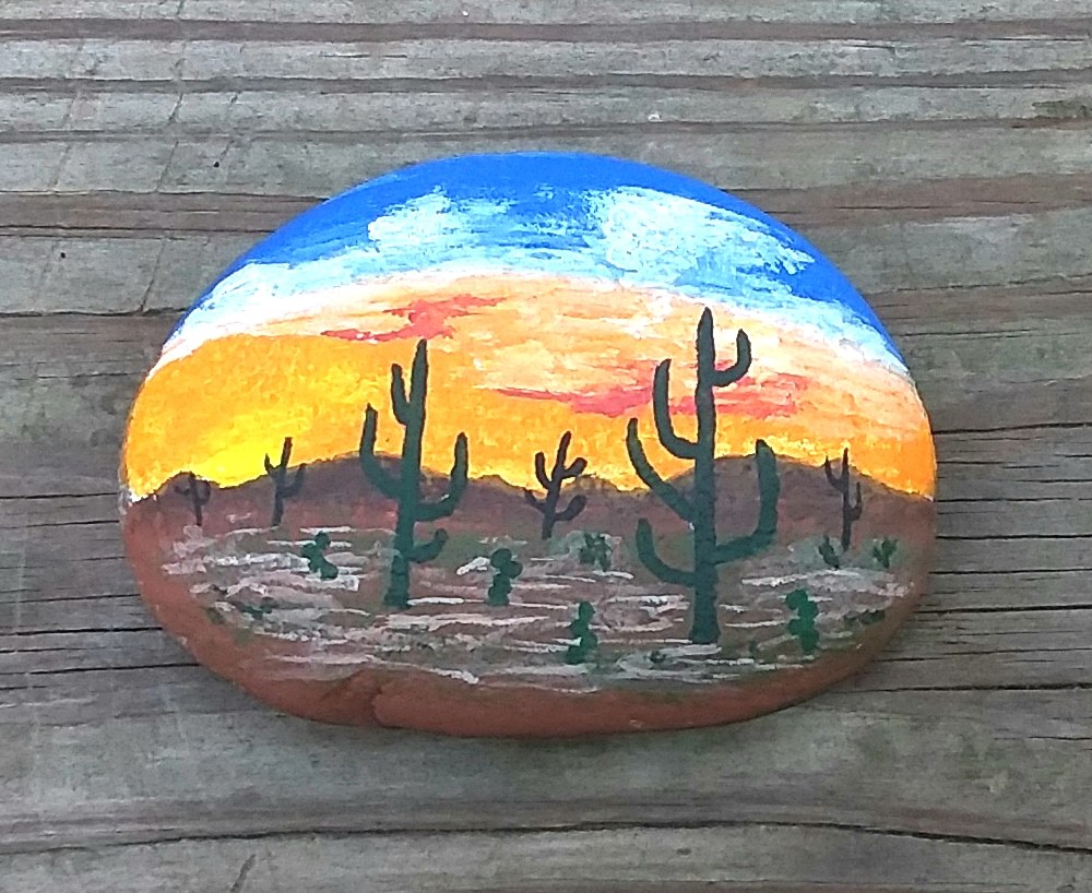
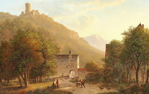
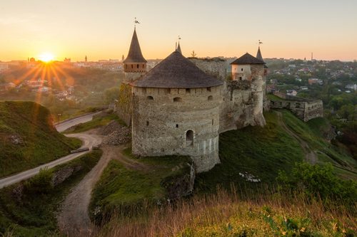
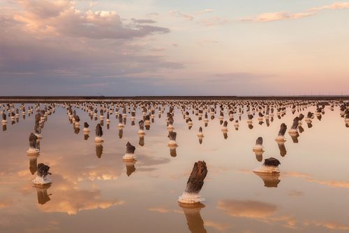
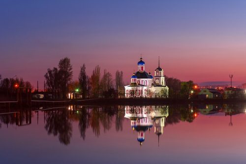
Color temperature is the psychological split of every hue into warm (reds, oranges, yellows) or cool (blues, greens, violets), independent of how light or dark, or how saturated, a color actually is. The split is not physical — a pale yellow and a pale blue can share the same value and intensity — it is a feeling: warm colors seem to advance toward the viewer and radiate heat or energy, while cool colors seem to recede and carry calm or distance. Painters lean on this constantly. Atmospheric perspective relies on temperature: distant mountains and background objects are painted cooler and grayer than a warm, detailed foreground, tricking the eye into reading depth on a flat surface. A single warm accent in an otherwise cool painting, or vice versa, becomes an automatic focal point because the eye is drawn to temperature contrast almost before it registers subject matter. Impressionists made the idea famous by painting shadows blue or violet instead of black, discovering that shadows read as cool rather than simply dark.
How artists use it
Warm foreground, cool background
Landscape painters since the Renaissance push warm, detailed color into the foreground and shift distant hills, sky, and water toward cool blue-gray. The temperature shift alone reads as distance, even without any change in perspective lines.
Colored shadows
Impressionists like Claude Monet stopped painting shadows black and started painting them blue or violet, discovering that shade reads as a cool color rather than an absence of light. It let sunlight itself feel warmer by contrast.
Warm accent as focal point
A single warm note — a red scarf, a lit window, an orange sky — dropped into a mostly cool composition pulls the eye instantly, because temperature contrast competes with almost nothing else for attention.
Monochrome temperature shift
Painters model form by shifting a single hue warmer where light hits and cooler where it turns into shadow, rather than only changing value. A warm-lit cheek next to a cool-shadowed one reads as rounder than gray shading alone.
Whole-canvas mood
An entire painting pushed toward one temperature — an all-blue nocturne or an all-orange sunset — sets emotional tone before a viewer identifies a single object, using temperature the way music uses a key.
Temperature as time of day
Warm golden light signals dawn or dusk, cool blue light signals night or overcast weather; painters shift a whole palette's temperature to tell a viewer what time it is without depicting a clock or sun position directly.
Instant examples
Color Temperature in famous works, fast
- A sunset sky
- → instant warmth — layered oranges, reds, and yellows signal the sun sitting low on the horizon.
- Blue snow shadows
- → cool color used for shade instead of gray or black, a hallmark of Impressionist winter scenes.
- An orange flame
- → heat and energy — the hottest part of a fire is painted with the warmest, most intense hue.
- A blue-gray horizon
- → distance — far-off mountains or sea painted cool signal atmospheric depth.
- A single red object in a blue room
- → focal point — warm color surrounded by cool automatically draws the eye first.
- A candlelit interior beside a cool night window
- → the classic pairing of indoor warmth against outdoor cold.
The story
Painters used warm-versus-cool instinctively long before science explained it — Renaissance landscape painters already pushed distant hills toward blue-gray to suggest atmospheric depth, a technique called aerial perspective. J.M.W. Turner spent the early 1800s dissolving whole canvases into fields of warm yellow-orange light, drawing on Johann Wolfgang von Goethe's Theory of Colours (1810), which described warm hues as active and cool hues as calming. The real shift came with Impressionism in the 1870s: Claude Monet and Camille Pissarro abandoned black shadows entirely, painting shade in cool blues and violets and letting sunlit areas glow warm by contrast, a break from academic convention. Post-Impressionists and Fauves pushed temperature further as pure emotional language rather than observed light, using warm and cool with no regard for realism at all.
The canonical examples
| Work | Artist | Date | Why it matters |
|---|---|---|---|
| Impression, Sunrise | Claude Monet | 1872 | a warm orange sun and its reflection cut through an otherwise cool blue-gray harbor mist |
| The Starry Night | Vincent van Gogh | 1889 | cool blue swirling sky and hills surround warm yellow stars, moon, and lit windows |
| Rain, Steam and Speed – The Great Western Railway | J.M.W. Turner | 1844 | a warm golden locomotive emerges from a dissolving field of cool gray rain and mist |
| Twilight in the Wilderness | Frederic Edwin Church | 1860 | a blazing warm orange-red sunset sky contrasts with the cool dark silhouette of the forested landscape below |
| The Scream | Edvard Munch | 1893 | a warm orange-red sky burns above the cool blue-violet fjord and figures on the bridge |
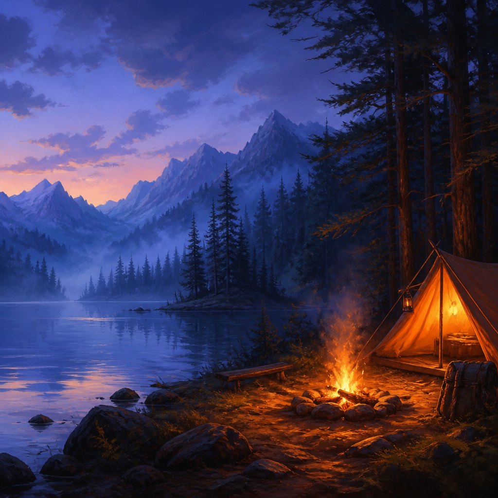 AI-generated
Try it yourself
Practice color temperature with AI
This example was generated from a prompt like: “A quiet lakeside scene split by color temperature: a warm orange campfire and glowing tent on the near shore, facing a cool blue-violet mist-covered forest and mountains across the water, dusk lighting, painterly style.”
Open the Color Temperature Art Style generator →The concept today
Color temperature still runs film and photography grading, where directors push flashbacks or dream scenes cool and keep present-day scenes warmer, while horror films drain warmth entirely for dread. Interior designers sell "warm" and "cool" paint chips by exactly this logic. Digital art and photo software include temperature sliders as a basic tool, letting anyone shift an entire image toward orange or blue with one control, and portrait photographers still warm up skin tones and cool down backgrounds to make a subject pop forward.
Compose your own
Paint or digitally render the same simple scene twice, once pushed entirely warm and once entirely cool, and compare how differently identical shapes feel. Practice atmospheric perspective by painting three overlapping hills: warm and detailed up close, progressively cooler and flatter with distance. Try shading a sphere using only warm and cool versions of one hue instead of black and white, warming the lit side and cooling the shadow side. Finally, build a mostly cool composition and drop in one small warm object, then swap it for a cool object, and notice how much weaker the focal point becomes.
Frequently asked questions
What is color temperature in art?
Color temperature is whether a hue reads as warm (red, orange, yellow) or cool (blue, green, violet). It's independent of how light, dark, or saturated a color is, and artists use it to suggest depth, light, mood, and focal points.
Why did Impressionists paint shadows blue?
Painters like Claude Monet noticed outdoor shadows reflect cool sky light rather than reading as simply dark, so they painted shade in blue and violet instead of black, making sunlit warm areas feel even brighter by contrast.
How does color temperature create depth in a painting?
Following atmospheric perspective, objects close to the viewer are painted warm and detailed while distant objects shift cool and hazy, mimicking how real air scatters light and makes far-off things look bluer and less distinct.
What's an example of warm and cool contrast in a famous painting?
In The Starry Night, Vincent van Gogh surrounds warm yellow stars and lit windows with a cool blue swirling sky and hills, letting temperature contrast carry much of the painting's energy.