 Art
Art
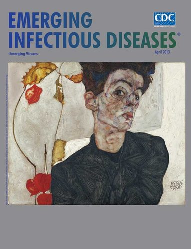
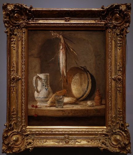
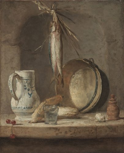
Saturation, also called chroma or intensity, describes how pure a color is — how far it sits from a neutral gray of the same value. A fully saturated red is the most vivid, undiluted red possible; mix in gray, its complement, or black and white, and it dulls toward a muted, grayish version of the same hue without necessarily getting lighter or darker. Saturation is independent of both hue and value: two reds can share the exact same shade of red and lightness yet look completely different in vividness. Artists control saturation to direct attention and set mood. A high-saturation object placed among duller, grayed-down surroundings pulls the eye first, because intense color competes with almost nothing else for attention. Whole movements have been built around pushing saturation to its limit — Fauvism used raw, unmixed pigment straight from the tube — while other traditions, like tonal academic painting, deliberately keep saturation low across an entire canvas to feel restrained, natural, or somber.
How artists use it
Unmixed pigment
Henri Matisse and the Fauves painted with color straight from the tube, refusing to gray it down with black or complementary mixtures. Skies turned orange, faces turned green, all at full intensity, treating raw saturation itself as the subject.
Saturated focal point
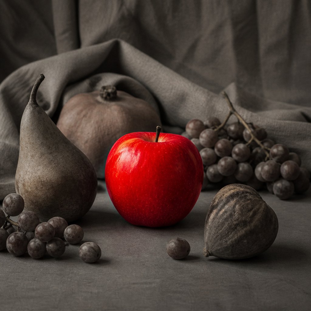
Painters desaturate a background into muted grays and browns, then reserve full-intensity color for the single object or figure meant to matter most, guaranteeing the eye lands there first regardless of composition or size.
Flat poster saturation
Late-19th-century lithograph posters used flat, fully saturated color blocks, printed with minimal shading, because vivid unbroken color was legible and eye-catching from across a busy street, unlike subtly modeled tone.
Desaturated distance
Landscape painters often lower saturation as forms recede toward the horizon, pairing it with cooler temperature, so faraway hills look hazier and less intense than the vividly colored foreground.
Optical mixing with pure dots
Pointillists placed small dots of fully saturated, unmixed pigment side by side rather than blending on the palette, letting the eye combine them from a distance into a color that stays more luminous than physically mixed paint.
Muted tonal harmony
Some painters deliberately restrict an entire canvas to low-saturation earth tones, grays, and browns, creating a subdued, unified mood where the rare saturated accent carries enormous visual weight.
Instant examples
Saturation in famous works, fast
- A Fauvist canvas
- → raw, unmixed color straight from the tube, with none of it dulled toward gray.
- A 19th-century lithograph poster
- → flat, vivid color blocks designed to grab attention from a distance.
- A single bright red object in a gray scene
- → a deliberate saturation spike used to mark the focal point instantly.
- Faded, dusty landscape tones
- → low saturation used to suggest heat haze, distance, or age.
- A tropical postcard
- → boosted saturation used to make ordinary scenery look more vivid than reality.
- Pointillist dot clusters
- → tiny patches of pure saturated pigment meant to blend optically at a distance.
The story
Painters controlled intensity long before it had a name, but the science arrived with Michel-Eugène Chevreul, whose 1839 study of simultaneous contrast, developed while overseeing dye production at a Paris tapestry works, explained how adjacent colors intensify or dull each other's apparent purity. Georges Seurat and Paul Signac applied that science directly in the 1880s, dotting canvases with small strokes of unmixed, fully saturated pigment meant to combine in the viewer's eye rather than on the palette, a technique called pointillism. The real break came in 1905, when Henri Matisse, André Derain, and their circle exhibited canvases so aggressively saturated and unnaturalistic that critics dubbed them les fauves, "the wild beasts." Their raw, tube-straight color abandoned realistic local color entirely. Poster and advertising artists of the same decades, working in commercial lithography, pushed flat saturated color for maximum visibility on the street.
The canonical examples
| Work | Artist | Date | Why it matters |
|---|---|---|---|
| Woman with a Hat | Henri Matisse | 1905 | the sitter's face and hat are built from raw, unmixed strokes of intense green, orange, and red rather than natural skin tones |
| Harmony in Red (The Red Room) | Henri Matisse | 1908 | wall, tablecloth, and furniture are all painted in the same flat, fully saturated red, unifying the whole room in one intense hue |
| Sunflowers | Vincent van Gogh | 1888 | layers of thickly applied chrome yellow paint push the flowers and background to a near-maximum saturation of a single hue |
| Vision after the Sermon (Jacob Wrestling with the Angel) | Paul Gauguin | 1888 | the ground is painted as a flat, unmodulated field of intense saturated red, unrelated to any realistic color of grass |
| Moulin Rouge: La Goulue | Henri de Toulouse-Lautrec | 1891 | the lithographic poster uses flat blocks of vivid saturated color, printed to catch the eye of passersby on a Paris street |
 AI-generated
Try it yourself
Practice saturation with AI
This example was generated from a prompt like: “A still life on a plain gray tabletop: one fully saturated bright red apple glowing intensely, surrounded by muted, grayish-brown fruit and dull neutral drapery, soft studio lighting, sharp focus on the vivid apple.”
Open the Saturation Art Style generator →The concept today
Saturation sliders are a standard control in every photo and design app, letting anyone push a photo toward vivid postcard color or drain it toward muted film-noir gray with one drag. Social media filters routinely boost saturation because more intense color reads as more appealing on a small screen. Brand logos are engineered around a few fully saturated colors for instant recognition, while prestige "cinematic" film grading often does the opposite, deliberately desaturating footage to feel serious or restrained.
Compose your own
Paint or edit the same simple object three times: once at full saturation straight from the tube or slider, once mixed with gray to half-intensity, and once nearly neutral. Compare how differently each version feels despite matching hue and value. Build a composition that's almost entirely low-saturation grays and browns, then add one small fully saturated accent, and notice how automatically the eye finds it. Try the pointillist exercise: place small dots of two saturated, unmixed complementary colors side by side and squint from a distance to see them blend into a duller color in your eye.
Frequently asked questions
What is saturation in art?
Saturation, also called chroma or intensity, describes how pure or vivid a color is, independent of how light or dark it is. A fully saturated red is the most vivid version of that red; adding gray dulls it without necessarily changing its lightness.
What's the difference between saturation and value?
Value measures light versus dark; saturation measures purity versus dullness. Two colors can share the exact same value while one looks vivid and intense and the other looks muted and grayish.
Why did Fauvist painters use such intense color?
Henri Matisse and the Fauves wanted color itself to carry emotion rather than describe reality accurately, so they used raw, unmixed, fully saturated pigment straight from the tube instead of naturalistic, muted local color.
How do artists use saturation to create a focal point?
By keeping most of a composition low in saturation, grayed and muted, and reserving one small area of full-intensity color for the subject that should draw the eye first, since vivid color competes strongly for attention.