 Art
Art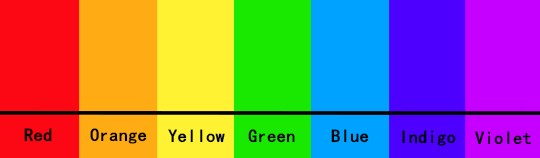

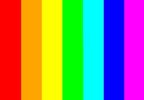
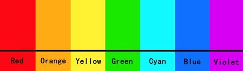
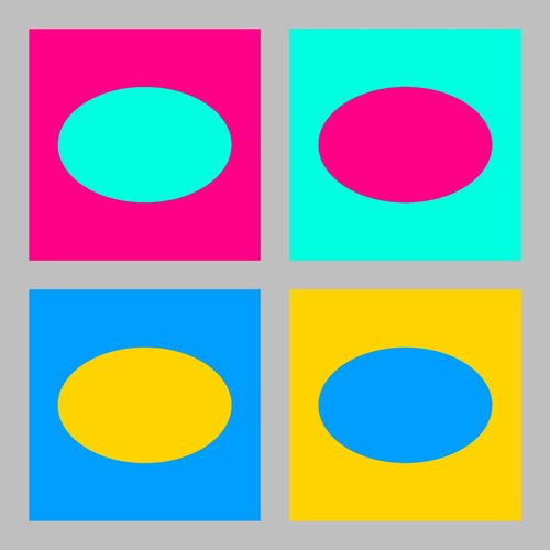
Hue is the attribute that answers the question "what color is it?" — red, orange, yellow, green, blue, violet, or any position around the color wheel — independent of how light, dark, dull, or vivid that color happens to be. A pale pink and a deep maroon can share the same hue, red, while differing completely in value and saturation. Artists organize hues on a wheel because it makes their relationships visible: hues opposite each other are complementary and create maximum contrast when placed side by side, while hues next to each other are analogous and blend harmoniously. Painters choose a hue scheme before ever touching a brush to a value: a warm-dominant palette of reds, oranges, and yellows behaves differently from a cool-dominant one built on blues and greens, regardless of how those colors are later lightened, darkened, or muted. Isaac Newton first arranged the visible spectrum into a circle in 1704, and every color wheel since descends from that basic diagram of pure hue.
How artists use it
Complementary hue pairing
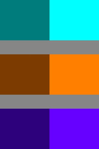
Placing hues from opposite sides of the color wheel, such as red against green or blue against orange, side by side creates the strongest possible contrast, making both hues appear more intense than they would alone.
Analogous hue harmony
Choosing three or four neighboring hues on the wheel, like yellow, yellow-orange, and orange, produces a naturally harmonious palette, since neighboring hues share underlying pigment relationships and rarely clash.
Restricted primary hue palette
Some painters limit an entire canvas to the three primary hues plus black and white, refusing every mixed or intermediate hue, to keep a composition feeling elemental, geometric, and deliberately unnatural.
Triadic hue scheme
Selecting three hues spaced evenly around the wheel, such as red, yellow, and blue, gives a composition strong variety while still feeling balanced, since no single hue family dominates the arrangement.
Optical hue mixing
Rather than premixing paint, some painters set small strokes of two distinct pure hues directly beside each other, letting the eye blend them into a third, more luminous hue at viewing distance.
Local hue exaggeration
Painters sometimes shift an object's actual hue away from reality entirely, painting skin green or shadows purple, using hue choice as pure invention rather than observation.
Instant examples
Hue in famous works, fast
- A rainbow
- → the full visible spectrum of hues arranged in their natural order, the basis of every color wheel.
- A traffic light
- → three distinct hues, red, yellow, green, chosen for maximum visual separation from one another.
- A national flag with blocks of pure color
- → hue used at full clarity, with no blending, to stay instantly identifiable at a distance.
- A printed color wheel
- → primary, secondary, and tertiary hues mapped in a circle showing their relationships.
- Pointillist dot clusters
- → individual pure hues placed side by side rather than premixed.
- A hardware store paint chip strip
- → a single hue shown across a range of lighter and darker tints and shades.
The story
Isaac Newton split sunlight through a prism in the 1660s and, in his 1704 book Opticks, arranged the resulting spectrum of hues into the first scientific color circle, showing that hue is a continuous, ordered property of light. In 1766, the English entomologist Moses Harris published Natural System of Colours, engraving and hand-coloring one of the first printed color wheels to organize primary, secondary, and tertiary hues for artists to use directly. Johann Wolfgang von Goethe pushed back against Newton's purely physical account in his 1810 Theory of Colours, arranging hues around a wheel based on perceived emotional effect rather than wavelength alone. Michel-Eugène Chevreul's 1839 law of simultaneous contrast, developed while overseeing dye production at a Paris tapestry works, explained how adjacent hues alter each other's appearance, directly influencing Georges Seurat and Paul Signac, who built pointillist paintings from small dots of pure, unmixed hue in the 1880s.
The canonical examples
| Work | Artist | Date | Why it matters |
|---|---|---|---|
| Opticks (color circle diagram) | Isaac Newton | 1704 | arranges the seven hues Newton split from sunlight with a prism into the first scientific color wheel |
| Natural System of Colours | Moses Harris | 1766 | one of the first printed color wheels to organize primary, secondary, and tertiary hues into distinct hand-colored wedges |
| Theory of Colours (color wheel diagram) | Johann Wolfgang von Goethe | 1810 | arranges hues around a wheel based on perceived emotional and psychological effect rather than physical wavelength |
| Chromatic circle (De la loi du contraste simultané des couleurs) | Michel-Eugène Chevreul | 1839 | diagrams hue relationships to explain how adjacent colors shift each other's apparent hue and intensity |
| A Sunday Afternoon on the Island of La Grande Jatte | Georges Seurat | 1884–86 | built from tiny dots of distinct, unmixed hues placed side by side so the eye blends them from a distance |
 AI-generated
Try it yourself
Practice hue with AI
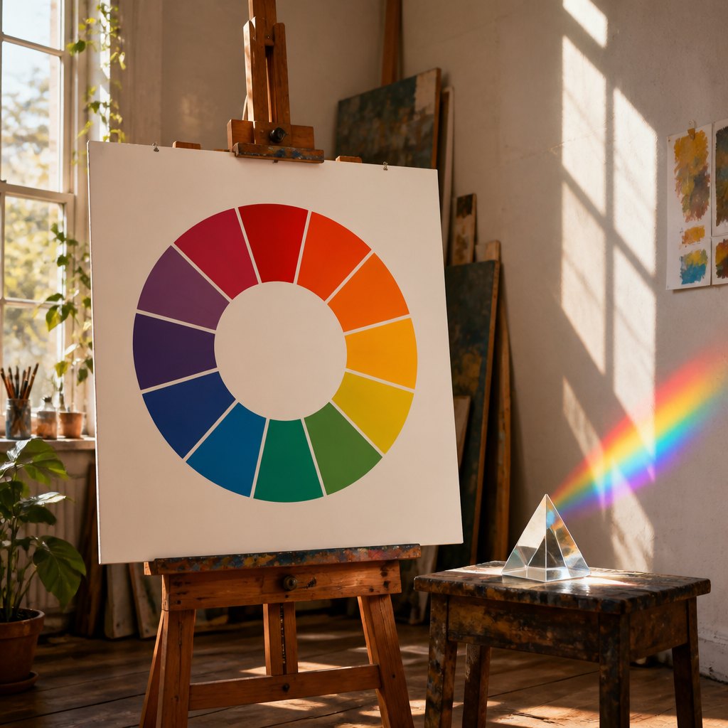
This example was generated from a prompt like: “A large printed color wheel diagram on an easel in a sunlit studio, showing twelve distinct pure hues arranged in a circle, beside a glass prism casting a small rainbow spectrum onto a white wall.”
Open the Hue Art Style generator →The concept today
Digital color pickers still display hue as a circular slider or wheel, the same basic diagram Newton and Moses Harris introduced centuries ago, with saturation and lightness controlled separately. Printers and screens both rely on standardized hue systems, CMYK and RGB, to reproduce color consistently across devices. Brand guidelines specify an exact hue value for a logo the way a paint chip specifies one for a wall, and design software lets anyone rotate a base hue around the wheel to instantly generate a matching complementary or analogous palette.
Compose your own
Draw or print a basic twelve-part color wheel and label the three primary hues, three secondary hues made by mixing two primaries, and six tertiary hues between them. Pick a complementary pair directly across the wheel and paint a small study using only those two hues at varying lightness and dullness. Then try an analogous study using three neighboring hues instead, and compare how much calmer it feels next to the complementary version. Finally, mix a hue's exact opposite into it a little at a time and watch it gray out completely, proving that a hue's identity and its purity are two separate things.
Frequently asked questions
What is hue in art?
Hue is simply which color something is, red, blue, yellow, and so on, independent of how light, dark, or vivid it appears. Two shades can share the same hue while looking completely different in lightness or intensity.
What's the difference between hue, value, and saturation?
Hue is which color it is; value is how light or dark it is; saturation is how pure or dull it is. A single hue, like blue, can be rendered at many different values and saturations without changing which hue it remains.
How does a color wheel organize hue?
A color wheel arranges hues in the spectrum order light naturally splits into, with primary hues equally spaced and secondary and tertiary hues filling the gaps, making complementary and analogous relationships easy to see at a glance.
Why did Georges Seurat paint with tiny dots of pure hue?
Seurat applied contemporary color science by placing small strokes of unmixed, distinct hues directly next to each other rather than premixing paint, letting the viewer's eye blend them optically into more luminous colors from a distance.