 Art
Art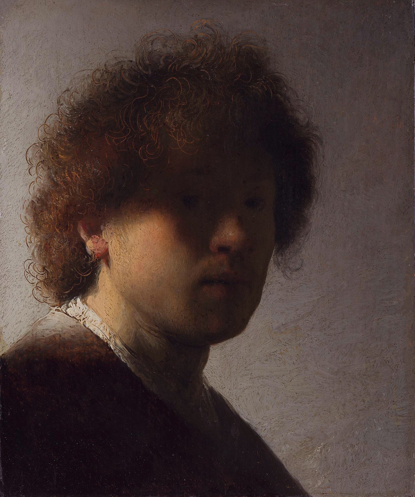
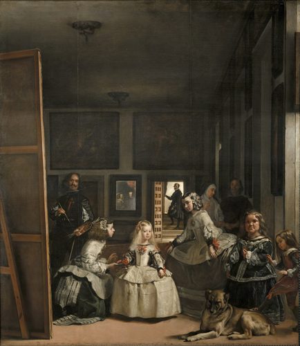
Tint and shade describe what happens when a single hue's value is pushed up or down. Add white and you get a tint — pink is a tint of red, sky blue a tint of blue — lighter, often read as delicate, airy, or distant. Add black and you get a shade — maroon is a shade of red, navy a shade of blue — darker, heavier, often read as somber or receding into shadow. Together they let an artist build a full value range from one pigment, which is exactly how form gets modeled: light striking a sphere pushes the lit side toward tint and the far side toward shade, tricking a flat surface into looking round. Painters also use tint and shade compositionally, saving the brightest tints for a focal point and letting the deepest shades sink into the background, since the eye is always drawn first toward the strongest value contrast on the canvas.
How artists use it
Tenebrist shadow
Caravaggio pushed backgrounds into near-black shade while a narrow shaft of light picked out faces and hands in pale tint, as in The Calling of Saint Matthew. The extreme value gap, not color, is what makes the scene feel theatrical and urgent.
Grisaille underpainting
Northern Renaissance panels were sometimes painted entirely in gray tints and shades to imitate carved stone, as on the closed exterior wings of the Ghent Altarpiece. The technique proves value alone, without any hue, can fully describe form and light.
Value-only studies
Georges Seurat's conté crayon drawings for La Grande Jatte contain no outline at all, only graded pressure building smooth transitions from white paper to deep black. It shows a whole scene can be constructed from tint and shade with zero drawn line.
High-key versus low-key
Whistler's pale Nocturne and Symphony paintings sit high in the value scale, dominated by tints, reading as quiet and airy. Rembrandt's portraits sit low, dominated by shade, reading as grave and weighty — the same tool used for opposite moods.
The squint test
Painters squint at a subject to blur out hue and see only value groupings, deciding where tints and shades belong before color is ever mixed. It is a working habit, not a stylistic choice, used to keep a picture's lights and darks organized.
Modeling local color
A red apple gets a pale pink tint on its lit shoulder and a deep maroon shade where it turns away from the light, while staying recognizably red throughout. This keeps an object's hue identity intact while still describing its three-dimensional form.
Instant examples
Tint and Shade in famous works, fast
- candlelit tenebrism
- → deep shade swallows the background while a tint-lit face or hand glows at the composition's center.
- grisaille church panels
- → a scene painted only in gray tints and shades to mimic carved stone sculpture.
- moonlit seascapes
- → near-black shades render water while pale silvery tints mark moonlight on the waves.
- a value scale swatch chart
- → a white-to-black gradient strip teaching how one hue splits into a full range of tints and shades.
- porcelain skin highlights
- → pale pink tints model the lit planes of a painted face against deeper shaded contours.
- black-and-white photography
- → the same tint-and-shade logic stripped of hue entirely, with value alone doing all the work.
The story
Renaissance painters formalized value control through sfumato, Leonardo da Vinci's smoky blending of light and dark, and through chiaroscuro modeling more broadly. Northern workshops used grisaille, monochrome gray tints and shades, both as finished sculpture-imitation panels and as underpaintings meant to be glazed with color later. The Baroque pushed shade to an extreme: Caravaggio's tenebrism, adopted across Europe by the Caravaggisti after his death in 1610, plunged backgrounds into near-total darkness to isolate figures in tint-lit spotlights. In 1839 Michel-Eugène Chevreul's writings on simultaneous contrast helped separate value from hue as a distinct variable, and in 1905 Albert Munsell's color system formally defined value as one of three independent dimensions alongside hue and chroma, a structure still taught in art schools today.
The canonical examples
| Work | Artist | Date | Why it matters |
|---|---|---|---|
| The Calling of Saint Matthew | Caravaggio | 1599–1600 | a near-black shaded background isolates the figures under a single shaft of tint-lit illumination |
| Ghent Altarpiece (exterior grisaille panels) | Jan van Eyck | 1432 | figures painted entirely in gray tints and shades to imitate carved stone statues |
| Judith Slaying Holofernes | Artemisia Gentileschi | c. 1614–1620 | tenebrist shade dominates the background while tint highlights the struggle at the canvas's core |
| Study for A Sunday on La Grande Jatte | Georges Seurat | 1884 | a conté crayon drawing built entirely from graded value, with no outline at all |
| The Night Watch | Rembrandt | 1642 | a spotlight of tint falls on the central figures while surrounding militia members recede into shade |
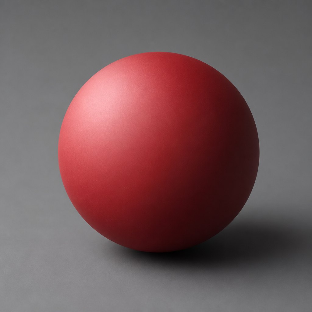 AI-generated
Try it yourself
Practice tint and shade with AI
This example was generated from a prompt like: “A single matte red sphere on a plain gray studio background, lit from the upper left, showing a smooth gradient from a pale pink tinted highlight to a deep maroon shaded edge, no other objects, soft even lighting.”
Open the Tint and Shade Art Style generator →The concept today
Concept artists still block in a picture in pure grayscale, a modern grisaille, before adding any color, because value carries a composition long before hue does. Film noir cinematography leans on the same tenebrist logic as Caravaggio, pooling light against deep shadow. Digital painting software includes dedicated value-only preview modes, and photographers still talk in terms of high-key and low-key lighting when describing a tint-dominant or shade-dominant image.
Compose your own
Paint a value scale strip first: mix one hue, then step it from full white tint down to full black shade in five even stages, so you can see the range you have to work with. Next, paint a simple sphere using only that scale, placing the lightest tint where an imagined light source hits and the deepest shade on the far side, to feel how value alone creates roundness. Try a grisaille exercise: paint a small still life entirely in grays, then glaze thin color over it once the values already read correctly. Finally, squint at a reference photo until color disappears and sketch only the three or four value groups you can still see.
Frequently asked questions
What is the difference between a tint and a shade?
A tint is a hue mixed with white, making it lighter, like pink from red. A shade is a hue mixed with black, making it darker, like maroon from red. Both change value while keeping the same base hue.
What is a tone in color theory?
A tone is a hue mixed with gray, combining both white and black, which lowers its intensity without pushing it strongly toward light or dark. Tints, shades, and tones are the three ways to modify a pure hue's value and saturation.
Why did Renaissance artists paint in grisaille?
Grisaille let artists study or display form using only gray tints and shades, either as a finished imitation of carved stone sculpture, as on Van Eyck's Ghent Altarpiece exterior, or as an underpainting glazed with color afterward.
How does value create the illusion of 3D form on a flat surface?
Light naturally creates a gradient from light to dark across a rounded object. Reproducing that gradient with tints on the lit side and shades on the far side tricks the eye into reading a flat painted shape as three-dimensional.