 Art
Art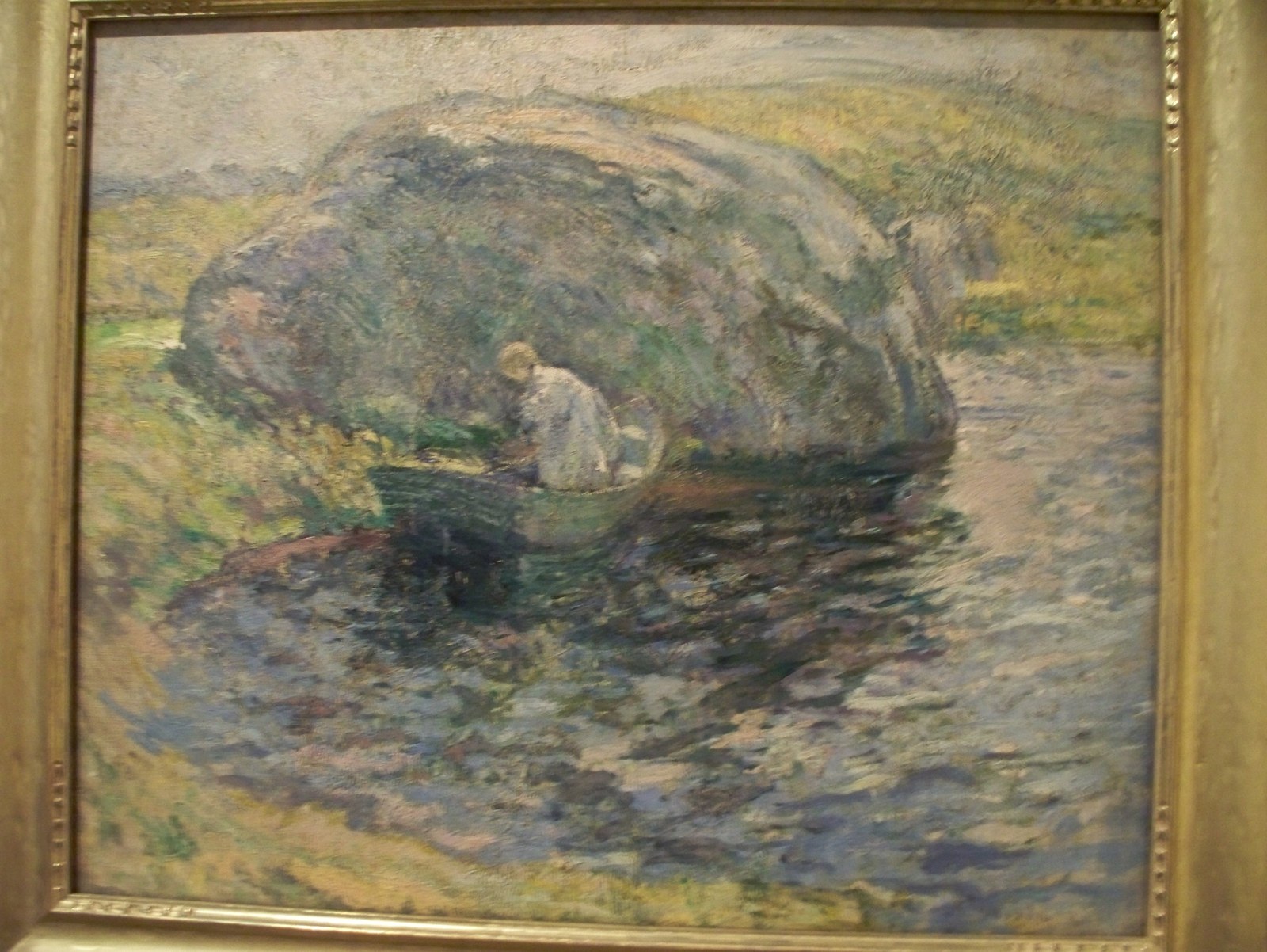
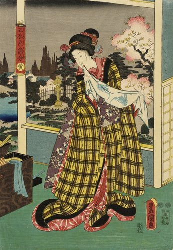
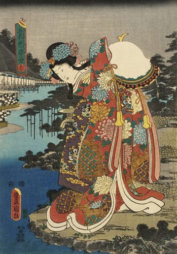
Color harmony is the deliberate arrangement of hues so a composition feels unified rather than jarring. Artists lean on relationships mapped out on the color wheel: analogous harmony pairs neighboring hues like blue, blue-green, and green for a calm, cohesive feel; complementary harmony pairs opposites like red and green in careful proportion so they energize each other without clashing; monochromatic harmony builds an entire image from tints and shades of a single hue; triadic harmony balances three evenly spaced hues. Harmony is not about using few colors, but about making the colors present feel like they belong together, often through repetition — echoing one accent hue in several places across a canvas ties distant areas of the picture into a single visual family. Where contrast pulls the eye apart to create drama, harmony settles it, which is why calm, decorative, or meditative images almost always lean on it.
How artists use it
Analogous grouping
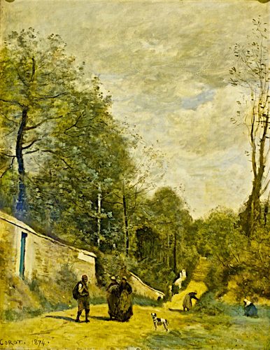
Painters build calm scenes from hues that sit side by side on the wheel, such as yellow, yellow-green, and green in a sunlit field. Because none of the colors fight for attention, the eye reads the whole area as one unified passage rather than competing parts.
Controlled complements
A small dose of an opposite hue, a patch of orange in a mostly blue painting, keeps a limited palette from feeling flat while staying balanced, since the accent occupies far less area than the dominant color. Proportion, not just choice of hue, is what keeps complements harmonious rather than jarring.
Monochromatic restraint
Building an entire canvas from tints and shades of one hue, as in a painting dominated almost entirely by blue, guarantees harmony automatically because every value shares the same underlying color family, with mood carried by value alone.
One dominant hue
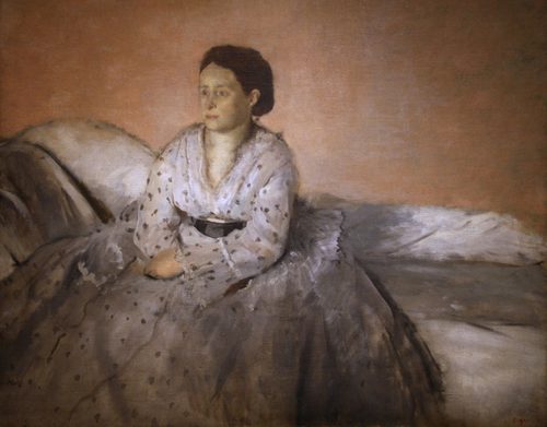
Letting a single color take over most of the canvas, spreading the same red across furniture, walls, and pattern alike, erases the usual visual seams between separate objects and folds the whole composition into one continuous field of color.
Repeating an accent
Scattering a single accent hue in several small spots across an otherwise varied palette, a fleck of gold echoed in three corners of a canvas, quietly stitches distant areas of the composition together without the viewer noticing why.
Balanced triads
Three hues spaced evenly around the wheel, such as red, yellow, and blue, stay harmonious when their proportions are uneven, with one hue dominant and the other two used sparingly as accents rather than in equal amounts.
Instant examples
Color Harmony in famous works, fast
- Japanese woodblock prints
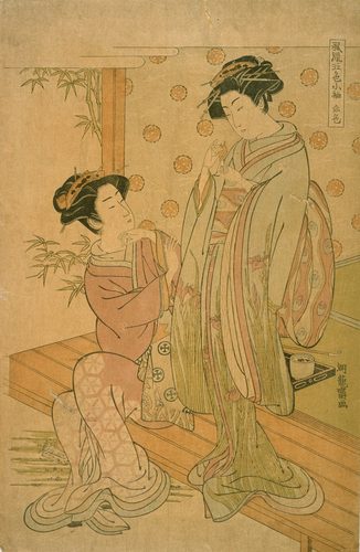
- → a deliberately limited indigo-and-cream palette keeps an entire scene visually unified.
- Klimt's gold-ground portraits
- → monochromatic gold tones across figure and background merge the sitter into a single decorative field.
- Impressionist wheat fields
- → analogous yellows and yellow-greens sit side by side to read as one sunlit, harmonious mass.
- a red interior painting
- → one dominant hue spread across every surface dissolves the usual boundaries between objects.
- pointillist beach scenes
- → tiny dots of complementary color sit close together and optically blend into a balanced whole.
- art nouveau posters
- → flat, harmonious color areas paired with sinuous line keep a decorative design feeling calm.
The story
Michel-Eugène Chevreul's 1839 study of simultaneous contrast, written while he oversaw dye production at a French tapestry works, gave artists a scientific vocabulary for how neighboring colors affect one another, directly shaping how the Impressionists and later Georges Seurat arranged hues for maximum harmony through optical mixing. The mid-19th-century arrival of Japanese woodblock prints in Europe, a wave later called Japonisme, introduced Western artists to restrained, harmonious palettes built from a handful of flat colors rather than a full naturalistic range. Henri Matisse and the Fauves pushed harmony toward boldness rather than subtlety, with Matisse titling an entire 1908 canvas Harmony in Red. In the 1920s, Johannes Itten's teaching at the Bauhaus formalized specific harmony schemes, analogous, complementary, triadic, and split-complementary, into a structured curriculum still used in art and design education.
The canonical examples
| Work | Artist | Date | Why it matters |
|---|---|---|---|
| The Great Wave off Kanagawa | Katsushika Hokusai | c. 1831 | varying tints and shades of Prussian blue unify sky, sea, and foam into one harmonious limited palette |
| The Kiss | Gustav Klimt | 1907–08 | the figures and background share the same golden tones, creating harmony through near-monochromatic color |
| Harmony in Red (The Dessert) | Henri Matisse | 1908 | one dominant red is spread across tablecloth, wall, and pattern alike, unifying the entire canvas |
| A Sunday Afternoon on the Island of La Grande Jatte | Georges Seurat | 1884–86 | small dots of complementary color sit adjacent and optically blend into a balanced overall palette |
| Nocturne in Black and Gold – The Falling Rocket | James McNeill Whistler | 1875 | a narrow, dark tonal range with small gold accents keeps the entire nocturnal scene harmonious |
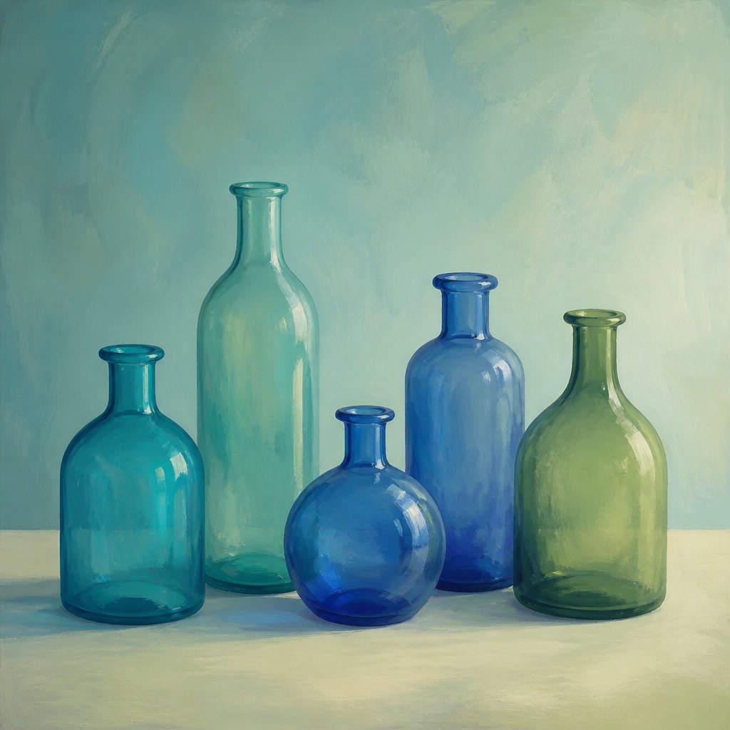 AI-generated
Try it yourself
Practice color harmony with AI
This example was generated from a prompt like: “A simple still life of glass bottles in teal, blue, and green sitting on a plain pale surface, softly lit, all colors drawn from neighboring positions on the color wheel, calm and cohesive, no other objects.”
Open the Color Harmony Art Style generator →The concept today
Color harmony now drives brand identity, app design, and interior mood boards as directly as it once drove fine painting; digital color-wheel tools let designers generate analogous, complementary, or triadic palettes with one click. Instagram-era photography and home decor both favor tightly harmonized, near-monochromatic palettes as a visual signature. Concept artists building a scene's mood almost always start by locking a limited harmonious palette before adding detail, since an inconsistent palette reads as unfinished no matter how refined the linework is.
Compose your own
Pick three neighboring colors on a wheel, blue, blue-green, and green, and paint a small still life using only those hues plus their tints and shades, to feel how analogous harmony holds together automatically. Then repeat the exercise with a dominant hue and one small complementary accent, adjusting the accent's size until it enlivens the painting without unbalancing it. Try a strict monochromatic study next, building an entire image from tints and shades of a single color. Finally, take a finished multicolor painting and check whether one hue reappears in at least three separate places; if not, add a small echo of it somewhere and see how the composition tightens.
Frequently asked questions
What is color harmony in art?
Color harmony is the arrangement of hues within a composition so they feel visually balanced and pleasing together, usually achieved through analogous, complementary, monochromatic, or triadic relationships mapped on the color wheel.
What are the main types of color harmony?
The most common types are analogous (neighboring hues), complementary (opposite hues in careful proportion), monochromatic (one hue in varied tints and shades), and triadic (three evenly spaced hues).
How did Japanese prints influence Western color harmony?
Japanese woodblock prints, widely collected in Europe from the mid-1800s, showed Western artists how a restrained, flat, limited palette could feel more harmonious than fully naturalistic color, influencing painters like those in the Impressionist circle.
What's the difference between color harmony and color contrast?
Harmony arranges colors so they feel unified and calm together, while contrast places colors so they visually push against each other for drama or emphasis. Most successful paintings use a harmonious base palette with small areas of contrast.