 Art
Art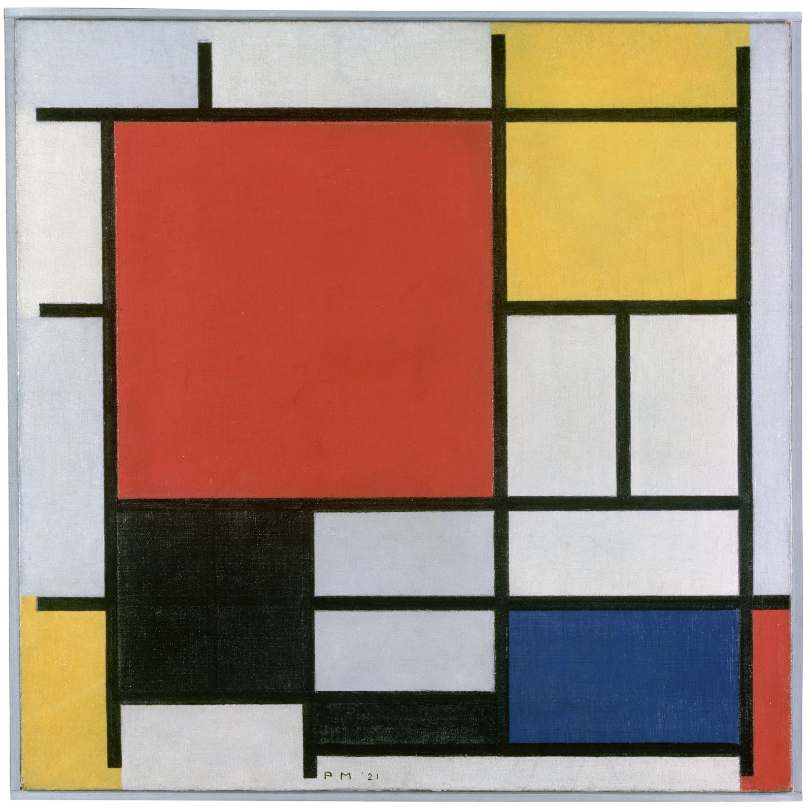
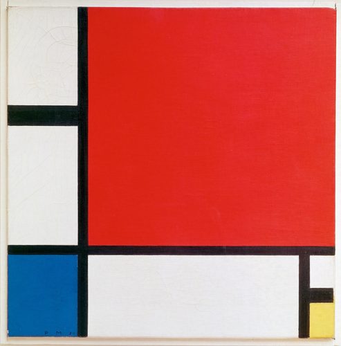
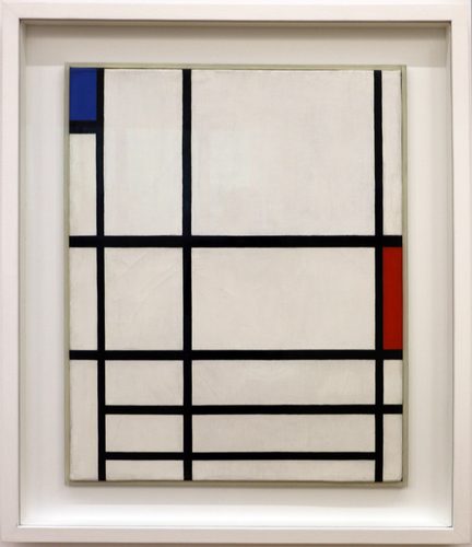
In traditional pigment-based color theory, red, yellow, and blue are the primary colors: hues that cannot be produced by combining any other paints, yet which combine with one another to produce every secondary color, orange, green, and violet, and by extension every tertiary color a painter needs. Because they sit at the root of the whole color wheel, primaries carry a sense of directness and boldness that mixed colors rarely match, which is why they show up constantly in flat design, signage, and children's materials as well as fine art. Some 20th-century movements treated the primary triad as more than a mixing tool: the Dutch De Stijl group restricted their palette to red, yellow, and blue alongside black, white, and gray, arguing that this reduced set represented a universal visual language stripped of decoration, national style, or personal taste. Used this way, primary colors become less about naturalism and more about clarity, structure, and geometric order.
How artists use it
The De Stijl reduction
Piet Mondrian and Theo van Doesburg limited their palettes to red, yellow, and blue plus black, white, and gray, arguing this stripped-down set achieved a universal visual order free of personal or national style, visible across their grid-based abstract compositions.
Flat, unmodulated blocks
Primary colors are typically applied as large, even, unshaded areas rather than blended or modeled with light and shadow. The flatness keeps each hue reading at full strength, which is part of why primary-based compositions feel so direct and graphic.
Primaries in three dimensions
De Stijl ideas moved off canvas into furniture and architecture, with painted wooden panels assigned to red, blue, yellow, and black much as a painting's rectangles would be, proving the same color logic could organize a physical object as easily as a flat picture.
Uneven proportion for balance
A composition built only from primaries stays visually dynamic, rather than static or garish, when the three hues appear in unequal amounts, one color dominant, the others reduced to small accents, rather than being spread in equal thirds across the surface.
Teaching the color wheel
Art instruction almost always begins with the primary triad, showing students that yellow and blue make green, red and yellow make orange, and red and blue make violet, before introducing tints, shades, and more complex mixtures built from that same base.
Primaries versus print primaries
The artist's red-yellow-blue triad is a pigment-mixing convention, while commercial printing instead relies on cyan, magenta, and yellow as its subtractive primaries, and screens rely on red, green, and blue light as additive primaries, a distinction worth knowing when the term shows up outside painting.
Instant examples
Primary Colors in famous works, fast
- Mondrian grid paintings
- → flat rectangles of red, yellow, and blue separated by heavy black lines, the clearest shorthand for primary color theory.
- De Stijl furniture
- → painted wooden chairs and cabinets with distinct planes in red, blue, and yellow translating painting theory into objects.
- De Stijl architecture
- → buildings with structural beams or window frames picked out in primary colors against neutral walls.
- children's building block sets
- → toys deliberately limited to red, yellow, and blue as the simplest, most legible color set for early learning.
- a color-wheel diagram
- → red, yellow, and blue placed at three evenly spaced points as the root from which every other hue is mixed.
- Bauhaus geometric abstraction
- → primary hues assigned to basic shapes, with color and form treated as directly linked variables.
The story
The idea of a small set of colors from which all others can be mixed goes back to early color-wheel theorists, refined through the 18th and 19th centuries as painters' workshops standardized red, yellow, and blue as the practical pigment primaries, distinct from the physicist's primaries of light. The concept became a movement's philosophy in 1917, when Theo van Doesburg founded the journal De Stijl in the Netherlands alongside Piet Mondrian, arguing that restricting a composition to primary colors plus black, white, and gray achieved a universal, almost spiritual visual order beyond individual style. Wassily Kandinsky, teaching color theory at the Bauhaus in the 1920s, explored the same triad's expressive and symbolic weight, pairing it with his interest in geometric abstraction. The De Stijl approach extended beyond painting into Gerrit Rietveld's furniture and architecture in the 1920s, cementing primary color reduction as a recognizable strand of early modernist design.
The canonical examples
| Work | Artist | Date | Why it matters |
|---|---|---|---|
| Composition with Red, Yellow, and Blue | Piet Mondrian | 1930 | flat rectangles of pure red, yellow, and blue are divided by thick black grid lines, the archetypal primary-color composition |
| Broadway Boogie Woogie | Piet Mondrian | 1942–43 | small squares of red, yellow, and blue replace Mondrian's usual black grid lines, evoking Manhattan's street pattern and jazz rhythm |
| Composition VIII (The Cow) | Theo van Doesburg | 1918 | an abstracted cow is reduced to geometric planes filled with red, yellow, blue, black, and white |
| Yellow-Red-Blue | Wassily Kandinsky | 1925 | geometric and biomorphic forms are organized into zones dominated in turn by yellow, red, and blue, the three hues named in its title |
| Red and Blue Chair | Gerrit Rietveld | 1917–23 | a wooden chair's flat structural planes are painted red, blue, yellow, and black, applying De Stijl color theory to a real object |
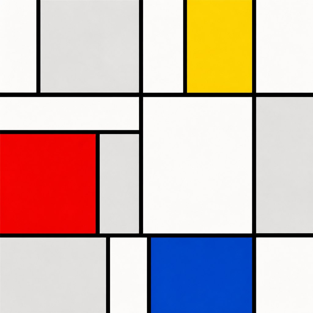 AI-generated
Try it yourself
Practice primary colors with AI
This example was generated from a prompt like: “A flat geometric abstract composition on white background, divided into uneven rectangles by thick black lines, most rectangles left white or light gray, three of them filled solid with pure red, yellow, and blue, De Stijl style.”
Open the Primary Colors Art Style generator →The concept today
Primary colors remain a default choice wherever instant legibility matters more than subtlety: safety signage, children's products, sports team kits, and flat digital interface design all lean on saturated red, yellow, and blue because they read clearly at a glance and mix logically for anyone learning color from scratch. Graphic designers still cite De Stijl and Bauhaus color reduction as a direct influence when building bold, geometric branding systems.
Compose your own
Start with only three tubes of paint, red, yellow, and blue, plus white and black, and mix every secondary and tertiary hue you can from that limited set before reaching for any pre-mixed color. Then build a small De Stijl-style grid drawing, dividing a rectangle into uneven blocks and filling most of them with white or gray while reserving red, yellow, and blue for only a few accent shapes. Try assigning each primary a mood, the way Kandinsky treated color symbolically, and build a simple geometric abstraction around that idea. Finally, compare your painter's primary mixes against a screen's red-green-blue light mixing to see how the two systems behave differently.
Frequently asked questions
What are the primary colors in art?
In traditional painting, the primary colors are red, yellow, and blue. They cannot be mixed from other pigments, but combining pairs of them produces the secondary colors orange, green, and violet.
Why did Mondrian use only primary colors?
Mondrian, alongside Theo van Doesburg's De Stijl movement, believed restricting a painting to red, yellow, and blue plus black, white, and gray achieved a universal visual order free of personal style, decoration, or national identity.
What's the difference between primary colors in paint and in light?
Painters mix pigments using red, yellow, and blue as subtractive primaries, where mixing colors removes light and darkens the result. Screens instead mix red, green, and blue light additively, where combining colors adds brightness.
Can every color be mixed from just red, yellow, and blue?
In practice, artists can mix a wide range of secondary and tertiary colors from the three primaries plus white and black, though real pigments have impurities that keep the mixes from matching a pure theoretical color wheel exactly.