 Art
Art
Secondary colors — orange, green, and violet (purple) — sit exactly between the three primaries on the color wheel, formed when two primaries are mixed in equal measure: red and yellow make orange, yellow and blue make green, and blue and red make violet. Unlike primaries, secondaries are produced on an artist's own palette rather than bought as a base pigment, which is why color theory treats them as a test of mixing skill. On the wheel, each secondary sits directly opposite the one primary that wasn't used to make it, so orange opposes blue, green opposes red, and violet opposes yellow — the classic complementary pairs painters exploit for maximum contrast. Secondaries can also be mixed optically instead of physically: pointillists placed small dots of two primaries side by side and let the eye blend them into a secondary from a distance. Because they read warmer or cooler depending on their primary ratio, secondaries give painters a far wider palette than the three primaries alone allow.
How artists use it
Complementary clash
Vincent van Gogh built The Night Café around a green billiard table set against blood-red walls, saying the pairing could express 'the terrible passions of humanity.' Green, mixed from yellow and blue, sits directly opposite red on the wheel, so the contrast reads as maximum visual tension.
Fauvist non-naturalism
Henri Matisse painted his wife's face in Woman with a Hat with patches of green, orange, and lavender unrelated to actual skin tone. The Fauves used secondary colors as pure sensation rather than description, letting a green shadow or orange cheek carry emotional heat over anatomy.
Optical mixing
Georges Seurat built the grass and shadows of A Sunday on La Grande Jatte from thousands of tiny dots of pure yellow and blue, letting the viewer's eye fuse them into green from a distance rather than mixing the paint on a palette first.
Decorative secondary contrast
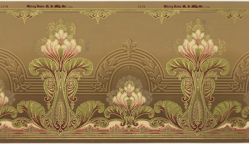
Alphonse Mucha's Art Nouveau posters, such as Job, set swirling golden-orange hair against soft lavender-purple backgrounds, pairing two secondaries a third of the wheel apart for decorative harmony rather than tension — ideal for advertising design.
Secondary as atmosphere
Claude Monet centered Impression, Sunrise on a single dab of pure orange sun hovering over a hazy blue-green harbor, letting one small warm patch of secondary color anchor an otherwise loosely brushed, atmospheric scene.
Cloisonnist flat fields
Paul Gauguin flooded the ground of Vision after the Sermon with flat, unmodulated orange-red bordered in black outline, using secondary color as symbolic space rather than natural description, in the Cloisonnist manner he pioneered with Émile Bernard.
Instant examples
Secondary Colors in famous works, fast
- The orange sun in Impression, Sunrise
- → warmth and light — a single dab of pure secondary orange anchors an otherwise hazy blue-green harbor scene.
- Purple twilight skies in landscape painting
- → dusk and mystery — violet, the coolest secondary, is traditional shorthand for the last light of day.
- Green foliage in classical landscapes
- → nature and growth — green, mixed from yellow and blue, is the default secondary for depicting plant life.
- Orange autumn leaves in seasonal scenes
- → change and warmth — orange marks the turn from summer green toward winter's cooler palette.
- Purple royal robes in portraiture
- → status and wealth — violet pigment was historically costly, so painters used it to signal nobility.
- Van Gogh's green billiard table
- → tension — paired with red walls in The Night Café, it shows maximum complementary contrast at work.
The story
Isaac Newton's 1666 color circle first placed mixed hues between the primaries that made them. Johann Wolfgang von Goethe's 1810 Theory of Colours and chemist Michel-Eugène Chevreul's 1839 law of simultaneous contrast, developed while overseeing dyes at the Gobelins tapestry works, gave painters a scientific basis for why complementary secondaries seemed to vibrate against each other. The Impressionists applied broken color in the 1870s, and Georges Seurat pushed the idea further in the 1880s with pointillism, mixing secondaries optically rather than on the palette. In 1905 a group nicknamed 'Fauves,' or wild beasts, including Matisse, exhibited canvases at the Salon d'Automne built from unmixed, non-naturalistic secondary color. Around the same years, Alphonse Mucha's Art Nouveau posters turned secondary harmonies into commercial decoration, and Johannes Itten's 1921 Bauhaus color wheel formalized the primary-secondary-tertiary system still taught today.
The canonical examples
| Work | Artist | Date | Why it matters |
|---|---|---|---|
| Impression, Sunrise | Claude Monet | 1872 | a single dab of pure orange sun glows against a hazy blue-green harbor, the painting's only saturated secondary |
| The Night Café | Vincent van Gogh | 1888 | a green billiard table clashes against red walls, exploiting the green-red complementary pair for deliberate unease |
| Woman with a Hat | Henri Matisse | 1905 | the sitter's face and hat are built from non-naturalistic patches of green, orange, and violet |
| Vision after the Sermon | Paul Gauguin | 1888 | a flat, unmodulated orange-red ground fills most of the canvas, outlined in black in the Cloisonnist manner |
| Job | Alphonse Mucha | 1896 | golden-orange hair swirls against a lavender-purple ground, pairing two secondaries for decorative harmony |
 AI-generated
Try it yourself
Practice secondary colors with AI
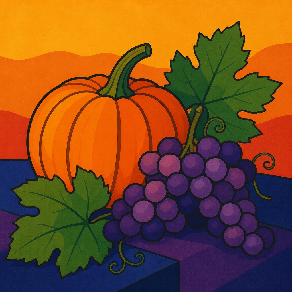
This example was generated from a prompt like: “A flat still-life illustration of an orange pumpkin, green leaves, and purple grapes arranged on a table against a warm gradient background, poster-style flat color, bold outlines, saturated secondary color palette.”
Open the Secondary Colors Art Style generator →The concept today
Digital color pickers let anyone drag a slider straight to a precise orange, green, or violet, replacing the physical mixing that once demanded skill. Brand and packaging design still leans on secondary psychology, orange for energy and approachability, purple for luxury, green for growth or eco-friendliness. Video game and app icon design frequently pairs a secondary with its complementary primary for instant visual pop on small screens, a direct descendant of Chevreul's nineteenth-century contrast theory.
Compose your own
Mix all three secondaries from only red, yellow, and blue paint before touching a tube of premixed orange or green — noticing how the ratio shifts a green toward yellow or blue teaches more than any wheel diagram. Try an optical-mixing exercise: place small dots of two primaries side by side on paper and view them from across the room. Paint one small study using only a secondary and its complementary primary to feel how much contrast that single pairing generates. Finally, limit an entire sketch to one secondary color in varying values, forcing you to build form from light and dark alone.
Frequently asked questions
What are examples of secondary colors in famous paintings?
Van Gogh's The Night Café uses a green billiard table against red walls, Matisse's Woman with a Hat is built from non-naturalistic orange and violet patches, and Monet's Impression, Sunrise centers on a single dab of pure orange sun.
What is the difference between primary and secondary colors?
Primary colors (red, yellow, blue) can't be mixed from other colors and are the wheel's starting points. Secondary colors (orange, green, violet) are made by mixing two primaries together in equal amounts.
Why do orange and blue look good together in art?
Orange and blue are complementary — directly opposite each other on the color wheel because blue is the one primary not used to make orange. Placing them side by side creates the strongest possible visual contrast.
How do painters mix secondary colors from paint?
Orange comes from mixing red and yellow, green from yellow and blue, and violet from blue and red. The exact ratio of the two primaries determines whether the resulting secondary leans warmer or cooler.