 Art
Art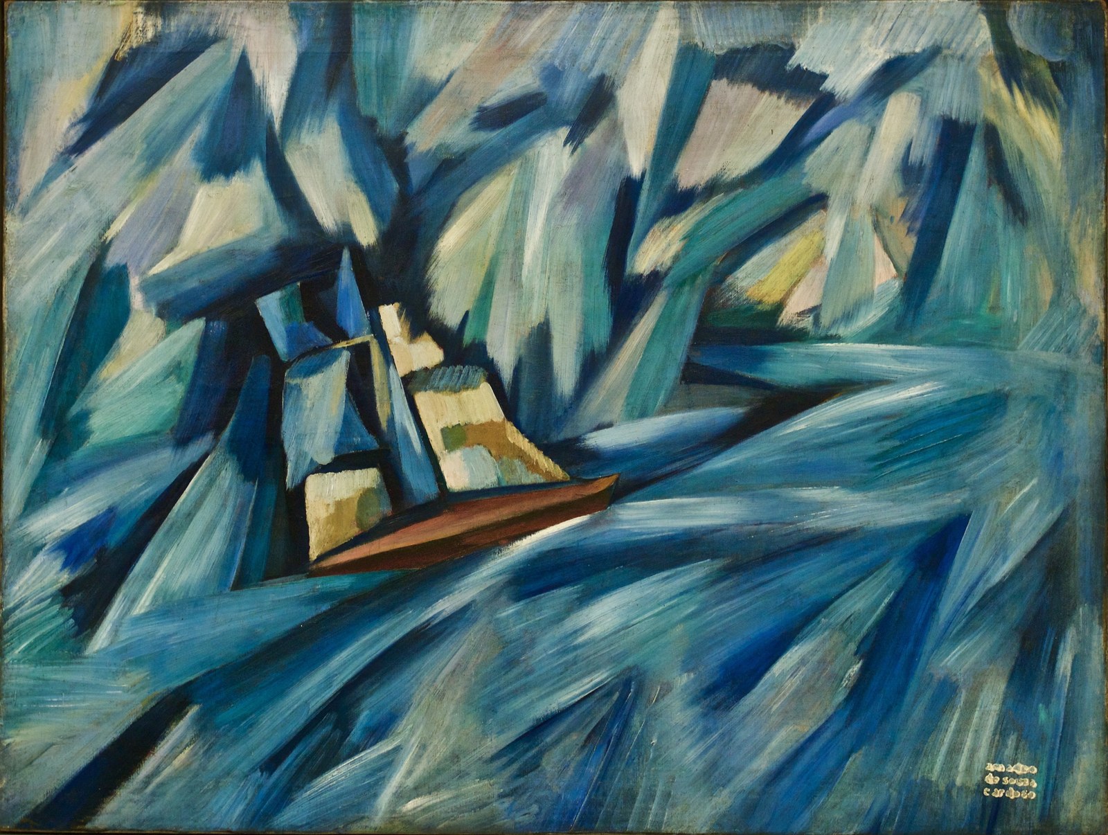
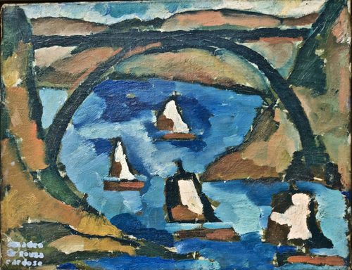
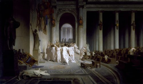
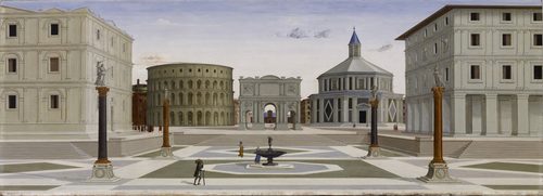
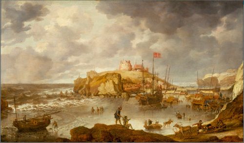
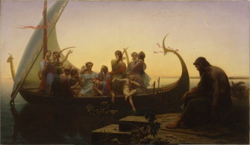
Depth in art is the set of tricks a painter uses to make a flat surface feel like it contains real space. Since a canvas or panel has no actual third dimension, artists fake it through several overlapping cues: linear perspective, where parallel lines appear to converge toward a vanishing point; overlapping, where a nearer object simply blocks part of a farther one; diminishing scale, where identical objects shrink as they recede; and atmospheric (or aerial) perspective, where distant forms lose contrast, sharpness, and warm color as haze and air thicken between them and the viewer. Foreshortening compresses a single object, like an outstretched arm, along the sightline to make it appear to project toward or away from us. None of these are optional extras — they are the vocabulary that lets a two-dimensional picture convincingly represent a road, a room, or a mountain range receding for miles.
How artists use it
Linear perspective
Raphael's School of Athens uses a coffered barrel vault whose orthogonal lines converge precisely behind Plato and Aristotle at the painting's center. Architecture becomes a geometric machine for depth, funneling the eye straight to the philosophical heart of the fresco.
Atmospheric perspective
In Caspar David Friedrich's Wanderer above the Sea of Fog, distant mountain ridges dissolve into pale, cool, low-contrast shapes behind a layer of mist. The technique mimics how real air scatters light over distance, softening color and detail the farther something sits from the viewer.
Overlapping forms
Pieter Bruegel the Elder stacks hunters, trees, frozen ponds, and distant villages in Hunters in the Snow so each layer partially blocks the one behind it. This simplest of depth cues needs no math at all, just a clear sense of what sits in front of what.
Diminishing scale
Meindert Hobbema lines The Avenue at Middelharnis with tall, identical poplars that shrink steadily toward a distant church tower. The repeated, shrinking rhythm of the trees turns a flat Dutch road into a corridor plunging deep into the picture.
Foreshortening
Andrea Mantegna paints the dead Christ from the soles of his feet in The Lamentation over the Dead Christ, compressing the body's length so it reads as lying flat, receding sharply away from the viewer rather than stretched sideways across the panel.
Tonal recession
Painters routinely soften edges and lower contrast for distant elements while keeping foreground shapes crisp and dark-against-light. This value gradation alone, independent of color, is often enough to make a background feel convincingly farther away.
Instant examples
Depth in famous works, fast
- A road narrowing to a point on the horizon
- → linear perspective — parallel edges appear to meet at a single vanishing point far in the distance.
- Pale blue-gray mountains behind green foreground hills
- → atmospheric perspective — haze cools and lightens color the farther a form sits from the viewer.
- One tree trunk partly hidden behind another
- → overlapping — the simplest depth cue, needing no perspective math, just occlusion.
- A row of identical lampposts shrinking into the distance
- → diminishing scale — equal objects appear smaller as they recede from the viewer.
- An arm or leg pointing straight at the viewer, compressed
- → foreshortening — a form is shortened along the sightline to suggest it projects into space.
- Sharp, dark foreground contrasted with soft, pale background
- → tonal recession — reduced contrast and detail signal that a shape is farther away.
The story
Illusionistic depth became a science in early Renaissance Florence: Filippo Brunelleschi demonstrated a mathematically correct vanishing-point system around 1415, and Leon Battista Alberti codified linear perspective in his 1435 treatise Della Pittura. Leonardo da Vinci separately described aerial perspective, noting how distance mutes color and softens edges. Northern and Dutch landscape painters of the 1600s, including Hobbema and Bruegel's generation, pushed deep, layered space into everyday scenery rather than sacred architecture. Baroque artists exploited steep diagonal recession for drama, while 19th-century Romantic and Hudson River School painters used vast atmospheric depth to evoke the sublime. Impressionists loosened precise perspective but kept atmospheric color shifts, and by the early 20th century modernists like Cézanne and the Cubists began deliberately dismantling depth in favor of a flatter picture plane.
The canonical examples
| Work | Artist | Date | Why it matters |
|---|---|---|---|
| School of Athens | Raphael | 1509–1511 | coffered vaulted architecture converges toward a vanishing point behind the central figures |
| The Avenue at Middelharnis | Meindert Hobbema | 1689 | two rows of tall trees shrink steadily toward a distant church, plunging the eye down the road |
| Hunters in the Snow | Pieter Bruegel the Elder | 1565 | overlapping layers of figures, ponds, and hills recede into a hazy, pale valley |
| The Lamentation over the Dead Christ | Andrea Mantegna | c. 1480 | the body is painted from the feet upward, sharply foreshortened to suggest deep recession |
| Wanderer above the Sea of Fog | Caspar David Friedrich | 1818 | mist swallows distant ridgelines, using atmospheric perspective to suggest vast, hazy space |
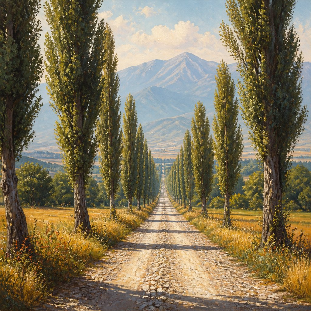 AI-generated
Try it yourself
Practice depth with AI
This example was generated from a prompt like: “A gravel road bordered by tall poplar trees converging toward a distant hazy blue mountain range, warm detailed foreground fading to pale cool color in the distance, clear single-point perspective, painterly landscape, soft atmospheric haze.”
Open the Depth Art Style generator →The concept today
Depth cues now drive game environments, where parallax scrolling and fog effects mimic atmospheric perspective in real time, and film backgrounds still rely on scale and haze to sell distance on a flat screen. Photographers control depth of field to blur backgrounds the way painters once softened distant hills. Product and UI designers borrow drop shadows and layered planes to suggest depth on a flat interface, and VR now renders true stereoscopic depth, the technology every painted illusion was reaching for.
Compose your own
Draw a straight road or hallway and mark a single vanishing point on the horizon; connect every edge to it and watch instant depth appear. Add a row of repeating objects, like fence posts or trees, and shrink each one slightly as it moves back. Overlap two similar shapes so one clearly sits in front of the other. Then desaturate and lighten anything meant to read as far away while keeping foreground elements dark and crisp. Finally, try foreshortening a simple object, like a book or an arm, by drawing it end-on rather than from the side, and notice how much it fights the flatness of the page.
Frequently asked questions
What techniques create depth in a painting?
The main techniques are linear perspective (converging lines to a vanishing point), atmospheric perspective (distant forms losing contrast and warm color), overlapping shapes, diminishing scale, and foreshortening, which compresses a form along the viewer's sightline.
What is atmospheric perspective and how does it create depth?
Atmospheric perspective describes how real air and haze scatter light, making distant objects appear paler, cooler, and less detailed. Painters copy this effect deliberately, softening and desaturating background elements so they read as farther away.
Who invented linear perspective in art?
Filippo Brunelleschi demonstrated a working vanishing-point system around 1415 in Florence, and Leon Battista Alberti wrote the first formal explanation of linear perspective in his 1435 treatise Della Pittura, standardizing it for painters.
What's the easiest way to add depth to a flat drawing?
Overlap shapes so one clearly sits in front of another, and shrink and soften anything meant to look far away. These two cues alone create a convincing sense of depth without needing precise perspective construction.