 Art
Art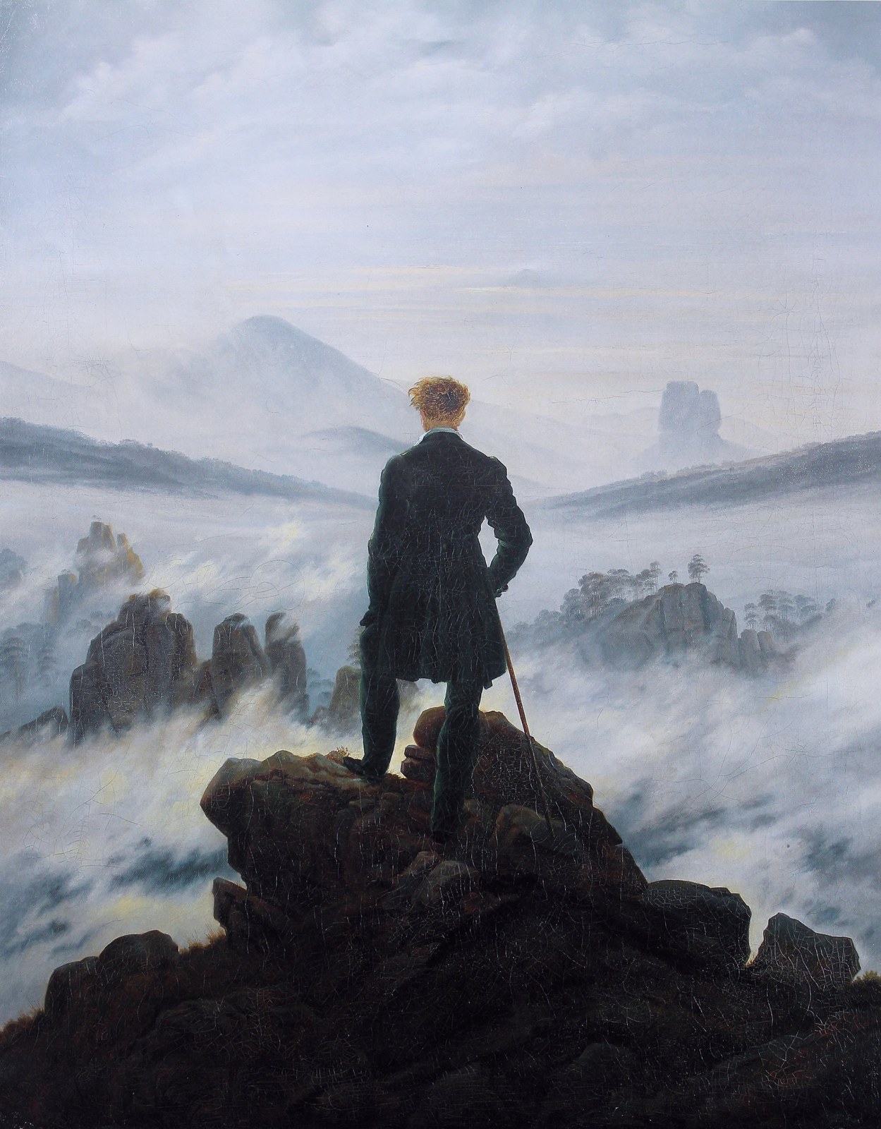
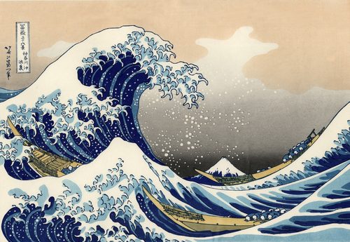
The rule of thirds divides a picture into a 3x3 grid using two evenly spaced horizontal lines and two vertical lines. The idea is that placing important elements — a horizon, a face, a tree, a boat — along those lines, or better yet at one of the four intersections, produces a livelier, more balanced composition than centering everything. A horizon dropped to the bottom third emphasizes sky and drama; pushed to the top third, it emphasizes foreground and ground. A portrait subject whose eyes fall near an upper intersection feels alert and engaging rather than stiff. The grid is a rough, easy-to-eyeball approximation of the golden ratio, which is why most camera viewfinders and phone apps now overlay it by default. It isn't a law — plenty of great pictures center a subject deliberately for symmetry or solemnity — but it remains the fastest compositional check an artist or photographer can run before pressing a shutter or lifting a brush.
How artists use it
Low horizon, big sky
Dutch Golden Age landscapists such as Jacob van Ruisdael habitually dropped the horizon to the bottom third of the canvas, giving billowing clouds two-thirds of the picture's real estate. The technique turns weather and light into the actual subject, with land reduced to a narrow supporting strip.
High horizon, deep ground
Pushing the horizon up into the top third instead lets a painter fill the frame with rolling fields, a winding road, or a crowded market, giving foreground detail more room to breathe. The sky shrinks to a sliver, and the viewer's attention drops immediately into the terrain.
Face on the line
In Vermeer's Girl with a Pearl Earring, the sitter's turned face and glinting earring sit near an upper intersection point of the frame rather than dead center, which is part of why the gaze feels so immediate and alert rather than posed and static.
Deliberate symmetry
Some artists reject the grid on purpose. Formal portraiture, religious icons, and architectural facades often center the subject exactly, using symmetry to project calm, authority, or stillness — a reminder that the rule of thirds is a tool, not a requirement.
Serial variation
Claude Monet's grainstack paintings of 1890–91 repeat the same low horizon and off-center haystack across dozens of canvases, changing only light and season. The steady thirds-based placement lets color and atmosphere carry all the variation instead.
The camera grid
Modern photographers rarely calculate proportions by hand; nearly every digital camera and phone app overlays a 3x3 grid directly onto the live viewfinder, letting a shooter nudge a horizon or a face onto a line in real time before the shutter fires.
Instant examples
Rule of Thirds in famous works, fast
- The horizon line in a seascape
- → pushed to a lower or upper third rather than centered, to weight the composition toward sky or water on purpose.
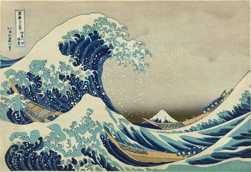
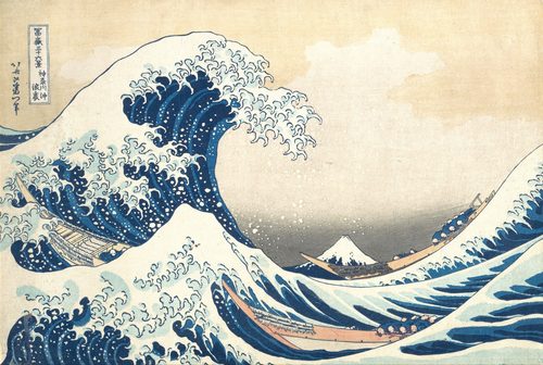
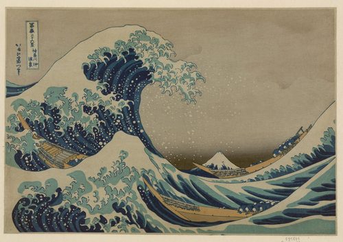
- The Great Wave off Kanagawa
- → Mount Fuji sits small in a distant third of the print while the curling wave dominates the rest of the frame.
- Girl with a Pearl Earring
- → her eye and the pearl sit near an upper-third intersection, anchoring the viewer's gaze off dead center.
- A haystack in a Monet field
- → the stack itself sits off to one side third of the canvas, never centered, letting sky or field dominate.
- Eyes on the upper third line
- → a common portrait guideline: aligning the eyes to the top grid line, not the vertical center, for a livelier crop.
- The 3x3 grid overlay
- → the nine-box grid built into camera viewfinders and phone apps, turning a painter's habit into a one-tap guide.
The story
Painters balanced horizons and figures off-center long before anyone named the habit, but the phrase is often traced to English engraver John Thomas Smith, whose 1797 book Remarks on Rural Scenery advised dividing a landscape roughly two parts to one between land and sky rather than splitting it evenly. The proportion it approximates sits close to the golden ratio's 1.618, making it a simplified stand-in for a balance artists had already been eyeballing since the Renaissance. Dutch Golden Age landscapists and later Romantic painters such as Caspar David Friedrich placed horizons and figures off-center by instinct. Photography adopted the term explicitly in the twentieth century as a teaching shortcut, and by the digital era camera makers built the 3x3 grid directly into viewfinders and smartphone screens, turning a rough painter's habit into an instant overlay anyone could use.
The canonical examples
| Work | Artist | Date | Why it matters |
|---|---|---|---|
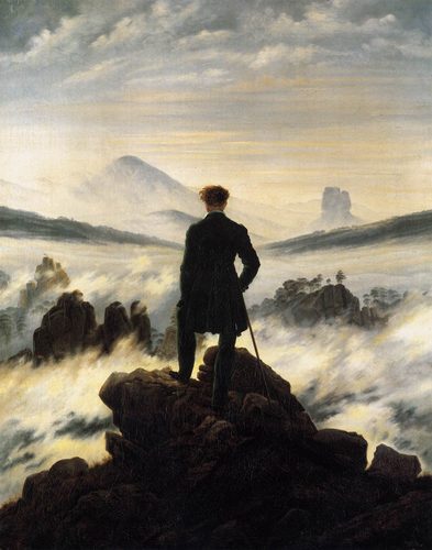
| Wanderer above the Sea of Fog | Caspar David Friedrich | 1818 | the lone figure stands near the left vertical third, viewed from behind against a low, fog-filled horizon |
| The Great Wave off Kanagawa | Katsushika Hokusai | c. 1831 | Mount Fuji sits small in a distant third while the towering wave and foam claim the rest of the frame |
| Girl with a Pearl Earring | Johannes Vermeer | c. 1665 | the turned face and glinting pearl fall near an upper third intersection rather than the canvas center |
| Impression, Sunrise | Claude Monet | 1872 | the small orange sun sits off-center in the sky rather than in the middle of the harbor scene |
| Grainstacks, End of Summer | Claude Monet | 1891 | a low horizon and an off-center stack placed along the grid let shifting light dominate the composition |
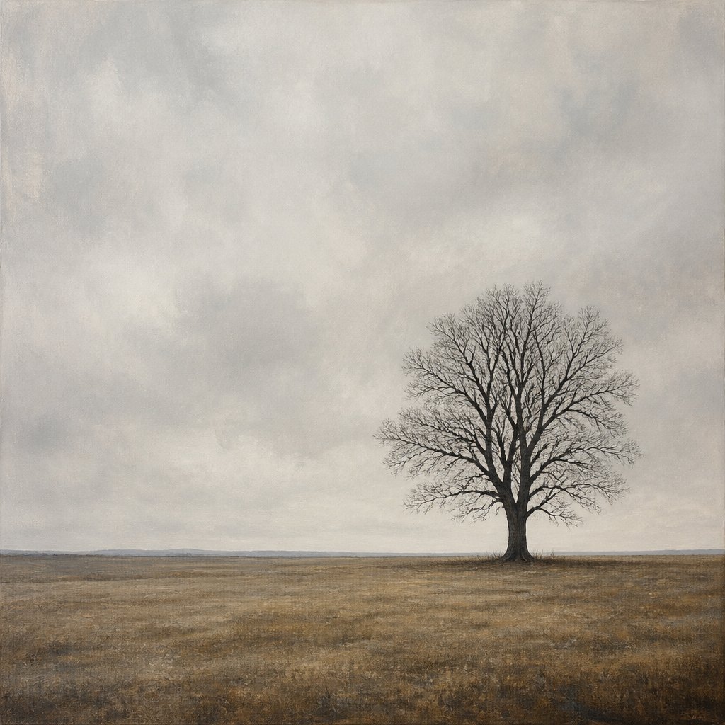 AI-generated
Try it yourself
Practice rule of thirds with AI
This example was generated from a prompt like: “A single bare tree standing at the right-third intersection of a wide flat field, with a low horizon line placed along the lower third and a pale overcast sky filling the upper two-thirds, minimal, calm.”
Open the Rule of Thirds Art Style generator →The concept today
Phone cameras and photo apps default to a 3x3 grid overlay, and cropping tools on Instagram and design software snap edits to thirds automatically. Cinematographers frame dialogue shots with eyes on the upper line, and web designers place hero images and headlines off-center for the same reason painters once did. Despite constant debate among photographers about whether it's overused or oversimplified, it remains the first compositional rule taught in nearly every beginner art and photography class.
Compose your own
Overlay a 3x3 grid on a photo you already like and check where the main subject actually falls — it's rarely dead center. Then shoot or sketch the same scene twice: once centered, once with the subject nudged to an intersection, and compare which feels more alive. Practice moving a horizon line deliberately between the top third and bottom third to see how each choice shifts emphasis between sky and ground. Finally, try breaking the rule on purpose with a perfectly symmetrical composition, and notice how that stillness reads differently from an off-center one.
Frequently asked questions
What is the rule of thirds in art?
It's a compositional guideline that divides a picture into a 3x3 grid and suggests placing important elements, like a horizon or a face, along the grid lines or at their intersections rather than in the exact center of the frame.
Is the rule of thirds the same as the golden ratio?
No, but it's related. The golden ratio is an exact mathematical proportion near 1.618, while the rule of thirds is a simpler, easier-to-eyeball approximation of a similar balance that doesn't require any calculation.
Why do photographers use the rule of thirds?
Because it gives a quick, reliable way to avoid static, centered compositions. Placing a subject or horizon off-center tends to create a sense of movement and visual interest that a perfectly centered shot often lacks.
Do all great paintings follow the rule of thirds?
No. Many artists center subjects deliberately for symmetry, calm, or formality, especially in religious or ceremonial portraiture. The rule of thirds is a common tool, not a requirement every successful composition must follow.