 Art
Art
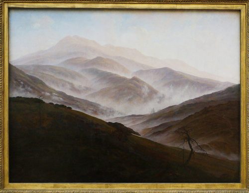
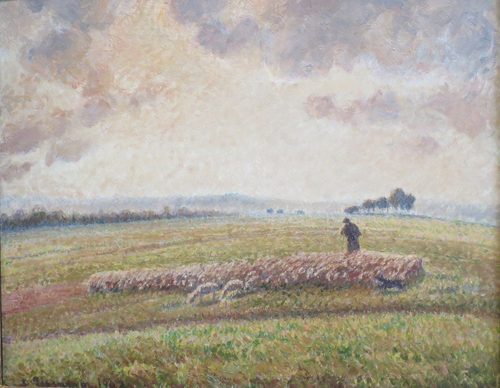
Gradation is the principle of art that governs gradual, step-by-step change rather than an abrupt jump — a color shifting slowly from warm to cool, a value darkening bit by bit into shadow, or a shape shrinking steadily as it recedes into the distance. Where contrast relies on sudden difference to grab attention, gradation relies on smoothness to guide the eye calmly across a surface or deep into an illusion of space. It is the mechanism behind atmospheric, or aerial, perspective: distant objects gradually lose contrast, saturation, and detail, and shift toward a hazy blue-gray, because the atmosphere itself scatters light between the object and the viewer's eye. Gradation also models three-dimensional form, since a sphere reads as round only because its surface tone changes gradually rather than in one hard step from light to shadow. Beyond landscape and modeling, gradation organizes rhythm and movement, as when a series of shapes grows steadily larger or smaller across a composition, creating a sense of flow, growth, or motion that a set of identical, evenly spaced shapes could never produce.
How artists use it
Atmospheric perspective
Landscape painters lighten and cool distant elements step by step, so mountains several ridges back fade almost into the color of the sky itself. Leonardo da Vinci described this effect in his notebooks, and it appears in the hazy blue background behind the Mona Lisa.
Sfumato blending
Rather than a hard edge between light and shadow, sfumato dissolves the boundary into countless microscopic tonal steps, so no single line marks where one value ends and the next begins. It is gradation used specifically to make form look soft and lifelike rather than cut-out.
Bokashi gradient printing
Japanese woodblock printmakers developed bokashi, a technique of wiping ink unevenly across a block, to produce a smooth printed gradient impossible with a single flat color. Hokusai's skies and seas often depend on this gradual, hand-controlled fade from dark to light.
Size gradation for depth
Repeating a motif — trees, waves, figures — while shrinking each repetition slightly creates an illusion of distance even on a flat surface, since the eye reads gradually decreasing size as gradually increasing depth. It is one of the simplest depth cues available without any perspective lines at all.
Color temperature shift
Skies rarely fade evenly; painters graduate a sunset through several distinct color families — warm orange near the horizon cooling gradually into blue overhead — to capture how atmospheric light actually scatters at different angles.
Value gradient modeling form
A convincingly rounded object needs a smooth, continuous gradient from its brightest highlight through a middle tone to its darkest shadow edge, not a series of flat, separate tonal bands. Painters blend wet paint or layer thin glazes specifically to avoid visible steps in that transition.
Instant examples
Gradation in famous works, fast
- Sunset sky fading orange to blue
- → color gradation — a gradual temperature shift across the sky rather than a hard color boundary.
- Hazy blue mountains in the distance
- → atmospheric perspective — gradation of value and saturation signaling depth without any drawn perspective lines.
- Soft smoky edges around a face
- → sfumato — tonal gradation replacing a hard contour line to make form look continuous.
- Trees shrinking steadily toward a vanishing point
- → size gradation — a repeated motif getting gradually smaller to imply increasing distance.
- Ombre fabric or dyed cloth
- → a physical color gradient moving smoothly from one hue or value to another.
- Smooth shading across a sphere
- → value gradation — a continuous tonal gradient modeling curved form without visible bands.
The story
Gradation as a deliberate technique took shape in the Renaissance, when Leonardo da Vinci wrote about how color, contrast, and detail all soften with distance, an effect now called atmospheric or aerial perspective, and applied it to the hazy background of the Mona Lisa, begun around 1503. His related technique, sfumato, used gradual tonal blending instead of hard outlines to model faces and hands. Chinese ink painters had already been graduating tone for centuries to suggest misty, layered mountain distances. Japanese woodblock printmakers developed bokashi, a hand-wiped ink gradient, to fade skies and water smoothly in prints like Katsushika Hokusai's The Great Wave off Kanagawa, 1831. Romantic painters such as Caspar David Friedrich pushed atmospheric gradation into an emotional tool, dissolving figures into fog, and Impressionists like Claude Monet later graduated color itself to capture shifting light rather than fixed local color.
The canonical examples
| Work | Artist | Date | Why it matters |
|---|---|---|---|
| Mona Lisa | Leonardo da Vinci | c. 1503–1519 | the background landscape fades gradually into pale blue haze, an early demonstration of atmospheric perspective |
| The Great Wave off Kanagawa | Katsushika Hokusai | 1831 | the woodblock-printed sky uses a hand-wiped bokashi gradient fading smoothly from dark to light |
| Wanderer above the Sea of Fog | Caspar David Friedrich | 1818 | distant ridgelines gradually lighten and lose detail as they recede into mist, deepening the sense of depth |
| Rain, Steam and Speed | J.M.W. Turner | 1844 | form and color dissolve gradually into swirling atmospheric haze rather than resolving into hard edges |
| Impression, Sunrise | Claude Monet | 1872 | the sky and water shift through gradual color and value steps to capture the soft light of early morning |
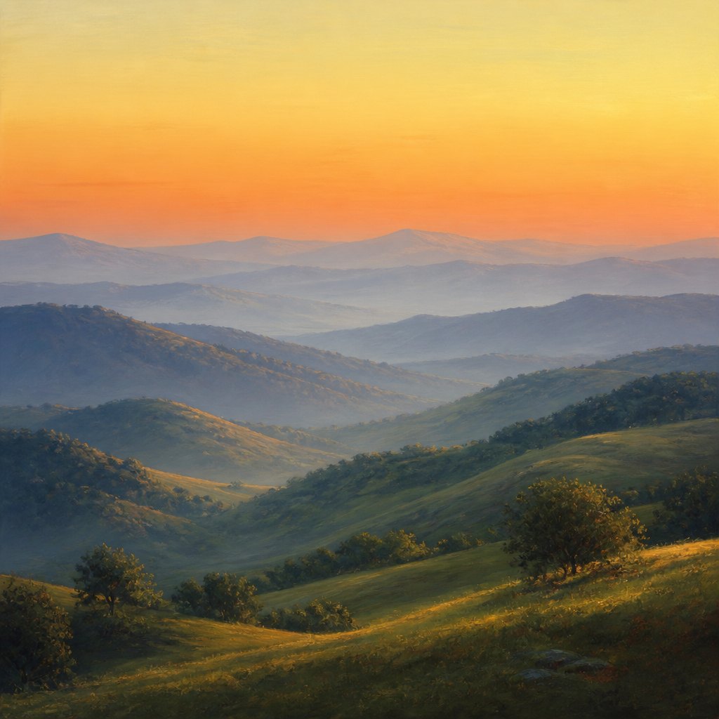 AI-generated
Try it yourself
Practice gradation with AI
This example was generated from a prompt like: “A landscape of rolling hills receding into pale blue haze, beneath a sky gradating smoothly from warm orange near the horizon to soft pale yellow higher up, gentle atmospheric perspective, no figures, soft focus in the distance.”
Open the Gradation Art Style generator →The concept today
Digital design tools default to gradients as a basic building block, fading one color smoothly into another across a button, background, or logo. Photographers use graduated neutral-density filters to darken a bright sky gradually without a hard line across the frame. Landscape and plein air painters still study atmospheric perspective directly from life to make distant hills recede convincingly. Motion graphics and app interfaces rely on gradual color and size transitions to suggest depth and movement on a flat screen, the same trick painters worked out centuries earlier.
Compose your own
Paint or draw a simple value gradient strip first, blending smoothly from white to black with no visible steps, to train your hand at continuous transition. Study atmospheric perspective directly: paint a landscape with several receding hills, lightening, cooling, and softening the detail of each one further back. Practice sfumato by shading a sphere with a soft blending tool or a dry brush, working the edge between light and shadow until no hard line remains. Try a size-gradation exercise, repeating one simple shape across a page while shrinking it steadily, and notice how convincingly that alone suggests distance without a single perspective line.
Frequently asked questions
What is gradation in art?
Gradation is a gradual, step-by-step change in color, value, or size rather than a sudden shift. It appears in fading sunset skies, hazy distant mountains, and smoothly shaded spheres, and it is one of the main tools artists use to suggest depth and soft, continuous form.
How is gradation different from contrast?
Contrast relies on sudden difference between elements to create emphasis and visual tension, while gradation relies on smooth, gradual change to create calm, flow, and the illusion of continuous space or form. Many compositions use both together deliberately.
What is atmospheric perspective and how does gradation create it?
Atmospheric perspective is the effect where distant objects appear lighter, less detailed, and cooler in color because of haze in the air between them and the viewer. Artists reproduce it by gradating value, saturation, and detail gradually as forms recede into the distance.
What is sfumato and how does it use gradation?
Sfumato is a painting technique, associated with Leonardo da Vinci, that blends the transition between light and shadow so gradually that no hard edge is visible. It relies entirely on tonal gradation to make faces and forms look soft and three-dimensional.