 Art
Art
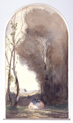
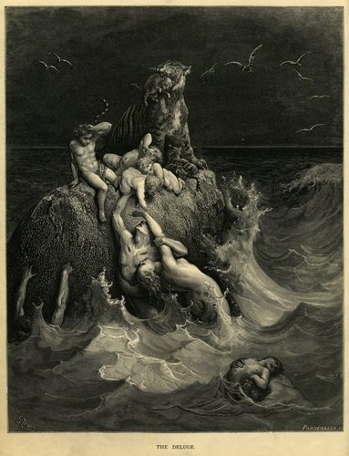
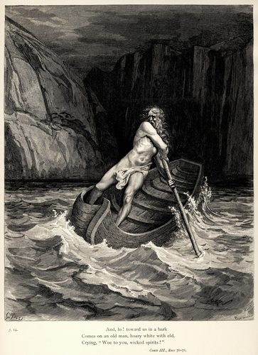
Tone, also called value, describes how light or dark a color is, independent of what hue it happens to be — a pale yellow and a pale blue can share the same tone even though they look nothing alike. Artists arrange tones along a scale running from pure white to pure black, and nearly every convincing drawing or painting depends on getting that scale right before color enters the picture at all. A full tonal range, with genuine darkest darks and brightest lights, reads as high-contrast and dramatic; a narrow range clustered around the middle reads as soft, hazy, or low-key. Tone is what makes a sphere look round rather than flat: the transition from its lightest highlight through a middle tone to its darkest shadow is what the eye interprets as curving form. Artists sometimes strip color away entirely to work in pure tone, as in grisaille painting, engraving, or charcoal drawing, precisely because value alone can carry an image's structure, mood, and readability without a single hue to help it along.
How artists use it
Grisaille underpainting
Painters have long blocked in an entire composition first in grays or browns, establishing every light and dark relationship before a single color is added on top. Grisaille panels on the outside of the Ghent Altarpiece show the technique used as a finished artwork in its own right.
Value scale discipline
Academic art training breaks tone into a simple numbered scale, often nine steps from white to black, and asks students to place every shadow and highlight onto that scale deliberately. Squinting at a subject blurs out color and detail, leaving only the tonal relationships behind.
High-key versus low-key
A composition built mostly from light values, with few real darks, reads as airy and optimistic; one built mostly from dark values, with only small bright accents, reads as somber or dramatic. Photographers and painters both choose a key deliberately to set mood before subject matter even registers.
Tonal focal point
The single lightest or darkest spot in an otherwise mid-toned picture almost always grabs the eye first. Artists reserve their most extreme values for the point they most want a viewer to notice, keeping the rest of the composition closer together in tone.
Crosshatching for tone
Engravers and pen draftsmen cannot mix gray paint, so they fake every value by controlling the density of parallel and crossed lines — sparse lines for a light passage, dense overlapping lines for a shadow. Albrecht Dürer's engravings are built almost entirely from this method.
Tonal unity across a scene
Landscape and portrait painters often keep an entire canvas within a narrower value range than reality actually shows, unifying a composition so no single area fights for attention. Real scenes have far more contrast than most successful paintings actually depict.
Instant examples
Tone in famous works, fast
- Black-and-white photograph
- → the clearest example of pure tone — every color has been translated into a scale of grays.
- Charcoal value scale strip
- → a standard teaching tool: a gradated bar from white to black used to calibrate a student's eye.
- Grisaille church panel
- → an entire finished image rendered in grays alone, imitating carved stone relief.
- Engraving crosshatch pattern
- → line density standing in for shadow, since printmaking tools can't blend actual gray.
- Lithograph poster
- → smooth tonal gradients achieved through a printing process rather than mixed paint.
- Silverpoint portrait drawing
- → a narrow, delicate tonal range achieved with a metal point instead of graphite or ink.
The story
Renaissance workshops built paintings from the ground up in tone: painters laid in a monochrome underpainting, sometimes in green (verdaccio) or gray, to settle every light-dark relationship before layering color glazes on top. Grisaille itself became a finished technique in its own right, seen on the exterior grisaille panels of Jan van Eyck's Ghent Altarpiece, completed 1432, which imitate carved stone statues using tone alone. Printmakers depended entirely on tonal control since etching and engraving plates yield only black ink on white paper — Francisco Goya's aquatint series Los Caprichos, published 1799, achieved a huge tonal range this way, and Käthe Kollwitz later used the same black-and-white economy for stark emotional effect. The invention of photography in the nineteenth century made pure tonal images an everyday reality rather than a specialized craft, and academic art schools formalized value-scale training that art students still practice today.
The canonical examples
| Work | Artist | Date | Why it matters |
|---|---|---|---|
| Ghent Altarpiece (exterior grisaille panels) | Jan van Eyck | 1432 | Saints John the Baptist and John the Evangelist are painted entirely in gray tones to imitate carved stone statues |
| The Sleep of Reason Produces Monsters (Los Caprichos, plate 43) | Francisco Goya | 1799 | aquatint etching runs from near-solid black to bare paper white to build its nightmarish tonal depth |
| Saint Jerome in His Study | Albrecht Dürer | 1514 | engraved crosshatching alone, with no color, produces every shadow and highlight in the room |
| Woman with Dead Child | Käthe Kollwitz | 1903 | etched in stark black and white, with almost no midtones, to intensify the image's emotional weight |
| Study for A Sunday on La Grande Jatte | Georges Seurat | 1884–1885 | conté crayon builds the entire scene from a smooth, carefully controlled range of grays |
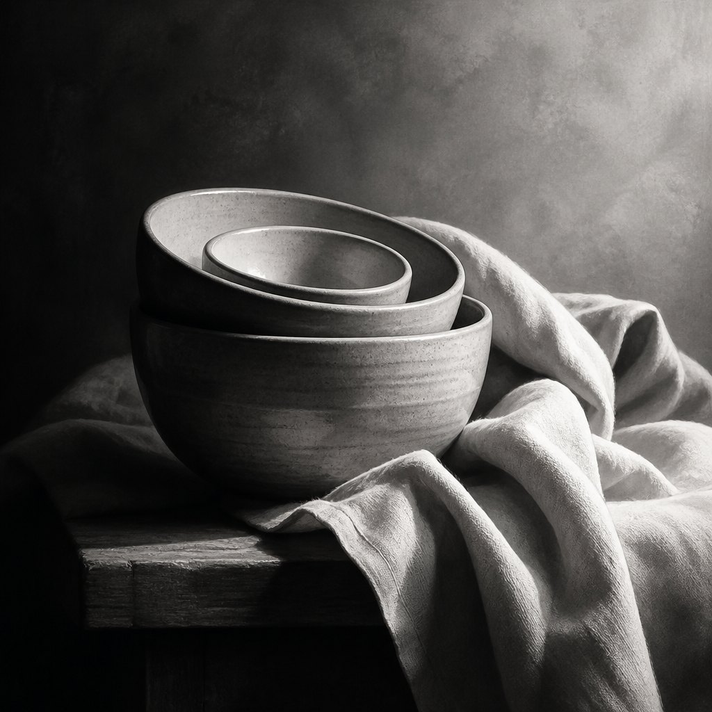 AI-generated
Try it yourself
Practice tone with AI
This example was generated from a prompt like: “A grayscale still life of stacked ceramic bowls and a draped cloth on a table, lit from one side so the composition shows a full range from near-black shadow to bright white highlight, studio lighting, no color.”
Open the Tone Art Style generator →The concept today
Digital painters still 'block in values' before adding color, working in grayscale first to make sure a composition reads before hue complicates the judgment. Photographers convert images to black and white specifically to check tonal balance once color is stripped away. Print and web designers use grayscale mockups for the same reason — value carries the layout's hierarchy on its own. Comic inkers, film colorists, and video game lighting artists all still lean on the same nine-step value logic academic ateliers taught centuries ago.
Compose your own
Make a simple value scale first: paint or shade nine boxes running smoothly from pure white to pure black, then practice matching real objects to a step on that scale. Photograph or view your own drawing in black and white to strip out color and judge whether the tonal structure alone still reads clearly. Try a grisaille exercise: paint an entire small still life using only black, white, and gray, focusing purely on getting the light-to-dark relationships convincing. Squint hard at any reference photo — it blurs detail and color, leaving only the big tonal shapes, which is exactly what you want to block in first.
Frequently asked questions
What is the difference between tone and value in art?
Tone and value are usually used interchangeably to mean how light or dark something is, independent of its actual color. Some instructors reserve 'tone' for a color mixed with gray, but for most purposes the two terms describe the same light-to-dark scale.
What is grisaille and why did painters use it?
Grisaille is painting done entirely in shades of gray. Renaissance painters used it as an underpainting to settle values before adding color, and also as a finished technique to imitate carved stone, as seen on the Ghent Altarpiece's exterior panels.
How many values should a drawing have?
There's no fixed rule, but academic training often uses a nine-step scale from white to black as a practice tool. Many successful drawings actually use a narrower range of five or so distinct values to keep the image unified.
Why do artists desaturate reference photos before painting?
Converting a photo to grayscale removes color so the artist can judge the underlying light-to-dark structure clearly. Since value carries most of an image's sense of form and depth, getting it right matters more than getting hue right.