 Art
Art
Harmony in art is the pleasing agreement between different elements in a composition — colors, shapes, textures, or lines — that feel like they belong to the same family rather than competing with each other. Color harmony is the most common form, achieved through analogous colors that sit next to each other on the color wheel, a monochromatic scheme built from a single hue, or a carefully balanced set of complementary colors used in unequal amounts. Shape harmony repeats related forms, like consistently rounded edges or a family of similar angles, so nothing feels visually out of place. Harmony is closely related to unity, but where unity is about a composition feeling like one whole, harmony specifically describes the quality of elements agreeing pleasantly with each other, the way notes in a chord sound good together rather than clashing. A harmonious composition tends to feel calm, resolved, and easy to look at, while a lack of harmony can feel jarring even if every individual part is well made. Artists reach for harmony when they want a scene to feel settled rather than tense.
How artists use it
One hue, many values
Pablo Picasso's The Old Guitarist stays almost entirely within shades of blue, and that monochromatic harmony ties together figure, shadow, and background into a single calm, melancholic mood without a single competing color to disrupt it.
Neighbors on the color wheel
Claude Monet's Water Lilies paintings lean on analogous greens, blues, and violets sitting close together on the color wheel, and that narrow, related color range gives the pond's reflections a soft, harmonious glow rather than any jarring contrast.
Curves that echo each other
In Henri Matisse's The Dance, the rounded limbs, curved backs, and looping hand-holds of the five figures all repeat the same soft, rounded shape language, and that shape harmony makes a chain of very different poses feel like one continuous gesture.
A muted, related palette
Johannes Vermeer's Girl with a Pearl Earring restricts its palette to warm ochres against a single cool blue, and the limited, related range of color keeps the portrait feeling calm and unified rather than visually busy.
Repeating architectural rhyme
Andrea Palladio's Villa Rotonda repeats the same triangular pediment and column arrangement on all four sides of the building, and that architectural harmony makes the structure feel balanced and resolved from every angle it's viewed from.
Nature's own harmony, painted
In Katsushika Hokusai's Thirty-six Views of Mount Fuji series, related blues and grays recur across nearly every print, and that consistent, harmonious color range unifies dozens of otherwise very different scenes into one recognizable visual world.
Instant examples
Harmony in famous works, fast
- The Old Guitarist
- → harmony — a single blue hue in many values unifies the whole painting into one calm mood
- Water Lilies
- → harmony — analogous greens, blues, and violets sit close on the color wheel for a soft glow
- The Dance
- → harmony — repeated rounded shapes across five figures create one continuous, agreeing gesture
- Girl with a Pearl Earring
- → harmony — a limited, related palette of ochre and blue keeps the portrait calm
- Villa Rotonda
- → harmony — the same pediment and column arrangement repeats on all four sides
- Thirty-six Views of Mount Fuji
- → harmony — a consistent range of blues and grays unifies dozens of different scenes
The story
Classical architecture treated harmony almost as a science, using repeated proportional ratios across columns, pediments, and facades so a building's parts would agree the way musical notes agree in a chord. Renaissance painters extended this idea into composition, balancing color and shape so a scene felt resolved rather than fought over. Color harmony was formalized in the 18th and 19th centuries as artists and scientists mapped the color wheel, identifying which hues sit naturally close together and which sit in tense opposition. Impressionist painters leaned heavily on analogous color harmony, favoring closely related hues to capture the soft, unified light of a single moment outdoors. In the 20th century, some abstract and modernist artists deliberately abandoned traditional harmony in favor of dissonant color and clashing shape, using the same understanding of what agrees to instead produce visual tension on purpose.
The canonical examples
| Work | Artist | Date | Why it matters |
|---|---|---|---|
| The Old Guitarist | Pablo Picasso | 1903-1904 | look at how one blue hue in many values unifies the whole scene |
| Water Lilies | Claude Monet | 1897-1926 | look at the closely related greens, blues, and violets across the pond's surface |
| The Dance | Henri Matisse | 1909-1910 | look at how the same rounded shape repeats through every linked figure |
| Girl with a Pearl Earring | Johannes Vermeer | c. 1665 | look at the limited, related range of ochre and blue |
| Villa Rotonda | Andrea Palladio | 1567-1592 | look at how the same pediment and column arrangement repeats on all four facades |
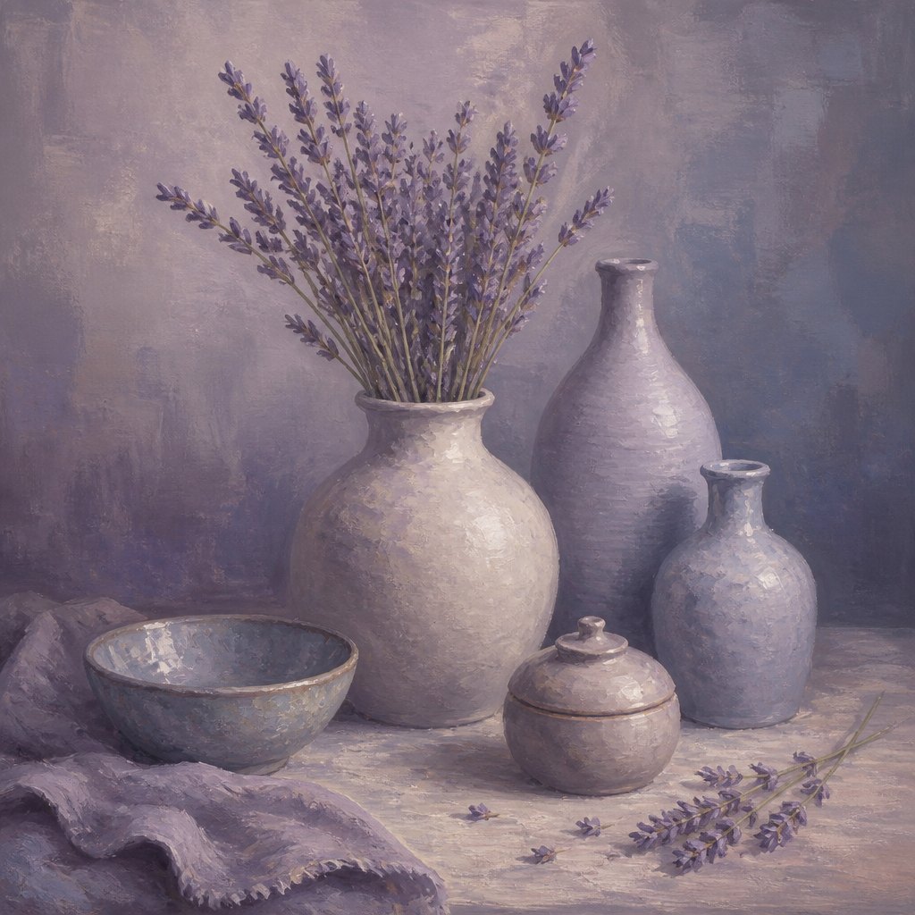 AI-generated
Try it yourself
Practice harmony with AI
This example was generated from a prompt like: “A quiet still life of pale ceramic vessels and dried lavender stems, everything painted in closely related soft violets, dusty blues, and warm grays so every object feels like part of the same calm, agreeing color family.”
Open the Color Harmony Art Style generator →The concept today
Photographers reach for color harmony in editing, grading an image toward one narrow, related range of tones so a photo feels cohesive rather than chaotic. Interior designers and architects still use proportional harmony, repeating a module or ratio across windows, furniture, and room dimensions. UI designers build harmony through a defined color palette and consistent corner radii, so buttons, cards, and text all feel like they belong to the same visual family. AI image generators produce more harmonious results when a prompt specifies a narrow palette or consistent mood rather than a scattered mix of unrelated colors.
Compose your own
Choose a color scheme before you start rather than adding colors as you go: pick a single hue and vary only its lightness and saturation for a monochromatic scheme, or choose two or three neighboring hues on the color wheel for an analogous one. Repeat a family of related shapes, like consistently rounded corners or a consistent angle, so different elements feel like they're speaking the same visual language. Keep contrast and value range moderate if calm harmony is the goal, saving sharp jumps for compositions that want tension instead. Step back periodically and ask whether any single element feels like it's fighting the rest; if so, shift its color or shape closer to the family already established rather than adding something entirely new.
Frequently asked questions
What are examples of harmony in art?
Pablo Picasso's The Old Guitarist uses one blue hue in many values; Claude Monet's Water Lilies rely on closely related greens, blues, and violets; and Andrea Palladio's Villa Rotonda repeats the same pediment and columns on all four facades for architectural harmony.
What's the difference between harmony and unity?
Unity is the broader sense that a composition reads as one connected whole, achieved through repetition, proximity, or a shared palette. Harmony more specifically describes elements agreeing pleasantly with each other, like related colors or echoing shapes. Harmony is one common way artists achieve unity.
What is color harmony?
Color harmony is a pleasing relationship between colors, usually achieved through a monochromatic scheme built from one hue, an analogous scheme using neighboring colors on the color wheel, or a balanced use of complementary colors in unequal amounts.
Why do some artists avoid harmony on purpose?
Some artists want tension rather than calm, so they deliberately clash colors or shapes that don't naturally agree. Understanding what makes elements harmonious lets an artist break that agreement on purpose, using dissonance to unsettle a viewer instead of soothing them.