 Art
Art
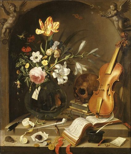
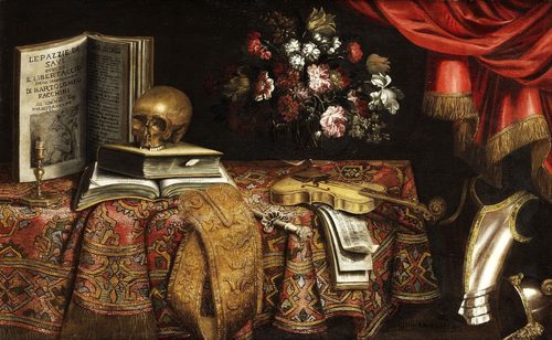
Juxtaposition in art is placing two unlike things side by side so each one changes how you read the other. Neither object has to touch or blend into the other — the meaning comes purely from proximity, from the mind's automatic habit of comparing whatever sits next to whatever else. A soft, melting shape beside a hard, rigid one reads as tension. A modern subject dressed in an old master's pose reads as commentary. A caption that contradicts its picture reads as a puzzle. Painters, collage artists, and photographers have all leaned on this trick because it does the work of an argument without a single word of explanation: put two things together and the viewer supplies the connection, the contrast, or the joke. Juxtaposition became especially prominent once artists started literally cutting and pasting real materials into their work, since a scrap of newspaper glued next to a painted shape makes the collision impossible to ignore. The same logic now drives everything from surrealist paintings to advertising layouts to a single, well-chosen prompt for an AI image generator.
How artists use it
Word against image
René Magritte's The Treachery of Images places a carefully painted pipe directly above the words 'Ceci n'est pas une pipe' — this is not a pipe. The picture and the caption contradict each other, juxtaposing an object with a denial of that same object to make you question what a picture actually is.
Soft against hard
In Salvador Dalí's The Persistence of Memory, limp pocket watches drape over a rigid rock ledge and a bare, dead tree. The juxtaposition of malleable, melting time against an unmoving, stony landscape is what makes the whole scene feel like an uneasy dream rather than a still life.
Glamour against decay
Andy Warhol's Marilyn Diptych repeats the same glowing publicity photo twenty-five times in candy colors on one panel, then twenty-five times more, smudged and fading, in black and white on the other. Set side by side, polished celebrity is juxtaposed directly against its own erosion.
Grand pose, modern rider
Kehinde Wiley's Napoleon Leading the Army over the Alps restages Jacques-Louis David's 1801 equestrian portrait of Napoleon with a contemporary rider in camouflage and boots, seated on the same rearing horse. Juxtaposing a present-day figure inside a centuries-old pose forces the two eras to argue with each other.
Two selves, one canvas
Frida Kahlo's The Two Fridas paints one woman as two seated figures, one in European lace with her heart cut open and bleeding onto her skirt, one in Tehuana dress with her heart whole, the two joined by a single vein. Juxtaposing the two versions of the same person turns a self-portrait into a conversation about identity.
Chaos against a flat grid
Pablo Picasso's Guernica crowds splintered bodies, a screaming horse, and a wailing mother into a nearly monochrome composition. The frantic, overlapping chaos of the figures is juxtaposed against the flattened, almost architectural grid of the picture plane, making the violence feel both raw and controlled.
Instant examples
Juxtaposition in famous works, fast
- The Treachery of Images
- → a painted pipe sits under text that denies it is one, image juxtaposed against its own caption
- The Persistence of Memory
- → limp, melting clocks drape over hard rock, soft time set against stone permanence
- Marilyn Diptych
- → bright repeated portraits fade into smudged black-and-white on the panel beside them
- The Two Fridas
- → two versions of one woman sit side by side, a whole heart against a severed, bleeding one
- Guernica
- → fractured bodies and animals crowd a flat black-and-white grid, chaos against order
- American Gothic
- → a soaring Gothic window looms over two plain farmers, high architecture against homespun life
- Napoleon Leading the Army over the Alps
- → camouflage and combat boots fill a nineteenth-century emperor's pose, present against past
The story
Juxtaposition became a deliberate artistic strategy once Cubist collage started gluing real newspaper and fabric scraps directly onto painted surfaces, letting torn, everyday material sit next to invented form. Dada artists pushed the idea further, cutting up photographs and printed text and reassembling them into combinations that had never existed in the world, designed to jolt rather than describe. Surrealist painters translated that same collage logic back into paint, pairing objects that had no business sharing a canvas to unsettle logical thought. Pop artists then juxtaposed high art conventions with the flat, mass-produced look of advertising and celebrity photography, collapsing the line between fine art and commercial imagery. Contemporary painters continue the tradition by placing historical conventions, grand poses, old master fabrics, alongside modern subjects and materials, using the friction between eras to comment on identity, power, and who art has traditionally represented.
The canonical examples
| Work | Artist | Date | Why it matters |
|---|---|---|---|
| The Treachery of Images | René Magritte | 1929 | a painted pipe and a caption that denies it contradict each other in plain sight |
| The Persistence of Memory | Salvador Dalí | 1931 | molten clocks drape over an inhospitable, rock-hard shore |
| Marilyn Diptych | Andy Warhol | 1962 | bright repeated portraits fade into smudged black-and-white on the right half |
| The Two Fridas | Frida Kahlo | 1939 | two versions of the same woman share one exposed vein and two different hearts |
| Guernica | Pablo Picasso | 1937 | shattered bodies pack a flat, nearly monochrome battlefield |
| Napoleon Leading the Army over the Alps | Kehinde Wiley | 2005 | a modern rider in camouflage strikes a nineteenth-century emperor's pose |
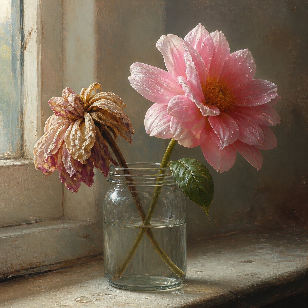 AI-generated
Try it yourself
Practice juxtaposition with AI
This example was generated from a prompt like: “A single wilted paper flower propped in a glass jar beside a fresh-cut real flower still beaded with dew, both lit by the same soft window light so their contrast in texture, color, and vitality reads instantly.”
Open the Bold Juxtaposition Art Style generator →The concept today
Street photographers hunt for accidental juxtaposition constantly, a luxury billboard behind a crumbling storefront, a tiny dog beside a giant statue, and build entire careers on catching that collision at the right instant. Film editors use juxtaposition through cutting, placing two shots back to back so their meaning collides even though neither shot changes. Advertising leans on before-and-after pairings and split-screen comparisons for the same effect. AI image prompts do it in a single phrase, pairing two unlikely nouns, a teacup and a desert, so the model generates instant, built-in meaning without any extra instruction.
Compose your own
Pick two things that share one quality but clash sharply in another: scale, texture, era, or mood. Place them close enough, touching or nearly touching, that a viewer compares them automatically instead of reading them as separate. Keep the background simple so the pairing itself carries the composition instead of getting lost in clutter. Push contrast along one dimension at a time, old against new, or soft against hard, rather than piling on every difference at once, which tends to read as noise instead of meaning. Add one small shared detail, a matching color or a repeated shape, to prove the pairing is intentional rather than accidental. Crop in tight so nothing else in the frame distracts from the two elements doing the actual work.
Frequently asked questions
What are examples of juxtaposition in art?
René Magritte's The Treachery of Images pairs a painted pipe with text denying it, Salvador Dalí's The Persistence of Memory drapes soft clocks over hard rock, Andy Warhol's Marilyn Diptych sets glossy color against faded black-and-white, and Frida Kahlo's The Two Fridas seats two versions of one woman side by side.
What is juxtaposition in art?
Juxtaposition is placing two distinct things side by side so their closeness creates meaning neither one has alone, letting a viewer compare textures, eras, moods, or ideas automatically just because the artist positioned them next to each other.
What's the difference between juxtaposition and contrast?
Juxtaposition is about placement, putting two distinct things next to each other so the pairing itself creates meaning. Contrast is a difference in one property, like light against dark or big against small, and can exist within a single object or across many.
Why do artists use juxtaposition?
It forces a comparison without narration, letting tension, humor, or commentary emerge from placement alone. Ordinary objects start to feel strange or pointed once they sit beside something that does not belong with them, and the viewer supplies the meaning.