 Art
Art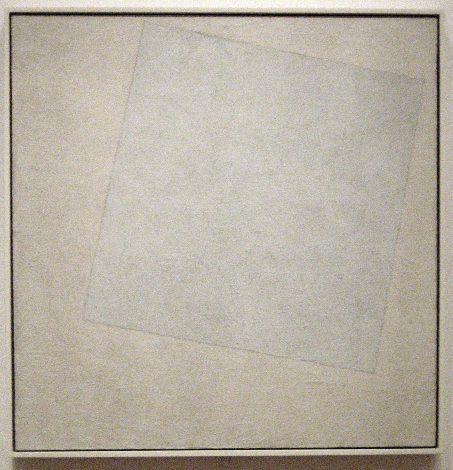
Simplicity is the principle of reducing a composition to its essential elements — fewer shapes, fewer colors, fewer competing focal points — so that what remains carries more weight. It works by removing anything a viewer's eye could get lost in: extra detail, clutter, secondary subjects. A simple composition might use one dominant shape, a limited palette of two or three colors, generous empty space, or a single figure isolated against a plain ground. None of this makes a work easy to produce; paring an image to its bare essentials forces every remaining mark to matter, since there is nowhere for a weak decision to hide. Simplicity is not emptiness — a nearly blank canvas can still be tightly composed and full of tension between its few parts. Artists reach for it to slow a viewer down or make a point without distraction, and it sits at the opposite end of a spectrum from complexity, with most compositions landing somewhere in between.
How artists use it
One shape, one idea
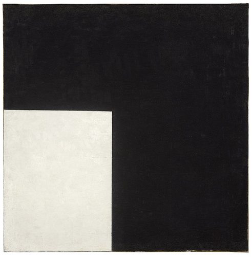
Kazimir Malevich's Black Square (1915) reduces the entire canvas to a black quadrilateral floating on white ground, cutting away landscape, figure, and story alike. It remains one of art history's most extreme demonstrations of reduction as content.
Negative space as content
Sesshū Tōyō's Haboku Landscape (1495) suggests mountains and mist with a handful of loose ink splashes across mostly untouched paper. The blank paper is not unfinished background; it is doing as much compositional work as the ink itself.
Isolated object
Francisco de Zurbarán's Still Life with Lemons, Oranges and a Rose (1633) sets a few pieces of fruit and a cup against a bare, dark background, giving each object room to be studied fully. Nothing competes for attention.
Flat cut shapes
Henri Matisse's late cut-out Icarus, from the book Jazz, reduces a falling figure to a single flat black silhouette against solid color fields, stripping away every anatomical detail while keeping the pose instantly readable.
Limited palette
Piet Mondrian's grid paintings restrict color to red, yellow, blue, black, and white, proving that a full visual language can run on only a handful of ingredients rather than a wide mixed range.
Flat color planes
Utagawa Hiroshige's Sudden Shower over Shin-Ōhashi Bridge and Atake (1857) renders rain and river as large flat bands of color with simplified diagonal lines standing in for detail, instead of naturalistic texture.
Instant examples
Simplicity in famous works, fast
- Black Square
- → reduction — a single black quadrilateral is the entire subject, with landscape, figure, and narrative all removed.
- Sumi-e ink landscapes
- → negative space — a few brushstrokes and large areas of blank paper let emptiness itself carry the image.
- Minimalist logo design
- → instant recognition — a shape reduced to a few lines communicates faster than a detailed emblem could.
- Single silhouette portrait
- → clarity — flattening a figure to one dark shape removes distracting detail and leaves only outline.
- Empty horizon in a seascape
- → calm — a plain line dividing sky and water needs no added incident to feel complete.
- Solid color field painting
- → focus — one saturated color filling a whole canvas asks the eye to slow down instead of scan.
The story
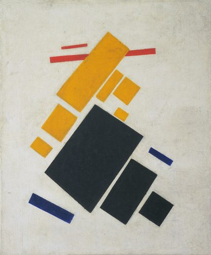
Reductive thinking has deep roots: Zen-influenced ink painters in medieval Japan and China treated blank paper, or ma, as active space rather than absence. Shaker communities in 18th- and 19th-century America built plain, undecorated furniture on principle. The modern turn came in 1915, when Kazimir Malevich exhibited Black Square in Petrograd, launching Suprematism and declaring painting could survive on a single shape and color. Piet Mondrian and the De Stijl movement pushed similar reduction into grids of primary color after 1917. The Bauhaus popularized 'less is more' as a design creed in the 1920s. Mid-century modernist architecture and 1960s Minimalist sculpture, by artists working in stripped-down geometric forms, carried the idea into three dimensions, and it now underlies flat digital interface design.
The canonical examples
| Work | Artist | Date | Why it matters |
|---|---|---|---|
| Black Square | Kazimir Malevich | 1915 | reduces the entire canvas to one black quadrilateral on a white ground, removing every reference to the outside world |
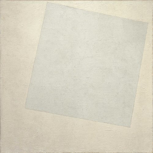
| Suprematist Composition: White on White | Kazimir Malevich | 1918 | a slightly tilted white square barely visible against a white ground pushes reduction to its outer limit |
| Icarus (plate from Jazz) | Henri Matisse | 1943–47 | a falling figure is flattened into one black cut-paper silhouette against solid color fields |
| Still Life with Lemons, Oranges and a Rose | Francisco de Zurbarán | 1633 | a few isolated fruits are arranged against a bare dark background with no other objects competing for attention |
| Sudden Shower over Shin-Ōhashi Bridge and Atake | Utagawa Hiroshige | 1857 | flat bands of color and a few simplified diagonal lines stand in for rain, sky, and river |
 AI-generated
Try it yourself
Practice simplicity with AI
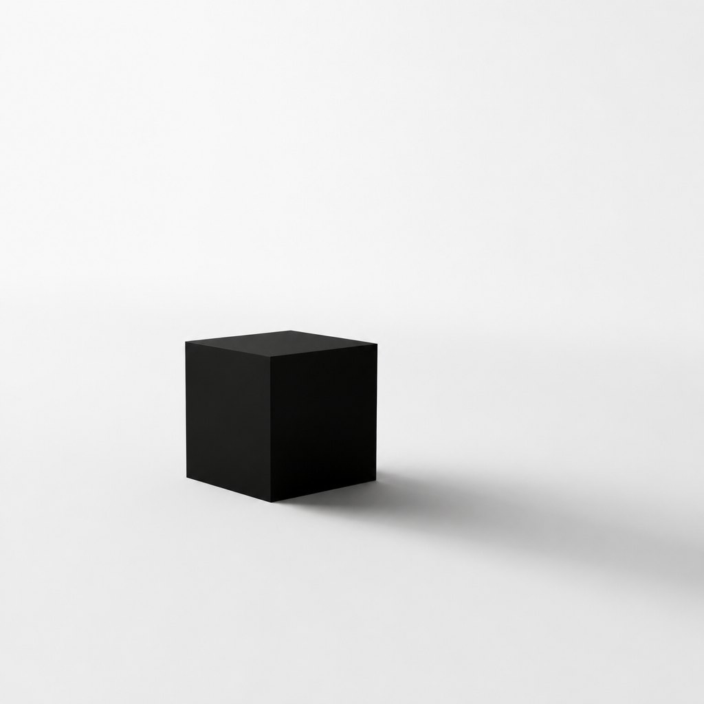
This example was generated from a prompt like: “A single matte black cube resting on a vast empty white floor, one soft shadow stretching to the edge of frame, no other objects, plain seamless white backdrop, even studio lighting, extreme minimalism, high contrast.”
Open the Simplicity Art Style generator →The concept today
Simplicity now drives product and interface design: flat UI, generous white space, and single-focus app screens all descend from the same instinct as Malevich's square. Brand logos are trimmed to a handful of lines so they read at any size. Home and lifestyle trends favor decluttered, minimal interiors. AI image tools offer explicit 'minimalist' style prompts. The pull toward simplicity persists precisely because attention is scarce and a pared-down image is processed faster than a busy one.
Compose your own
Start with a subject and remove one element at a time until the composition breaks — the last version before it stops working is often the strongest. Limit your palette to two or three colors before you begin, so you can't rely on variety to carry the image. Practice working in silhouette: block a subject in flat, single-color shapes with no interior detail and see how much still reads. Leave deliberate empty space around a focal object rather than filling the canvas edge to edge, and treat that space as part of the composition, not leftover background. Finally, try a single-shape study: build an entire image from one repeated shape in one color to feel how far reduction can go before meaning disappears.
Frequently asked questions
What are examples of simplicity in famous art?
Malevich's Black Square reduces painting to one shape and color, Zurbarán isolates a few fruits against bare darkness, Matisse's cut-out Icarus flattens a figure to a single silhouette, and Mondrian restricts his grids to five colors total.
Is simplicity the same as minimalism?
They're closely related. Simplicity is the general principle of reducing a composition to essentials; minimalism is the specific 20th-century art movement that made that reduction its core philosophy, especially in geometric sculpture and painting.
Why do artists use empty space instead of filling the canvas?
Empty space gives the eye somewhere to rest and makes the remaining elements stand out more strongly. In ink painting and modern design alike, blank areas are treated as active compositional space, not wasted room.
How is simplicity different from complexity as a design principle?
Simplicity removes elements so few things compete for attention; complexity adds layered detail so a viewer keeps finding new things. They sit at opposite ends of the same spectrum, and most artworks fall somewhere between the two extremes.